Media Queries in React
You might find you want to use the power of CSS media queries but within your React component. If you’ve wanted to know things like if the user’s device is 400px wide or less, then in CSS you could just write something like @media screen and (max-width: 400px).
But there are plenty of reasons you may want that same functionality within your React components, too. If so, we’ll get you up and running within mintues!
Importing and setting up
First, in your terminal while in the root directory of your project:
npm i media-queries-in-react
Then, in the file with the React component you want to use, just one import:
import useMediaQueries from "media-queries-in-react"
or (depending on which syntax you’re using)
const useMediaQueries = require("media-queries-in-react")
Then, in the body of your function component, define the queries you’d like to use like this:
export default function Component(){

    const mediaQueries = useMediaQueries({
        narrow: "screen and (max-width: 400px)",
    });


    return() { ...
The argument you pass into useMediaQueries() is a simple javascript object where the keys are the friendly names you’d like to have for your queries, and the values are the media query strings (Here’s a link to the MDN docs for all the available queries, and the syntax).
Just to be clear, the above example could just as easily use under400 as the key for its query, and could have included other queries as well:
export default function Component(){

    const mediaQueries = useMediaQueries({
        under400: "screen and (max-width: 400px)",
        landscape: "(orientation: landscape)"
    });


    return() { ...
The keys you choose are completely up to you.
Accessing the queries
When you define your queries and their friendly names within useMediaQueries(), it returns to you an object with the same keys (your friendly names).
The value of any given key is a boolean, representing if that media query is matched.
Note: if you passed an invalid query string it will always evaluate to false
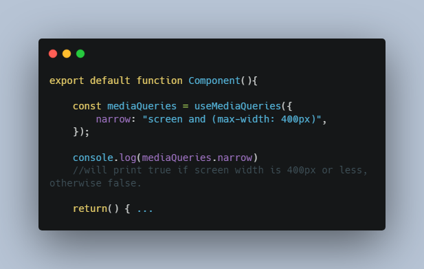
Using the first example from above:
export default function Component(){

    const mediaQueries = useMediaQueries({
        narrow: "screen and (max-width: 400px)",
    });

    console.log(mediaQueries.narrow)
    //will print true if screen width is 400px or less, otherwise false.

    return() { ...
That’s it! You now have full access to media queries in your JSX and can use them however you see fit.
They will automatically update if the user changes screen sizes, flips from portrait to landscape, etc.
Using the queries
Let’s continue that example from above. Let’s say you want some simple inline styles:
export default function Component(){

    const mediaQueries = useMediaQueries({
        narrow: "screen and (max-width: 400px)",
    });

    return() {
        <p style={ {fontSize:22} }>Hello, world!</p>
    }
But you notice the font feels a little too big on smaller screens. No problem!
export default function Component(){

    const mediaQueries = useMediaQueries({
        narrow: "screen and (max-width: 400px)",
    });

    const fontSize = mediaQueries.narrow ? 16 : 22

    return() {
        <p style={ {fontSize} }>Hello, world!</p>
    }
Or maybe you’re happy to leave the styling up to the CSS, but you want to easily change the rendered text depending on a media query.
export default function Component(){

    const mediaQueries = useMediaQueries({
        narrow: "screen and (max-width: 400px)",
        isDesktop: "(hover) and (pointer: fine)"
    });

    return() {
        <p>Hello, {mediaQueries.isDesktop ? "desktop" : "mobile"} user!</p>
    }
So far these are pretty simple examples, but where this can come in very handy is when you need to combine a media query with some other conditon or piece of data, like a prop.
( You may have run into this before. That other data usually won’t be available to your CSS, and your CSS media query won’t be available in the same place you have that other data. When you try to coordinate your CSS with everything going on in your JSX, it’s a pain and it breaks easily. Not anymore! ?)
Let’s say your component has a prop called user. Maybe you only want to render a special component if the user is a long-term member — but on smaller screens that makes your page way too busy, or moves something important below the fold.
So now you want to make sure they’re a long-term member AND the screen is a certain size.
export default function Component({user}){

    const mediaQueries = useMediaQueries({
        narrow: "screen and (max-width: 400px)",
        isDesktop: "(hover) and (pointer: fine)"
    });

    return() {
        <p>
            Hello, {mediaQueries.isDesktop ? "desktop" : "mobile"} user!
        </p>

        {!mediaQueries.narrow && user.isLongTermMember &&
           <SpecialOfferForLongTermMembers />
        }
    }
There are plenty more examples, but they all boil down to using the boolean value to accomplish your React-y magic ? If there are other examples you think would be super helpful to cover, please don’t hesitate to open a Pull Request with the example, or an Issue to discuss!
The quick recap:
- Import the function
import useMediaQueries from "media-queries-in-react"
//or
const useMediaQueries = require("media-queries-in-react")
- Define your queries and give them friendly names for easy reference (inside the body of a React function component):
const mediaQueries = useMediaQueries({
    ultraThin: "(max-width: 290px)",
    thin: "(max-width: 350px)",
    mobile: "(max-width: 480px)",
})
- Access your media queries by getting the property according to your friendly name, which will be a boolean value representing if the media query is matched — then use them however you need to in your React logic
const flexDirection = mediaQueries.thin ? 'column' : 'row';
const buttonLink = mediaQueries.mobile? "somewhere.com" : "somewhereelse.com"
    if ( !mediaQueries.mobile ) {
        return <InteractiveWidget />
     } else {
        return <SimpleImageWithLink />
     }
Tips & Tricks
- Since your input is a plain javascript object, it makes it a breeze to set up common breakpoints as a preset value. Imagine a separate file where you can store your default queries to easily import and reuse across all of your components. e.g.,
    const defaultMediaQueries = {
        tooNarrow: "screen and (min-width: 280px)",
        isMobile: "screen and (max-width: 480px)",
        isTablet: "(min-width: 750px) and (max-width: 1000px)",
        isDesktop: "(min-width: 1001px)"
    }

    export defaultMediaQueries;
-
To be continued…
- If you discover useful tips or helpful ways to implement, please don’t hesitate to open a Pull Request with the tip, or an Issue to discuss!