React-Flippy
React-Flippy allows you to create flipping cards in React projects. It can be used as controlled or uncontrolled component.
How to install ?
npm install react-flippy or yarn add react-flippy
How to use ?
import Flippy, { FrontSide, BackSide } from 'react-flippy';
// ... component class
render() {
// .. return
<Flippy
flipOnHover={false} // default false
flipOnClick={true} // default false
flipDirection="horizontal" // horizontal or vertical
ref={(r) => this.flippy = r} // to use toggle method like this.flippy.toggle()
// if you pass isFlipped prop component will be controlled component.
// and other props, which will go to div
style={{ width: '200px', height: '200px' }} /// these are optional style, it is not necessary
>
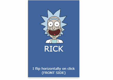
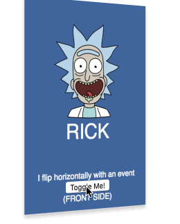
<FrontSide
style={{
backgroundColor: '#41669d',
}}
>
RICK
</FrontSide>
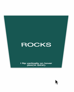
<BackSide
style={{ backgroundColor: '#175852'}}>
ROCKS
</BackSide>
</Flippy>
}
API for Components
Flippy
| Prop Name | Description | Values | Default |
|---|---|---|---|
| flipDirection | Direction of flip effect | horizontal/vertical | horizontal |
| flipOnHover | Should card flip on mouse hover | true/false | false |
| flipOnClick | Should card click on mouse click/touch | true/false | true |
| isFlipped | If you pass isFilipped prop component will be "controlled react component" and flipOnHover, flipOnClick functions will not work. You must handle this functionalities with your own logic. | undefined/true/false | undefined |
| ...props | Other props will be passed to container. |
Note: Flippy component has a function named "toggle" in its reference.
FrontSide
| Prop Name | Description | Values | Default |
|---|---|---|---|
| animationDuration | Duration of flip animation, should be used equal with back side for a good view. | number | 600 |
| elementType | Dom element type for card | dom element types | div |
| ...props | Other props will be passed to card. |
BackSide
| Prop Name | Description | Values | Default |
|---|---|---|---|
| animationDuration | Duration of flip animation, should be used equal with front side for a good view. | number | 600 |
| elementType | Dom element type for card | dom element types | div |
| ...props | Other props will be passed to card. |
Notes
To run sample project, clone the repository and run yarn && yarn start
To build project, clone repository and run yarn && yarn build