react-cool-forms
Powerful and flexible forms for React ?
Features
- ? Real flexible API
- ? UI library agnostic
- ? Conditional fields
- ? Array fields
- ? Form-level validation
- ? Field-level validation
- ? Dependent validation
- ? Custom validators
- ? onChange validation support
- ? Async validators support
- ⚡️ Output formatters support
- ? Extremal performance
- ? Small size (6 Kb gzipped)
- ✔️ No dependencies
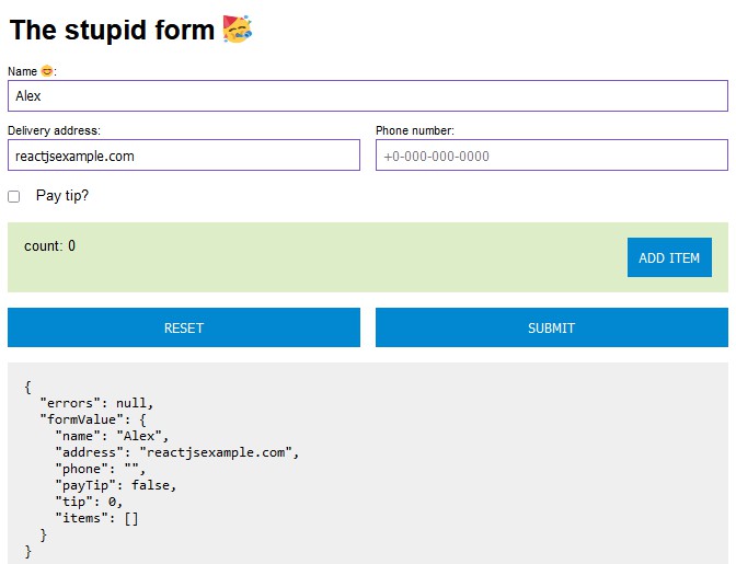
Demo
Motivation
I have been looking for a form validation library for React in the npm repository for a long time, but all of them did not suit me for one reason or another. First of all, I lacked the flexibility of the API of these libraries. Most of them are based on the use of simple HTML inputs and the like. But writing complex forms is not limited to HTML inputs or checkboxes or something else. Having a lot of experience with forms at my former company, I decided to write this library. The main message: any arbitrarily complex component that implements the value / onChange interface can be a full member of the form and pass the required validation. I also combined the classic Observer pattern along with the React Context and React memoization to get the best input performance without debounce technique (tested 3000 inputs in one form).
Installation
npm:
npm install react-cool-forms
yarn:
yarn add react-cool-forms
Usage
import { Form, Field } from 'react-cool-forms';

const required = {
  method: ({ fieldValue }) => Boolean(fieldValue),
  message: `It's required field`,
};

const handleSubmit = x => console.log('submit: ', x);
const getFirstName = form => form.firstName;
const setFirstName = (form, value) => (form.firstName = value);

<Form initialFormValue={{ firstName: '' }} onSubmit={handleSubmit}>
  {({ submit }) => {
    return (
      <>
        <Field
          name='firstName'
          getValue={getFirstName}
          setValue={setFirstName}
          validators={[required]}>
          {({ value, error, onChange }) => {
            return (
              <label>
                First name:
                <input value={value} onChange={e => onChange(e.target.value)} />
                {error && <div style={{ color: 'red' }}>{error}</div>}
              </label>
            );
          }}
        </Field>
        <button onClick={submit}>Submit</button>
      </>
    );
  }}
</Form>
API
import {
  Form,
  Field,
  Repeater,
  Debugger,
  useFormState,
  type Validator,
  type Formatter,
} from 'react-cool-forms';
Form
This is the root component that contains the root react context. Forms can be nested inside each other if you need it for some reason. The main properties that a Form takes are the initialization object and the onSubmit callback.
import { Form } from 'react-cool-forms';
<Form initialFormValue={{}} onSubmit={handleSubmit}>
  {({ formValue, errors, inProcess, submit, reset }) => <div>Some children here...</div>}
</Form>
type FormProps<T> = {
  initialFormValue: T;
  connectedRef?: React.Ref<FormRef<T>>;
  interrupt?: boolean;
  validators?: Array<Validator<T, T>>;
  onValidate?: (options: OnValidateOptions<T>) => void;
  onChange?: (options: OnChangeOptions<T>) => void;
  onSubmit: (options: OnSubmitOptions<T>) => void;
  children: (options: FormChildrenOptions<T>) => React.ReactElement;
};
FormProps
| prop | required | description |
|---|---|---|
| initialFormValue | ✅ | Initialization object. |
| connectedRef | Ref for imperative access to main methods. | |
| interrupt | Indicates whether to stop validation on the first error or not. | |
| validators | Array of root validators. | |
| onValidate | Called every time during validation. | |
| onChange | Called every time formValue changes. | |
| onSubmit | ✅ | Called after successful validation of the entire form. |
| children | ✅ | Render function that takes options (FormChildrenOptions). |
type FormRef<T> = {
  getFormValue: () => T;
  modify: (formValue: T) => void;
  validate: (formValue: T) => Promise<boolean>;
  submit: () => void;
  reset: () => void;
};
type FormChildrenOptions<T> = {
  formValue: T;
  errors: Record<string, string>;
  inProcess: boolean;
  validate: (formValue: T) => Promise<boolean>;
  submit: () => void;
  reset: () => void;
};
FormChildrenOptions
| prop | description |
|---|---|
| formValue | Actual value of form. |
| errors | Object with all validation errors. |
| inProcess | Shows if we are in the process of validation. |
| validate | Manual validation start if you need it. For example, validation before moving to the next step of the wizard. |
| submit | Call it for validation and submit form. |
| reset | Reset formValue to initialFormValue. |
type OnValidateOptions<T> = {
  formValue: T;
  isValid: boolean;
  errors: Record<string, string> | null;
};

type OnChangeOptions<T> = {
  formValue: T;
};

type OnSubmitOptions<T> = {
  formValue: T;
};
Field
This is a component that renders a single form element, such as input. Since the component does not impose any restrictions on how the form element should look, it expects to receive a render function as children that will display it.
import { Field } from 'react-cool-forms';
<Field
  name='name'
  getValue={(person: Person) => person.name}
  setValue={(person: Person, value: string) => (person.name = value)}>
  {({ value, error, onChange }) => <div>Some children here...</div>}
</Field>
type FieldProps<T, S> = {
  name: string;
  getValue: (formValue: S) => T;
  setValue: (formValue: S, fieldValue: T) => void;
  formatter?: Formatter<T>;
  validators?: Array<Validator<T, S>>;
  updatingKey?: string | number;
  enableOnChangeValidation?: boolean;
  onValidate?: (options: OnValidateFieldOptions<T>) => void;
  children: (options: FieldChildrenOptions<T>) => React.ReactElement;
};
FieldProps
| prop | required | description |
|---|---|---|
| name | ✅ | Label for correctly adding an error message to the error object. It should be unique within the form. |
| getValue | ✅ | Value access function inside formValue. |
| setValue | ✅ | Function to set a new value. |
| formatter | Function that formats value. | |
| validators | Array of validators that will participate in the validation process of this component. | |
| updatingKey | By default, the rendering of a child component in a Field is memoized for performance reasons. You can add this key to let the component know when you still want to update it. | |
| enableOnChangeValidation | Enables validation on the onChange event. | |
| onValidate | Fires every time a field is validated. | |
| children | ✅ | Render function that takes options. (FieldChildrenOptions). |
type OnValidateFieldOptions<T, N extends HTMLElement> = {
  nodeRef: React.RefObject<N> | null;
  isValid: boolean;
  fieldValue: T;
};
type FieldChildrenOptions<T> = {
  name: string;
  value: T;
  error: string | null;
  nodeRef: React.RefObject<any>;
  validate: () => Promise<boolean>;
  notify: (value: T) => void;
  onChange: (value: T) => void;
};
FieldChildrenOptions
| prop | required | description |
|---|---|---|
| name | Label that was passed to the Field. | |
| value | ✅ | Field value. Must be passed to the component that will trigger the value update, such as an input. |
| error | optional | Text error if field validation fails. |
| nodeRef | You can pass a nodeRef to your input if you want to implement something like scrolling to an element that didn’t pass validation. This ref will later be passed to the onValidate callback for this Field. | |
| validate | Allows you to call the validation of this field, for example, on the onBlur event. | |
| notify | Allows you to manually cause a new value to be set in a field. For example, inside the onBlur event to return an unformatted value to the form. Suppose the value of a field is ‘$1,000’ after formatting, even though the field is of type number. In this case, it is convenient to call the function of transforming a string into a number inside onBlur so that the correct data is sent to the server. | |
| onChange | ✅ | Must be passed to the component that will trigger the value update, such as an input. |
Validator
A validator is a simple object that contains three fields: a method, a message and an innerrupt. If you want to implement asynchronous validation, for example for a request to the server, then in the validation method, you must return a promise. You can also make validation dependent on other fields, due to the fact that the validation method accepts not only the value of one validated field, but also the value of the entire form. Interrupt
import { type Validator, type ValidatorMethodOptions } from 'react-cool-forms';
type Validator<T, S> = {
  method: (options: ValidatorMethodOptions<T, S>) => boolean | Promise<boolean>;
  interrupt: boolean; // Whether to abort validation if it fails on this validator
  message: string;
};

type ValidatorMethodOptions<T, S> = {
  fieldValue: T;
  formValue: S;
};
// Example of sync validator
const required = {
  method: ({ formValue, fieldValue }) => Boolean(fieldValue),
  message: `It's required field`,
};

// Example of async validator
const checkLogin = {
  method: ({ formValue, fieldValue }) => {
    return new Promise(resolve => {
      // Emulates request to server
      setTimeout(() => {
        resolve(true);
      }, 200);
    })
  },
  message: 'This login already exists',
};
Formatter
import { type Formatter, type FormatterOptions } from 'react-cool-forms';
A formatter is a function that formats value. Allows you to implement input masks or otherwise transform the output. It takes options with previous value, next value and node.
<Field
  name='nickname'
  getValue={x => x.nickname}
  setValue={(x, v) => (x.nickname = v)}
  formatter={formatUppercase}>
  {({ value, nodeRef, onChange }) => (
    // Pass a nodeRef if you need a node reference in the format function to move the caret
    <TextField
      ref={nodeRef}
      label='Your nickname'
      value={value}
      onChange={onChange}
    />
  )}
</Field>

const formatUppercase = (options: FormatterOptions<string, HTMLInputElement>) => {
  const { prevValue, nextValue, node } = options;

 return nextValue.toUpperCase();
};
type Formatter<T, N extends HTMLElement> = (options: FormatterOptions<T, N>) => T;

type FormatterOptions<T, N> = {
  prevValue: T;
  nextValue: T;
  node: N | null;
};
Repeater
In order to work with array-based forms, there is a Repeater component. It renders a list of nested Fields that, behind the scenes, work as a separate form with its own context, but in the end, thanks to the Repeater magic, arrays of forms can be treated as one. You can also nest Repeaters within each other if your data structure requires it. For example, you have an array of companies in your structure, and each of those companies has an array of accounts, and so on.
import { Repeater } from 'react-cool-forms';
const getCompanies = (form: MyForm): Array<Company> => form.companies;
const setCompanies = (form: MyForm, value: Array<Company>) => (form.companies = value);
const getKey = (value: Company) => value.ID;
const renderTrigger = ({ append }) => {
  return <button onClick={() => append(createCompany())}>Add company</button>;
};

const getCompanyName = (company: Company) => company.name;
const setCompanyName = (company: Company, value: string) => (company.name = value);

<Form initialFormValue={initialFormValue} onSubmit={handleSubmit}>
  {({ submit }) => {
    return (
      <Repeater
        name='companies'
        getValue={getCompanies}
        setValue={setCompanies}
        getKey={getKey}
        renderTrigger={renderTrigger}>
        {({ idx, key, shouldFocus, remove }) => {
          return (
            <>
              <Field
                name={`companies(${key}).name`} // name can be any unique value
                getValue={getCompanyName}
                setValue={setCompanyName}
                updatingKey={idx} // for correct removing
                validators={[required]}>
                {({ value, error, onChange }) => <div>Some children here...</div>}
              </Field>
              <button onClick={() => remove(idx)}>remove company</button>
            </>
          );
        }}
      </Repeater>
    );
  }}
</Form>
type RepeaterProps<T, S> = {
  name: string;
  connectedRef?: React.Ref<RepeaterRef<T>>;
  getValue: (formValue: S) => Array<T>;
  setValue: (formValue: S, fieldValue: Array<T>) => void;
  getKey: (formValue: T) => string | number;
  interrupt?: boolean;
  triggerPosition?: 'before' | 'after';
  renderTrigger?: (options: RenderTriggerOptions<T>) => React.ReactElement;
  children: (options: RepeaterChildrenOptions<T>) => React.ReactElement;
};
RepeaterProps
| prop | required | description |
|---|---|---|
| name | ✅ | Label for correctly adding an error message to the error object. It should be unique within the form. |
| connectedRef | Ref for imperative access to list modification methods (append, prepend, insert, swap, remove). | |
| getValue | ✅ | Value access function inside formValue. |
| setValue | ✅ | Function to set a new value. |
| getKey | ✅ | Function to return the unique ID of an object. Needed so that React knows when it should unmount the node completely. |
| interrupt | Indicates whether to stop validation on the first error or not. | |
| triggerPosition | Specifies where to render form control buttons: before or after the list. | |
| renderTrigger | Function that that takes options (RenderTriggerOptions) and should render buttons for adding elements to an array. | |
| children | ✅ | Render function that takes options (RepeaterChildrenOptions). |
type RenderTriggerOptions<T> = {
  inProcess: boolean;
  size: number;
  append: (item: T, shouldFocus?: boolean) => void;
  prepend: (item: T, shouldFocus?: boolean) => void;
  insert: (idx: number, item: T, shouldFocus?: boolean) => void;
  swap: (from: number, to: number) => void;
  remove: (idx: number | Array<number>) => void;
};
RenderTriggerOptions
| prop | description |
|---|---|
| inProcess | Shows if we are in the process of validation. |
| size | Number of elements in the current array. |
| append | Allows you to add an element to the end of the list. |
| prepend | Allows you to add an element to the beginning of the list. |
| insert | Allows you to add an element at the specified index. |
| swap | Allows swapping 2 list items. |
| remove | Allows you to remove an element from the list at the specified index or array of indices. |
Note that some list management methods take a shouldFocus parameter. If this parameter is true, then when rendering the list, you will need to pass it as an input to the autoFocus property.
type RepeaterChildrenOptions<T> = {
  key: string | number;
  idx: number;
  isFirst: boolean;
  isLast: boolean;
  isEven: boolean;
  isOdd: boolean;
  isSingle: boolean;
  size: number;
  shouldFocus: boolean;
  formValue: T;
  errors: Record<string, string> | null;
  inProcess: boolean;
  remove: (idx: number | Array<number>) => void;
};
Debugger
This is the component you need to view the formatted formValue and errors while using the form. To use it, you just need to put it inside a Form.
import { Debugger } from 'react-cool-forms';
<Form initialFormValue={{}} onSubmit={handleSubmit}>
  {({ formValue, errors, inProcess, submit, reset }) =>
    <>
      <div>Some children here...</div>
      <Debugger />
    </>
  }
</Form>
// Example of output
{
  "errors": {
    "name": "It is required field"
  },
  "formValue": {
    "name": "",
    "companies": [
      {
        "ID": 1,
        "name": "Company #1"
      },
      {
        "ID": 2,
        "name": "Company #2"
      }
    ]
  }
}
useFormState
A hook that you can use to access the form value and some of its useful methods while inside child components.
const {
  formValue,
  errors,
  inProcess,
  addValidator,
  removeValidator,
  modify,
  validate,
  submit,
  reset,
} = useFormState();
You can use this hook to detect changes in the entire form or in part of it by setting the detectChanges function. Now your component will only render when that piece of data in the form changes.
useFormState<MyForm, string>({
  detectChanges: x => x.phone,
});
type UseFormStateOptions<T, S> = {
  detectChanges: (formValue: T) => S;
};
Be sure to look at examples of using various APIs in the examples folder.
LICENSE
MIT © Alex Plex
