?QUEEN UI?
Currently the document of the library still has a lot of shortcomings and confusion, hope everyone will ignore it
✨ Features
- ? There are 6 colors for the components (black, red, orange, purple, green, blue)
- ⚓️ We have integrated 5 useful hooks in the library
- ⚙️ And some commonly used function that you might like
? Install
npm i queen-UI
yarn add queen-UI
? Links
Components
Hook
Functions
? Components
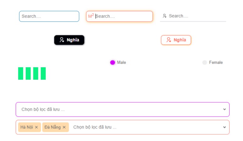
QInput
QInput contains all the basic props of an input element
        <QInput
            value={value}
            onChange={(e) => setValue(e.target.value)}
            placeholder="Search...."
        />
);
Props
| Name | Type | Description |
|---|---|---|
| color | string | Set themes for element. Default value is “black” and in addition 5 other colors: “red”, “orange”, “purple”, “green”, “blue” |
| icon | node | Add icon in front of input element |
| className | string | Add class name for element |
| style | object | Add inline style for element |
| boxShadow | boolean | Default value is true, when focus event is fired the input will have an additional box-shadow property according to themes |
| bordercolor | string | There are 3 types of modes: “0”: color and border color is gray when not focused,“1”: color and border color is primary color when not focused, “2”: Only borderbottom has color. Default value is “0” |
| ref | refObject | Add ref attached to React elements via the ref attribute. |
Images
QButton
QButton contains all the basic props of an button element
<QButton mode="2" color="orange">
    Submit
</QButton>
Props
| Name | Type | Description |
|---|---|---|
| color | string | Set themes for element. Default value is “black” and in addition 5 other colors: “red”, “orange”, “purple”, “green”, “blue” |
| className | string | Add class name for element |
| children | string or node | Add content for button element |
| style | object | Add inline style for element |
| mode | string | There are 3 types of modes: “1”: background-color is primary color, “2”: background-color is white. Default value is “1” |
| ref | refObject | Add ref attached to React elements via the ref attribute. |
Images
QRadio
QRadio contains all the basic props of an radio element like: name, onChange, value,…
<QRadio
    value={value}
    checked={value}
    name={"radio"}
    color="purple"
    onChange={setValue((old) => !old)}
>
    Male
</QRadio>
Props
| Name | Type | Description |
|---|---|---|
| color | string | Set themes for element. Default value is “black” and in addition 5 other colors: “red”, “orange”, “purple”, “green”, “blue” |
| className | string | Add class name for element |
| children | string or node | Add content for button element |
| style | object | Add inline style for element |
| checked | boolean | Condition for check |
| mode | string | There are 2 types of modes: “none”: Checkmark only has 1 single color , “circle”: Inside checkmark has a white circle. Default value is “none” |
| ref | refObject | Add ref attached to React elements via the ref attribute. |
Images
QLoading
QRadio contains all the basic props of an radio element like: name, onChange, value,…
<QLoading width="80" height="80" color="green" length="4" />
Props
| Name | Type | Description |
|---|---|---|
| color | string | Set themes for element. Default value is “black” and in addition 5 other colors: “red”, “orange”, “purple”, “green”, “blue” |
| className | string | Add class name for element |
| width | string | Set width property for element |
| height | string | Set height property for element |
| length | string | Number of columns displayed in loading component. Default value is “3” columns |
Images
QSelect
Since QSelect is designed based on QInput, it will contain some UI properties of QInput like bordercolor, placeholder,….
<QSelect
    data={optionQSelect(dataCityVN, "code", "name")}
    placeholder="Chọn bộ lọc đã lưu ..."
    value={placeCity}
    onChange={setPlaceCity}
    bordercolor={"1"}
    color="orange"
    mode={"multiple"}
/>
Props
| Name | Type | Description |
|---|---|---|
| color | string | Set themes for element. Default value is “black” and in addition 5 other colors: “red”, “orange”, “purple”, “green”, “blue” |
| className | string | Add class name for element |
| classListName | string | Add class name for list div element |
| **data ** | object (array) | The list of data will be displayed in QSelect, input data needs to be configured through the optionQSelect() function for the component to understand. |
| mode | string | Decide whether QSelect allows multiple items to be selected. Includes 2 values: **”none” **, **”multiple” **. Default value is “none” |
Images
QInfiniteScroll
This component that helps the developer to fire the load data event when the bar scrolls to the bottom of the list component
<div id="test-list">
    <QInfiniteScroll
        getData={LoadingData}
        hasMore={_test.length < 15}
        idScroll={"test-list"}
        endMessage={<span>Over</span>}
        loader={<span>Loading</span>}
    >
        {list - data}
    </QInfiniteScroll>
</div>
QCheckbox
This component still undeveloped yet
⚓️ Hook
useOutside
This hooks help developers know when the user has fired onClick event outside the component
useOutside(ref, state, setNewState);
Parameter
| Name | Type | Description |
|---|---|---|
| ref | refObject | Ref of main element when clicked outside. |
| state | boolean | State determines whether or not the element has been clicked outside. |
| ** setNewState** | function | Fired function when pressed outside. Return false |
useCountdown
This hooks help developers to perform countdown related functions
const [num, setNum] = useCountdown(initialtime);
Parameter
| Name | Type | Description |
|---|---|---|
| initialtime | number | Countdown time in seconds. |
Response
| Name | Type | Description |
|---|---|---|
| num | number | State shows the countdown time. |
| setNum | function | Reset countdown time with countdown time as input parameter. |
useHover
This hook helps the developer to determine if the mouse position is hovering the defined element
const [hoverRef, isHovered] = useHover();
Response
| Name | Type | Description |
|---|---|---|
| hoverRef | refObject | RefObject defines the element that will fire hover event. |
| isHovered | boolean | state determines whether to hover or not. |
useGoogleLogin
This hooks help developers to implement login with google
Hook is still under development, can’t use it yet
⚙️ Function
QCondition
This function will help you to instead of if else or switch case.
const expr = "Papayas";
const matched = QCondition(expr, {
    Oranges: "Oranges are $0.59 a pound.",
    Mangoes: "Mangoes and papayas are $2.79 a pound.",
    Papayas: "Mangoes and papayas are $2.79 a pound.",
    default: `Sorry, we are out of ${expr}.`,
});
//result: matched='Mangoes and papayas are $2.79 a pound.'
optionQSelect
This function is used to configure data when you use QSelect component
optionQSelect(data, keyValue, keyLabel);
Parameter
| Name | Type | Description |
|---|---|---|
| data | object (array) | To-do list config. |
| keyValue | string | Name of the unique key in the list, which helps the function identify the item when the user selects it. |
| ** keyLabel** | string | Key of item displays title in QSelect list |
deepEqual
This function used to compare the depth between two objects. Return true or false
deepEqual(object1, object2);
removeAccents
This function returns a string with all Vietnamese accents removed from string passed in
removeAccents(str);
dataCityVN
dataCityVN is a list of data including type names, id-codes of all cities in Vietnam
? Contributing
Thanks for this wonderful person
 Nghĩa Đinh