React-yearly-calendar
React.js Yearly Calendar Component
$ npm install react-yearly-calendar
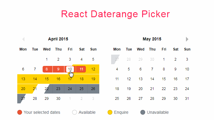
Live Demo
http://code.belka.us/react-yearly-calendar/custom_classes/
Or taste an example usage below:
var ReactDOM = require('react-dom');
var {Calendar, CalendarControls} = require('react-yearly-calendar');

function onDatePicked(date) {
  alert(date);
}

ReactDOM.render(
  <Calendar
    year={2016}
    onPickDate={onDatePicked}
  />,
  document.getElementById('calendar')
);
Styling guide
The calendar is rendered as an html table element, to ensure proper displaying even in case the style isn't being loaded.
Take a look at the css file in examples/basic/style.css. Here are some head-ups if you want to style it yourself.
table.calendar: the main element that renders the calendartable.calendar thead: renders the week day namestable.calendar thead th.bolder: addsbolderclass to Sundaystable.calendar td.month-name: first column in table body, showing month namestable.calendar td.prev-month,table.calendar td.next-month: classes applied to the days of the previous and next month showed in a month's row to fill it up. Day numbers and callbacks are present even in these cells, so we suggest to play with text color to make days less intrusive and addpointer-events: noneto prevent clicking.table.calendar td.week-separator: class applied to table cells used to separate one week from another. As above,pointer-events: noneis suggestedtable.calendar td.selected: the currently selected daytable.calendar td.bolder: the days which are Sundaystable.calendar td.range: the days in the selected rangetable.calendar td.range-left,table.calendar td.range-right: the left and right boundaries of the selected range
div.calendar-controls: the main CalendarControls containerdiv.calendar-controls .current-year: the current yeardiv.calendar-controls .controls: applies to next and previous arrows and to today buttondiv.calendar-controls .today: the today button
Responsive
A first attempt at making this design responsive can be seen here (windows width < 1200 triggers mobile layout). Discussion on this is really welcome on issue #10
Custom days/periods colors
By passing the customClasses prop, you can have a fine control on which CSS classes are assigned to each day.
customClassescan be a function accepting a moment object as a parameter, giving back the css class to be applied to the given day.
const customClasses = day => ( day.isBefore( moment([day.year(),2,21]) ) || day.isAfter( moment([day.year(),11,21]) ) ) ? 'cheap low-season': 'expensive high-season'
- If
customClassesis an object, the Calendar will use the keys as css classes and the values as rules to apply them.- if the value is an array of strings in the form
YYYY-MM-DD, those days will be given the css class. Useful for single days, like holidays! - if the value is an object with a
startand anendvalue (still in theYYYY-MM-DDform), the days in that period will be given the css class. Nice for seasons! - if the value is a string of comma-separated, three-letter weekdays names in the form
"ddd,ddd", the class will be given to the days of the week appearing on the string. Great for closing days during the week! - if the value is a function returning a boolean value, the class will be assigned using the function itself as a test. A must have for the finest tuning!
- if the value is an array of strings in the form
Confused? see the snippet below or try it yourself with this interactive example!
const customCSSclasses = {
  holidays: [
    '2016-04-25',
    '2016-05-01',
    '2016-06-02',
    '2016-08-15',
    '2016-11-01'
  ],
  spring: {
    start: '2016-03-21',
    end: '2016-6-20'
  },
  summer: {
    start: '2016-06-21',
    end: '2016-09-22'
  },
  autumn: {
    start: '2016-09-23',
    end: '2016-12-21'
  },
  weekend: 'Sat,Sun',
  winter: day => day.isBefore( moment([2016,2,21]) ) || day.isAfter( moment([2016,11,21]))
}
Build it yourself
Clone and run
$ npm install