use-select
React hooks for building select and combobox components.
useSelect
▸ useSelect<T, S, D>(props: UseSelectProps<T>): UseSelect<T, S, D>
Provides state and callbacks for building select component.
Only required prop are items that can be selected. To control value, provide value and onChange props.
Type parameters
| Name | Type |
|---|---|
T |
T - Type of items |
S |
S: HTMLElement = HTMLDivElement - Type of select element |
D |
D: HTMLElement = HTMLUListElement- Type of dropdown element |
Props
UseSelectProps<T> = Items<T> & ValueControl<T> & Handlers & Flags
Return value
UseSelect<T, S, D>
| Name | Type | Description |
|---|---|---|
clear |
(e: ReactMouseEvent) => void |
Calls onChange with undefined or empty array value in case of multiple selection. Prevents event propagation |
dropdownRef |
RefObject<D> |
Ref for dropdown element, used internally to allow closing of dropdown on outside click and scrolling to highlighted index item when using arrow keys to highlighted items. |
handleClick |
(e: ReactMouseEvent) => void |
Toggles isOpen flag, prevents event propagation |
handleItemClick |
(item: T) => void |
Calls select if item isn't selected or remove if item is selected |
handleKeyDown |
KeyboardEventHandler<never> |
Handles ArrowUp, ArrowDown, Enter and Escape key down event, apply to select and dropdown element (add tabIndex=0 to allow key events on div element) |
highlightedIndex |
number |
Index of currently highlighted item, used for keyboard control, ArrowUp key decreases this, while ArrowDown key increases it |
isOpen |
boolean |
Indicates whether dropdown is open or not |
isSelected |
(item: T) => boolean |
Returns true if item equals value, or in case of multiple selection, if item is part of value array |
open |
() => void |
Sets isOpen to true |
remove |
() => void |
Calls onChange with value set to undefined |
select |
(item: T) => void |
Calls onChange with provided item set as value |
selectRef |
RefObject<S> |
Ref for combobox element, used internally to allow closing of dropdown on outside click |
setHighlightedIndex |
(index: number) => void |
Sets highlightedIndex to provided index |
Usage
This example uses basic styling and markup, you can style your components however you want.
Note that you need to assign selectRef and dropdownRef, this is needed so that isOpen is set to false (dropdown is closed) if you click outside select or dropdown element.
If you want your dropdown to scroll to highlighted item when user presses arrow keys make your items direct children of dropdown element.
const Select = () => {
const [value, setValue] = useState<string>();
const {
selectRef,
open,
handleKeyDown,
isOpen,
handleClick,
dropdownRef,
handleItemClick,
isSelected,
highlightedIndex,
} = useSelect({
items: ["item1", "item2", "item3"],
onChange: value => setValue(value),
value,
});
return (
<div>
<div ref={selectRef} tabIndex={0} onFocus={open} onKeyDown={handleKeyDown}> {/* select */}
{value}
<button onFocus={e => e.stopPropagation()} onClick={handleClick}>
{isOpen ? <span>▲</span> : <span>▼</span>}
</button>
</div>
{isOpen && ( // dropdown
<ul
ref={dropdownRef}
tabIndex={0}
onKeyDown={handleKeyDown}
style={{ width: "400px", backgroundColor: "grey" }}>
{items.map((item, index) => ( // item
<li
key={item}
onClick={() => handleItemClick(item)}
style={{
color: isSelected(item) ? "blue" : "black",
backgroundColor: highlightedIndex === index ? "green" : "grey",
cursor: "pointer",
}}>
{item}
</li>
))}
</ul>
)}
</div>
);
};
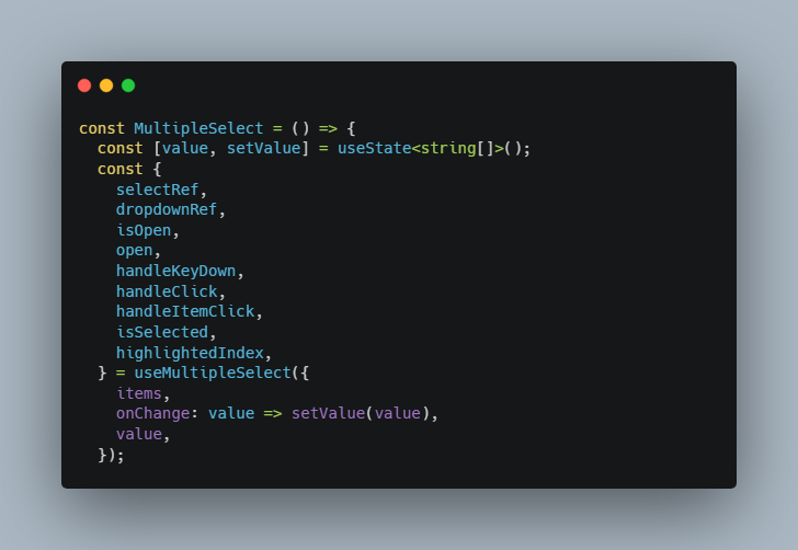
useMultipleSelect
▸ useMultipleSelect<T, S, D>(props: UseMultipleSelectProps<T>): UseMultipleSelect<T, S, D>
Allows selection of multiple items. Useful for building multiple select component.
Type parameters
| Name | Type |
|---|---|
T |
T - Type of items |
S |
S: HTMLElement = HTMLDivElement - Type of select element |
D |
D: HTMLElement = HTMLUListElement- Type of dropdown element |
Props
UseMultipleSelectProps<T>: Items<T> & MultiValueControl<T> & Handlers & Flags
Same as useSelect props, only difference are value and onChange props, in this case value is an array and onChange expects array parameter.
Return value
UseMultipleSelect<T, S, D>: Omit<UseSelect<T, S, D>, "remove"> & { remove: (item: T) => void ; removeByIndex: (index: number) => void }
Returns a similar object to useSelect, difference is in remove function. Also provides removeByIndex function for removing items according to their index in value array.
| Name | Type | Description |
|---|---|---|
remove |
(item: T) => void |
Calls onChange with value array without the provided item |
removeByIndex |
(index: number) => void |
Calls onChange with value array without the item at given index |
Usage
This example uses basic styling and markup, you can style your components however you want.
Note that you need to assign selectRef and dropdownRef, this is needed so that isOpen is set to false (dropdown is closed) if you click outside select or dropdown element.
If you want your dropdown to scroll to highlighted item when user presses arrow keys make your items direct children of dropdown element.
const MultipleSelect = () => {
const [value, setValue] = useState<string[]>();
const {
selectRef,
dropdownRef,
isOpen,
open,
handleKeyDown,
handleClick,
handleItemClick,
isSelected,
highlightedIndex,
} = useMultipleSelect({
items,
onChange: value => setValue(value),
value,
});
return (
<div>
<div ref={selectRef} tabIndex={0} onFocus={open} onKeyDown={handleKeyDown}>
{value?.join(", ")}
<button onFocus={e => e.stopPropagation()} onClick={handleClick}>
{isOpen ? <span>▲</span> : <span>▼</span>}
</button>
</div>
{isOpen && (
<ul
ref={dropdownRef}
tabIndex={0}
onKeyDown={handleKeyDown}
style={{ width: "400px", backgroundColor: "grey" }}>
{items.map((item, index) => (
<li
key={item}
onClick={() => handleItemClick(item)}
style={{
color: isSelected(item) ? "blue" : "black",
backgroundColor: highlightedIndex === index ? "green" : "grey",
cursor: "pointer",
}}>
{item}
</li>
))}
</ul>
)}
</div>
);
};
useCombobox
▸ useCombobox<T, S, D>(props: UseComboboxProps<T>): UseCombobox<T, S, D>
Hook that returns state and callbacks for controlling combobox component. Updates inputValue according to provided
value (currently selected item). This keeps inputValue and value state in sync whenever an item is selected, or value
was changed by some code.
Internally uses useSelect hook.
Type parameters
| Name | Type |
|---|---|
T |
T - Type of items |
S |
S: HTMLElement = HTMLDivElement - Type of select element |
D |
D: HTMLElement = HTMLUListElement- Type of dropdown element |
Props
UseComboboxProps<T>: UseSelectProps<T> & ComboboxFunctions<T>
Similar to useSelect props with added filter and itemToString functions.
filter function is used to filter items according to current input value of combobox. If not provided, defaults to returning items that start with input value.
itemToString function converts item to string so items can be compared to input value.
Return value
UseCombobox<T, S, D>: UseSelect<T, S, D> & UseComboboxReturnValue<T>
Returns everything useSelect hook returns + everything contained in UseComboboxReturnValue type.
UseComboboxReturnValue<T>
| Name | Type | Description |
|---|---|---|
inputRef |
RefObject<HTMLInputElement> |
Ref that needs to be applied to combobox input element |
inputValue |
string |
Value of input element |
items |
T[] |
Items filtered by filter prop, or in case of async combobox result of fetchItems |
setInputValue |
(value: string) => void |
Sets input value to given value |
Usage
This example uses basic styling and markup, you can style your components however you want.
Note that you need to assign selectRef and dropdownRef, this is needed so that isOpen is set to false (dropdown is closed) if you click outside select or dropdown element.
If you want your dropdown to scroll to highlighted item when user presses arrow keys make your items direct children of dropdown element.
const Combobox = () => {
const [value, setValue] = useState<string>();
const {
selectRef,
dropdownRef,
inputRef,
inputValue,
open,
setInputValue,
handleKeyDown,
handleClick,
handleItemClick,
isSelected,
highlightedIndex,
isOpen,
items,
} = useCombobox({
items: comboboxItems,
value,
onChange: value => setValue(value),
itemToString: item => item ?? "",
});
return (
<div>
<div ref={selectRef} tabIndex={0} onFocus={open} onKeyDown={handleKeyDown}>
<input value={inputValue} onChange={({ target: { value } }) => setInputValue(value)} ref={inputRef} />
<button onFocus={e => e.stopPropagation()} onClick={handleClick}>
{isOpen ? <span>▲</span> : <span>▼</span>}
</button>
</div>
{isOpen && (
<ul
ref={dropdownRef}
tabIndex={0}
onKeyDown={handleKeyDown}
style={{ width: "400px", backgroundColor: "grey" }}>
{items.map((item, index) => (
<li
key={item}
onClick={() => handleItemClick(item)}
style={{
color: isSelected(item) ? "blue" : "black",
backgroundColor: highlightedIndex === index ? "green" : "grey",
cursor: "pointer",
}}>
{item}
</li>
))}
</ul>
)}
</div>
);
};
useMultipleCombobox
▸ useMultipleCombobox<T, S, D>(props: UseMultipleComboboxProps<T>): UseMultipleCombobox<T, S, D>
Provides state and callbacks for combobox with multiple selection. When value prop changes, inputValue is set to
empty string, thus allowing for selection of new item.
Internally it uses useMultipleSelect hook.
Uses same props as useMultipleSelect + combobox functions (filter and itemToString). Returns same values as useMultipleSelect + values from UseComboboxReturnValue
Type parameters
| Name | Type |
|---|---|
T |
T - Type of items |
S |
S: HTMLElement = HTMLDivElement - Type of select element |
D |
D: HTMLElement = HTMLUListElement- Type of dropdown element |
Props
UseMultipleComboboxProps<T>: UseMultipleSelectProps<T> & ComboboxFunctions<T>
Return value
UseMultipleCombobox<T, S, D>: UseMultipleSelect<T, S, D\> & UseComboboxReturnValue<T>
Usage
This example uses basic styling and markup, you can style your components however you want.
Note that you need to assign selectRef and dropdownRef, this is needed so that isOpen is set to false (dropdown is closed) if you click outside select or dropdown element.
If you want your dropdown to scroll to highlighted item when user presses arrow keys make your items direct children of dropdown element.
const MultipleCombobox = () => {
const [value, setValue] = useState<string[]>();
const {
selectRef,
dropdownRef,
inputRef,
open,
isOpen,
highlightedIndex,
inputValue,
setInputValue,
items,
isSelected,
handleItemClick,
handleClick,
handleKeyDown,
} = useMultipleCombobox({
items: comboboxItems,
itemToString: item => item ?? "",
value,
onChange: setValue,
});
return (
<div>
<div ref={selectRef} tabIndex={0} onFocus={open} onKeyDown={handleKeyDown}>
{value?.join(", ")}
<input value={inputValue} onChange={({ target: { value } }) => setInputValue(value)} ref={inputRef} />
<button onFocus={e => e.stopPropagation()} onClick={handleClick}>
{isOpen ? <span>▲</span> : <span>▼</span>}
</button>
</div>
{isOpen && (
<ul
ref={dropdownRef}
tabIndex={0}
onKeyDown={handleKeyDown}
style={{ width: "400px", backgroundColor: "grey" }}>
{items.map((item, index) => (
<li
key={item}
onClick={() => handleItemClick(item)}
style={{
color: isSelected(item) ? "blue" : "black",
backgroundColor: highlightedIndex === index ? "green" : "grey",
cursor: "pointer",
}}>
{item}
</li>
))}
</ul>
)}
</div>
);
};
useAsyncCombobox
▸ useAsyncCombobox<T, S, D>(props: UseAsyncComboboxProps<T>): UseAsyncCombobox<T, S, D>
Returns state and callbacks for building combobox component that fetches items asynchronously.
Internally it uses useCombobox hook, but instead of filtering items this hook
calls fetchItems when inputValue changes.
Items returned from this hook are latest result of fetchItems call.
Type parameters
| Name | Type |
|---|---|
T |
T - Type of items |
S |
S: HTMLElement = HTMLDivElement - Type of select element |
D |
D: HTMLElement = HTMLUListElement- Type of dropdown element |
Props
UseAsyncComboboxProps<T>: { itemToString: ItemToString<T> } & ValueControl<T> & FetchItems<T> & Handlers & Flags
Similar to useCombobox, but instead of providing items you need to provide fetchItems function that will fetch items asynchronously when input value changes.
Return value
UseAsyncCombobox<T, S, D>: UseCombobox<T, S, D> & Loading
Returns everything useCombobox returns + loading flag that indicates if fetchItems is in progress.
Loading
| Name | Type | Description |
|---|---|---|
loading |
boolean |
True if fetchItems has been called but promise hasn't resolved yet. |
Usage
This example uses basic styling and markup, you can style your components however you want.
Note that you need to assign selectRef and dropdownRef, this is needed so that isOpen is set to false (dropdown is closed) if you click outside select or dropdown element.
If you want your dropdown to scroll to highlighted item when user presses arrow keys make your items direct children of dropdown element.
Example uses mock promise that resolves after 100ms timeout for fetchItems. You should use a function that will fetch items from some location and return them.
const AsyncCombobox = () => {
const [value, setValue] = useState<string>();
const {
selectRef,
dropdownRef,
inputRef,
inputValue,
open,
setInputValue,
handleKeyDown,
handleClick,
handleItemClick,
isSelected,
highlightedIndex,
isOpen,
items,
loading,
} = useAsyncCombobox({
fetchItems: async _ => {
const promise = new Promise<void>(resolve => {
setTimeout(() => {
resolve();
}, 100);
});
const [result] = await Promise.all([Promise.resolve(comboboxItems), promise]);
return result;
},
value,
onChange: value => setValue(value),
itemToString: item => item ?? "",
});
return (
<div>
<div ref={selectRef} tabIndex={0} onFocus={open} onKeyDown={handleKeyDown}>
<input value={inputValue} onChange={({ target: { value } }) => setInputValue(value)} ref={inputRef} />
<button onFocus={e => e.stopPropagation()} onClick={handleClick}>
{isOpen ? <span>▲</span> : <span>▼</span>}
</button>
</div>
{isOpen && (
<ul
ref={dropdownRef}
tabIndex={0}
onKeyDown={handleKeyDown}
style={{ width: "400px", backgroundColor: "grey" }}>
{loading
? "Loading..."
: items.map((item, index) => (
<li
key={item}
onClick={() => handleItemClick(item)}
style={{
color: isSelected(item) ? "blue" : "black",
backgroundColor: highlightedIndex === index ? "green" : "grey",
cursor: "pointer",
}}>
{item}
</li>
))}
</ul>
)}
</div>
);
};
useMultipleAsyncCombobox
▸ useMultipleAsyncCombobox<T, S, D>(props: UseMultipleAsyncCombobx<T>): UseMultipleAsyncCombobox<T, S, D>
Similar to useMultipleCombobox only this hook fetches new items on inputValue change.
Uses useMultipleCombobox internally.
Type parameters
| Name | Type |
|---|---|
T |
T - Type of items |
S |
S: HTMLElement = HTMLDivElement - Type of select element |
D |
D: HTMLElement = HTMLUListElement- Type of dropdown element |
Props
UseAsyncComboboxProps<T>: { itemToString: ItemToString<T> } & MultiValueControl<T> & FetchItems<T> & Handlers & Flags
Return value
UseMultipleAsyncCombobox<T, S, D>: UseMultipleCombobox<T, S, D\> & Loading
Returns everything useMultipleCombobox returns + loading flag.
Usage
This example uses basic styling and markup, you can style your components however you want.
Note that you need to assign selectRef and dropdownRef, this is needed so that isOpen is set to false (dropdown is closed) if you click outside select or dropdown element.
If you want your dropdown to scroll to highlighted item when user presses arrow keys make your items direct children of dropdown element.
Example uses mock promise that resolves after 100ms timeout for fetchItems. You should use a function that will fetch items from some location and return them.
const MultipleAsyncCombobox = () => {
const [value, setValue] = useState<string[]>();
const {
selectRef,
dropdownRef,
inputRef,
inputValue,
open,
setInputValue,
handleKeyDown,
handleClick,
handleItemClick,
isSelected,
highlightedIndex,
isOpen,
items,
loading,
} = useMultipleAsyncCombobox({
fetchItems: async _ => {
const promise = new Promise<void>(resolve => {
setTimeout(() => {
resolve();
}, 100);
});
const [result] = await Promise.all([Promise.resolve(comboboxItems), promise]);
return result;
},
value,
onChange: value => setValue(value),
itemToString: item => item ?? "",
});
return (
<div>
<div ref={selectRef} tabIndex={0} onFocus={open} onKeyDown={handleKeyDown}>
{value?.join(", ")}
<input value={inputValue} onChange={({ target: { value } }) => setInputValue(value)} ref={inputRef} />
<button onFocus={e => e.stopPropagation()} onClick={handleClick}>
{isOpen ? <span>▲</span> : <span>▼</span>}
</button>
</div>
{isOpen && (
<ul
ref={dropdownRef}
tabIndex={0}
onKeyDown={handleKeyDown}
style={{ width: "400px", backgroundColor: "grey" }}>
{loading
? "Loading..."
: items.map((item, index) => (
<li
key={item}
onClick={() => handleItemClick(item)}
style={{
color: isSelected(item) ? "blue" : "black",
backgroundColor: highlightedIndex === index ? "green" : "grey",
cursor: "pointer",
}}>
{item}
</li>
))}
</ul>
)}
</div>
);
};
Common Types
FetchItems<T>
Type parameters
| Name | Description |
|---|---|
T |
Type of items |
Type declaration
| Name | Type | Description |
|---|---|---|
fetchItems |
(query: string) => Promise<T[]> |
Fetch items asynchronously |
Flags
| Name | Type | Description |
|---|---|---|
clearable? |
boolean |
If true value can be set to undefined for value, and for array value can be set to an empty array. Note that for array value case it is still possible to set value to an empty array by calling remove or removeByIndex on every selected item. |
disabled? |
boolean |
If true open function does nothing, same as readOnly, provided as separate prop for convenience |
readOnly? |
boolean |
If true open function does nothing, same as disabled, provided as separate prop for convenience |
Handlers
| Name | Type | Description |
|---|---|---|
onClose? |
() => void |
This function is called when isOpen is set to false |
onOpen? |
() => void |
This function is called when isOpen is set to true |
Items<T>
Type parameters
| Name | Description |
|---|---|
T |
Type of items |
| Name | Type | Description |
|---|---|---|
items |
T[] |
Options that can be selected |
MultiValueControl<T>
onChange handler and value type for hooks where multiple selection is allowed
Type parameters
| Name | Description |
|---|---|
T |
Type of items |
Type declaration
| Name | Type |
|---|---|
onChange? |
(value?: T[]) => void |
value? |
T[] |
ValueControl<T>
onChange handler and value type for hooks where only single selection is allowed
Type parameters
| Name | Description |
|---|---|
T |
Type of items |
Type declaration
| Name | Type |
|---|---|
onChange? |
(value?: T) => void |
value? |
T |
ComboboxFunctions<T>
Filter and itemToString props for combobox.
Type parameters
| Name | Description |
|---|---|
T |
Type of items |
Type declaration
| Name | Type | Description |
|---|---|---|
filter? |
(items: T[], query: string, itemToString: ItemToString<T>) => T[] |
Provided items are equal to items prop, query is equal to current input value of combobox, and itemToString is equal to itemToString prop. Should return filtered items. If not provided, defaults to items.filter(item => itemToString(item).toLowerCase().startsWith(query.toLowerCase())) |
itemToString |
ItemToString<T> | Function that converts item to string. Since items can be of any type, to compare them we need to have a way of converting them to string. |
ItemToString<T>
Function that converts item to string. Since items can be of any type, to compare them we need to have a way of converting them to string.
T - type of item
(item?: T) => string