

React tailwindcss select
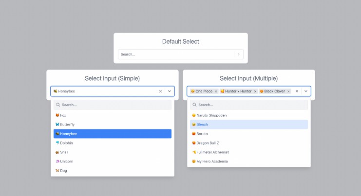
React-tailwindcss-select is a simple component ready to be inserted in your project. This component inspired by React-select is a select input made with Tailwindcss and React.
Features
- Select field of a single item
- Selection field for multiple items
- Optional button to clear the field
- Optional search for an item
- Optional deactivation of an option
Why
A select with the above features is above all indispensable in many projects. On a project using tailwindcss, when I install react-select or other such packages, the style of the latter is affected by that of tailwind.
Rather than looking for a component that uses tailwind, I preferred to make my own based on react-select which I like (and also because I generally like to reinvent the wheel ?).
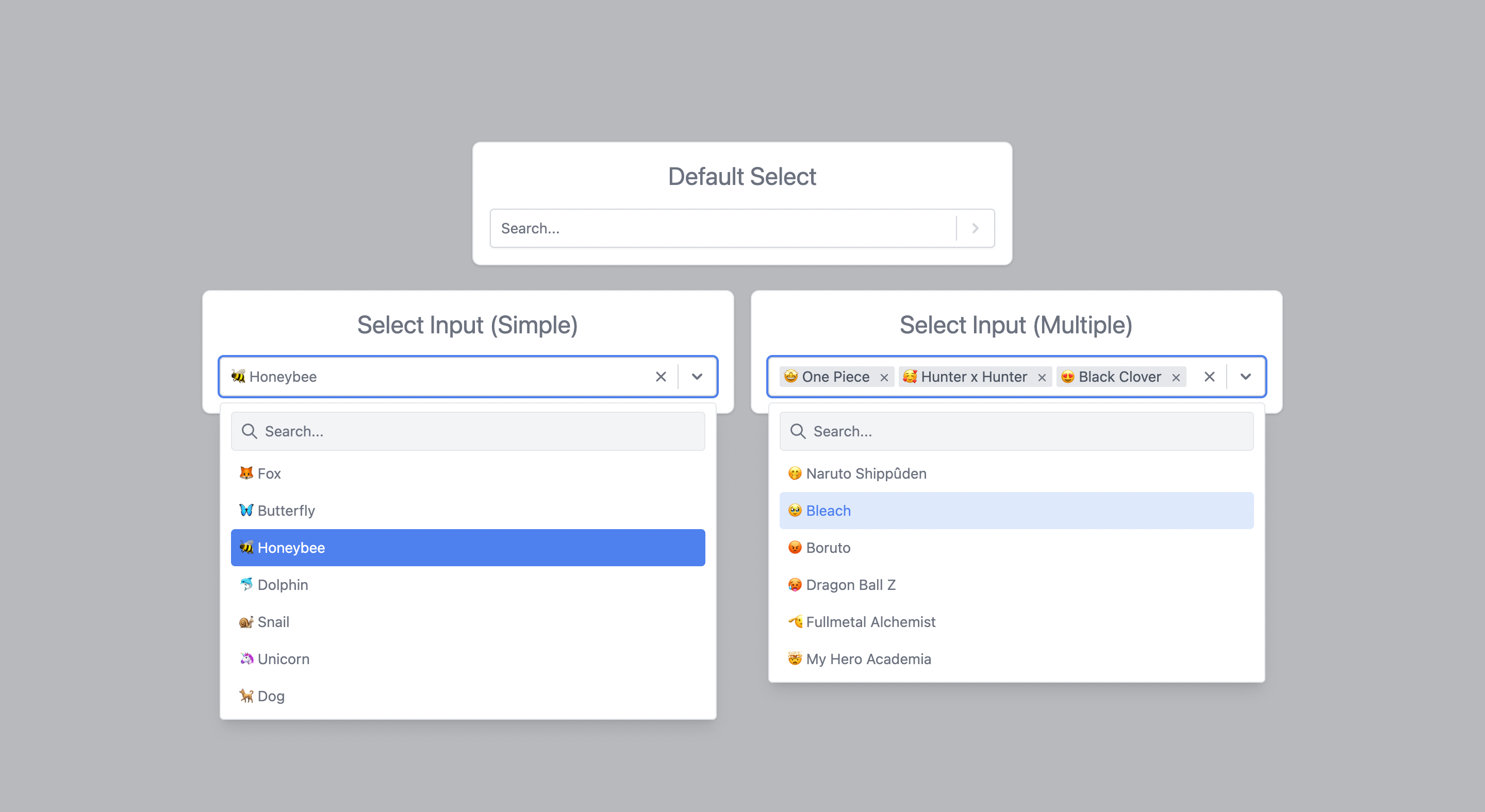
Online Demo
You can find the online demo at here
Install
You can use yarn
yarn add react-tailwindcss-select
Or via npm
npm install react-tailwindcss-select
make sure you have installed the peer dependencies as well with below versions.
"prop-types": "^15.8.1",
"react": "^18.2.0"
Usage
This component also exports a tiny css file built by tailwind. All css classes used in designing and customizing the select component are all custom tailwind classes which ensures that an existing tailwind project would not need to include this css file again.
Tailwind Project
A tailwind project would only have to import the react component using import Select from 'react-tailwindcss-select' and specify the component in the tailwind configuration to generate the styles of the classes used by react-tailwindcss-select.
Use this code to add the component to the tailwind configuration
// in your tailwind.config.js
module.exports = {
    // ...
    content: ["./src/**/*.{js,jsx,ts,tsx}", "./node_modules/react-tailwindcss-select/dist/index.esm.js"],
    // ...
}
None Tailwind Project
On a project that does not use tailwind, you need to import the component’s css as well.
To do this use these two codes: import Select from 'react-tailwindcss-select' and import 'react-tailwindcss-select/dist/index.css'
Warning In this case when you don’t use tailwind on your project, think about isolating the component and its style so that tailwind doesn’t affect the style of the elements in your project. For this you can use the shadow dom.
Then use react-tailwindcss-select in your app:
With React Component
import React from 'react';
import Select from 'react-tailwindcss-select';

const options = [
    {value: "fox", label: "? Fox"},
    {value: "Butterfly", label: "? Butterfly"},
    {value: "Honeybee", label: "? Honeybee"},
];

class App extends React.Component {
    constructor(props) {
        super(props);
        this.state = {animal: null};

        this.handleChange = this.handleChange.bind(this);
    }

    handleChange(value) {
        console.log("value:", value);
        this.setState({animal: value});
    }

    render() {
        const { animal } = this.state;

        return (
            <Select
                value={animal}
                onChange={this.handleChange}
                options={options}
            />
        );
    }
}
With React Hooks
import {useState} from 'react';
import Select from 'react-tailwindcss-select';

const options = [
    {value: "fox", label: "? Fox"},
    {value: "Butterfly", label: "? Butterfly"},
    {value: "Honeybee", label: "? Honeybee"},
];

const App = () => {
    const [aniam, setAnimal] = useState(null);

    const handleChange = (value) => {
        console.log("value:", value);
        setAnimal(value);
    };

    return (
        <Select
            value={animal}
            onChange={handleChange}
            options={options}
        />
    );
};

export default App;
Props
This table shows all the options available in react-tailwindcss-select.
| Option | Type | Default | Description |
|---|---|---|---|
isClearable |
Boolean |
true |
Indicates if you can empty the select field. |
isDisabled |
Boolean |
false |
Indicates if you can disable the select field. |
isMultiple |
Boolean |
false |
Indicates if you can do a multiple selection. |
isSearchable |
Boolean |
true |
Indicates if you can search the elements of the select field. |
loading |
Boolean |
false |
Indicates if you want a loader to appear in the field. |
menuIsOpen |
Boolean |
false |
Indicates if you want the options menu to be displayed by default. |
noOptionsMessage |
String |
No results found |
Default message when there is no option in the select field. |
onChange |
Function |
This callback, if present, is triggered when the select field value is modified. | |
options |
Array |
[] |
All options available in the select field. |
placeholder |
String |
Select... |
The placeholder shown for the select field. |
searchInputPlaceholder |
String |
Search... |
The placeholder shown for the search input field. |
value |
Object |
null |
Current value of select field. |
onChange
This callback, if present, is triggered when the select field value is modified. This callback takes as parameter the current value(s) selected. These values respect the same structure as the elements of the options.
(currentValue) => {
    console.log("currentValue:", currentValue);
};
options
All options available in the select field. Each option element must have a value property that serves as an identifier for the element, a label property that is the text that is displayed in the option list and an optional disabled property to specify whether the element is active.
// default element
const options =  [ {value: "fox", label: "? Fox"} ];
// default element with `disabled`
const options =  [ {value: "fox", label: "? Fox", disabled: true} ];
value
Current value of select field. These objects must follow the same structure as an options element. Thus, the following would work:
// default element Simple Select
const value =  {value: "fox", label: "? Fox"};
// default element with `disabled` Simple Select
const value =  {value: "fox", label: "? Fox", disabled: true};
// default element Multiple Select
const value =  [ {value: "fox", label: "? Fox"} ];
// default element with `disabled` Multiple Select
const value =  [ {value: "fox", label: "? Fox", disabled: true} ];
Contributing
Got ideas on how to make this better? Open an issue!
Thanks
This component is inspired by the excellent react-select library by Jed Watson.
I thank you in advance for your contribution to this project.
License
MIT Licensed. Copyright (c) Lewhe Onesine 2022.