react-bare-forms
React library using React Hooks to build forms & let you switch in & out Bootstrap 4 styling. React Bare Forms aka RBF aims to be the easiest to use form library for React.
React Bare Forms library is compatible with both React functional & class components.
Install
npm install react-bare-forms
⚠️ Warning: The library is still in a beta stage
Usage - Functional Component with Hooks
A basic form example with a text input field & submit button. Also, note how we import the isFieldEmpty function
from react-bare-forms. This is a validator & can be used to validate a single or *group (such as radio buttons) field(s).
There are different validators available & also a custom validator factor function to create your own validators.
import {Form, isFieldEmpty, SubmitButton, TextInputField} from "react-bare-forms";

const myState = { age: 0 }
const [state, setState] = React.useState(myState);

<Form
    state={state}
    context={setState}
    bare={false}
    autoComplete="off"
    callback={() => console.log("Form submitted!")}>

    <TextInputField
        value={state.age}
        name="age"
        hint="Enter your age"
        labelText="Age"
        validators={[isFieldEmpty(2)]} />

    <SubmitButton>Submit Form</SubmitButton>
</Form>
Usage - Class Component
Similiar to the functional component above but now we are using a Class component with
local state example:
import {Form, isFieldEmpty, SubmitButton, TextInputField} from "react-bare-forms";
class MyForm {

    state = {
        "age": 0,
    }

    myForm() {
            return(<Form
            state={this.state}
            context={this}
            bare={false}
            autoComplete="off"
            callback={() => console.log("Form submitted!")}>

            <TextInputField
                value={state.age}
                name="age"
                hint="Enter your age"
                labelText="Age"
                validators={[isFieldEmpty(2)]} />

            <SubmitButton>Submit Form</SubmitButton>
        </Form>);
    }


}
Usage - Class Component with Nested State
Same as the Class component above but with nested state example:
import {Form, isFieldEmpty, SubmitButton, TextInputField} from "react-bare-forms";
class MyForm {

    state = {
        "formData": { // <-- Note we are nesting out form state
            "age": 0,
        }
    }

    myForm() {
            return(<Form
            state={this.state}
            context={this}
            formKey="formData" // <-- Required: Name of our for formData attribute in the state object
            bare={false}
            autoComplete="off"
            callback={() => console.log("Form submitted!")}>

            <TextInputField
                value={state.age}
                name="age"
                hint="Enter your age"
                labelText="Age"
                validators={[isFieldEmpty(2)]} />

            <SubmitButton>Submit Form</SubmitButton>
        </Form>);
    }


}
File Ref
RBF's provides a function that returns a React ref to access your file object. To use, simply assign the returned ref from
the createFileRef function to a variable & pass this variable to FileField's ref prop.
To access your file object, pass your React ref to the getFileFromRef function.
For example:
 import {createFileRef, FileField, isFile, getFileFromRef} from "react-bare-forms";

 const myFileRef = createFileRef();

 <FileField
     ref={myFileRef}
     hint="Must be a file"
     labelText="Upload your file"
     validators={[isFile()]}
 />

 // To access the File object use `getFileFromRef` helper function:
let myFile = getFileFromRef(myFileRef);

// Example callback:
const myCallback = () => {
    const myFile = getFileFromRef(myFileRef);
    const formData = new FormData();
    formData.append("tmyFile", myFile);
}

// then add to the RBF's Form component:
<Form
    callback={myCallback}
    // ... .etc
Form Consumer
RBF's provides the FormConsumer, which gives access to field information.
Below is an example of a form containing a single text input field.
import {Form, FormConsumer, IFormContext, isFieldEmpty, TextInputField} from "react-bare-forms";

// Example within a class component
state = { age: 0 }

<Form state={myState} context={this}>
    <TextInputField
        value={this.state.age}
        name="age"
        hint="Enter your age"
        labelText="Age"
        validators={[isFieldEmpty(5)]}
    />
    <FormConsumer>
        {(context: IFormContext) => {
            return <code>{JSON.stringify(context.metadata)}</code>;
        }}
    </FormConsumer>
</Form>
The context object is available using the FormConsumer component. You can access the entire form context
from the callback's IFormContext type argument. The context includes a metadata property which gives you detailed
values of the current state of all the form fields & validation state.
{"inputs":{"state":{"age":{"name":"age","validation":[{"isValid":false,"messages":["Must be at least 2 characters"]}],"isTouched":false,"fieldValues":{"type":"value","currentValue":0}}},"metaType":"inputs","defaultState":{},"_name":"age","_fieldType":"text"},"checkboxes":{"state":{},"metaType":"checkboxes","defaultState":{}},"files":{"state":{},"metaType":"files","defaultState":{}},"radioGroups":{"state":{},"metaType":"radioGroups","defaultState":{}}}
Validators
There are validators available to handle all the basic common form validation requirements. Below is a list
of the current validators available but this list should grow in the near future!
To create your own custom validator use:
Form Fields
Form component
The main Form component that is required to wrap all RBF components. If the component that uses the Form component is a functional component then only the state props & state update function returned from the useState hook are required. If you are calling Form component from a class component then you must pass your local context or this keyword to the context prop.
An example using RBF Form component in a functional component
// Minimal setup for a RBF's Form component

const myState = {
  username: '',
}

 const [state, setState] = React.useState(state);
 <Form state={myState} context={setState}></Form>>
To use RBF Form component from a class component, you must pass in your
local context or this keyword.
// Minimal setup for a RBF's Form component for a class component

const this.state = { // in the constructor
  username: '',
}

<Form state={this.state} context={this}></Form>
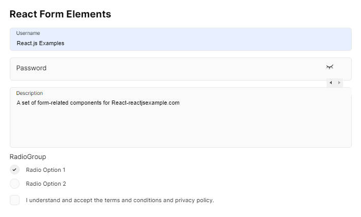
Input Field components
There are 4 components that cover the input field element:
TextInputField
import {TextInputField} from "react-bare-forms";

const state = { username: "" }
// A bare form example ... remember to set the Form.bare property to `true`
<TextInputField
    value={this.state.username}
    name="username"
/>

// Example with Bootstrap styling (Bootstrap styling comes as default)

<TextInputField
    value={state.username}
    name="username"
    hint="Needs to be at least 50 characters long"
    labelText="Username"
/>
EmailField
  import {EmailField} from "react-base-forms"

  const state = { email: "" }

 // A bare form example ... remember to set the Form.bare property to `true`
 <EmailField
    value={state.email}
    name="email"
 />

 // Example with Bootstrap styling (Bootstrap styling comes as default)
 <EmailField
    value={state.email}
    name="email"
    hint="Needs to be at least 50 characters long"
    labelText="Username"
  />
PasswordField
The PasswordField works the same as the EmailField & TextInputField's.
import {areFieldsEqual, isFieldEmpty, PasswordField} from "react-base-forms";

const state = { password: "", confirmPassword: "" };

// A bare form example ... remember to set the {@link Form.bare} property to `true`
<PasswordField
  value={state.password}
  name="username"
  validators={[isFieldEmpty(8)]}
/>

// Example with Bootstrap styling (Bootstrap styling comes as default)

<PasswordField
  value={state.confirmPassword}
  name="password"
  hint="Needs to be at least 8 characters long"
  labelText="Password"
/>
Also we can create two PasswordField components to confirm passwords are equal. Please see
{@link areFieldsEqual} for more info.
The first PasswordField has has a name prop of password & the second PasswordField a name
prop of confirmPassword. Then we can add a areFieldsEqual validator to the PasswordField
with the confirmPassword name props areFieldsEqual takes the first PasswordField
name as an argument).
<PasswordField
    name="password"
    // other props...

/>

<PasswordField
    name="confirmPassword"
    // other props...
    validators={[areFieldsEqual("password")]}
/>
CheckBoxField
The CheckBoxField component takes a checked prop instead of the usual value prop.
  import {CheckBoxField} from "react-base-forms";

  const state = { password: "", confirmPassword: "" };

 <CheckBoxField
   name="terms"
   checked={this.state.terms}
 />

 // Example with Bootstrap styling (Bootstrap styling comes as default)
 <CheckBoxField
   name="terms"
   checked={state.terms}
   hint="Click to agree"
   labelText="Agree to terms & conditions"
 />
Other Field Elements
The rest of the single input *fields.
TextArea Input _field
<TextAreaField
    name="about"
    value={this.state.about}
    hint="Your email"
    labelText="Must be at least 20 characters"
    validators={[isFieldEmpty(20)]}
/>
SelectField
A component to render a select field element.
  import {SelectField} from "react-base-forms";

  const state = { fruitChoice: "" };

 <SelectField
   size="lg"
   value={state.fruitChoice}
   name="fruitChoice"
   options={["banana", "apple", "orange"]}
  />
You can also pass an array of objects but you must use both the
objectKey & objectValue props. the objectKey will update your state
value & the objectValue is what is displayed to the user as an option.
// This is your option data
let selectData = [
  {id: 1, name: "first"},
  {id: 2, name: "second"},
];
// The state which will receive the update
let state = {
   select_data_id: undefined as any,
};

<SelectField
  size="lg"
  value={state.select_data_id}
  name="fruitChoice"
  objectKey="id" // Value will update state.select_data_id e.g *1, 2...*
  objectValue="name" // Value will be displayed in the select field e.g *first, second...*
  options={selectData}
/>
Radio Buttons
RadioGroup
The RadioGroup component takes a single props of name, which
- must be a unique to a form. See {@link RadioField}.
   import {CheckBoxField} from "react-base-forms";

   <RadioGroup name="group1">
     // place RadioFields components here...
   </RadioGroup>
RadioField
RadioField inputs are designed to be used with the RadioGroup component.
To use this component, add or nest it within a RadioGroup component as children.
It's possible to also use the isRadioChecked validator with a RadioGroup, as shown below:
 import {isRadioChecked, RadioField, RadioGroup} from "react-base-forms";

 const state = { male: true, female: false };

 <RadioGroup name="group1">
   <RadioField
     name="male"
     checked={state.male}
     hint="Click to agree"
     labelText="Agree to terms & conditions"
   />

   <RadioField
     name="female"
     checked={state.female}
     hint="Click to agree"
     labelText="Agree to terms & conditions"
     validators={[isRadioChecked()]}
   />

 </RadioGroup>
Buttons
The SubmitButton only requires a text string as children props (see below example).
The SubmitButton will be disabled until all form fields with a validators prop are validated.
import {SubmitButton} from "react-base-forms";

<SubmitButton>Submit</SubmitButton>
Bootstrap 4
Bootstrap 4 doesn't come with React Bare Forms so that you can obtain the smallest bundle size possible!
There are several ways to include Bootstrap 4. the simplist (but not the best) is to import it directly from the cdn in your index.html file. For example
<link rel="stylesheet" href="https://stackpath.bootstrapcdn.com/bootstrap/4.4.1/css/bootstrap.min.css" integrity="sha384-Vkoo8x4CGsO3+Hhxv8T/Q5PaXtkKtu6ug5TOeNV6gBiFeWPGFN9MuhOf23Q9Ifjh" crossorigin="anonymous">
But a much better way is to use Sass, so then we can choose which Bootstrap 4 Sass components we want our React app to use.
npm install bootstrap
Then install the loaders
npm install sass style-loader css-loader sass-loader --save-dev

# In your webpack.config.js:

    {
             test: /\.scss$/,
             use: [
                 "style-loader", // creates style nodes from JS strings
                 "css-loader", // translates CSS into CommonJS
                 "sass-loader" // compiles Sass to CSS, using Node Sass by default
             ]
    }
If you want to keep bundle sizes to a minimum, React Bare Forms only requires the following bootstrap 4 components:
- Forms
- Buttons
- Alerts
You can import them like this:
// - mystyles.scss
// If you want all the styles
@import "~bootstrap";
// Even better, just import the bootstrap components you need
// Required
@import "~bootstrap/scss/functions";
@import "~bootstrap/scss/variables";
@import "~bootstrap/scss/mixins";

// Optional
@import "~bootstrap/scss/forms";
@import "~bootstrap/scss/alert";
@import "~bootstrap/scss/buttons";
And finally import your sass into your React application:
import "./mystyles.scss";