react-verification-input
react-verification-input is a customizable, masked input that can be used to enter all sorts of codes e.g. security codes when two-factor authenticating. Also I'm sure you can think of many more creative use cases. This component is fully compatible with Redux Form ?
Installation
Install it by running
npm install react-verification-input --save
or
yarn add react-verification-input
in your terminal.
Usage
Import the React component as follows:
import VerificationInput from "react-verification-input";
Inside the render method write:
<VerificationInput />
That´s it! You now have a basic verification input with default configuration rendered on your page. ??
Of course the input can be configured manually. For a complete API overview see here.
Note: In order for it to work properly, make sure you have the
<meta name="viewport" content="width=device-width, initial-scale=1, shrink-to-fit=no user-scalable=no">tag in the head of your page. Otherwise, it might zoom in to the left side of the screen on mobile devices. This is the case because mobile devices zoom in on inputs and there is an input field outside of the viewport.
API documentation
All of these props are optional and thus come with a default value. However it's recommended to use at least the length, validChars and placeholder props.
| Option | Type | Default | Description |
|---|---|---|---|
| length | Number | 6 |
Define how many characters the input should allow. |
| validChars | String | 'A-Za-z0-9' |
Define which characters should be allowed. The string is inserted into a regexp character set ( /[]/ ) for input validating. |
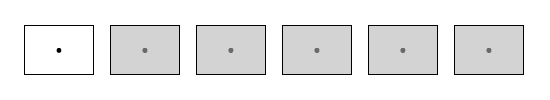
| placeholder | String | '·' (U+00B7) |
Define which character should be displayed as placeholder in empty fields. In order to use the blank character as a placeholder, specify this option as ' ' or ''. |
| autoFocus | Boolean | false |
This will make the input focus automatically as soon as the component is rendered. |
| removeDefaultStyles | Boolean | false |
Use this option to completely remove any styles that are not required for the component to work properly. This is useful if you want to override the default styles. |
| debug | Boolean | false |
This will reveal what is going on behind the scenes, which might come in handy when trying to better understand the component. Obviously you don't want to use this in production. ? |
| container | Object | {} |
Define the props of the container div. All props except for className are passed directly to the div element. Use { className: 'your-class' } to style the input. These options are available on every element. For more details on how to apply your custom styling see here. |
| inputField | Object | {} |
Define the props of the input element. See container for more details. |
| characters | Object | {} |
Define the props of the characters div. See container for more details. |
| character | Object | {} |
Define the props of the character divs. See container for more details. |
| getInputRef | Function | () => {} |
Define a function that will receive input element ref. |
Custom styling
Note: It's recommended to use the
removeDefaultStylesoption when applying custom styles, otherwise you may not be able to override the default styles.
Style the input by passing it your custom class names like so:
<VerificationInput
  removeDefaultStyles
  container={{
    className: "container",
  }}
  characters={{
    className: "characters",
  }}
  character={{
    className: "character",
    classNameInactive: "character--inactive",
    classNameSelected: "character--selected",
  }}
/>
There is also the inputField prop, which will attach styles to the actual input element, but you probably don't want to use this as it's outside the viewport and thus not visible.
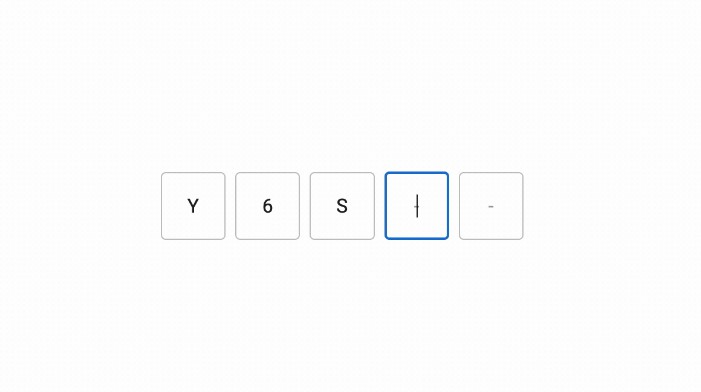
Have a look at these two examples:
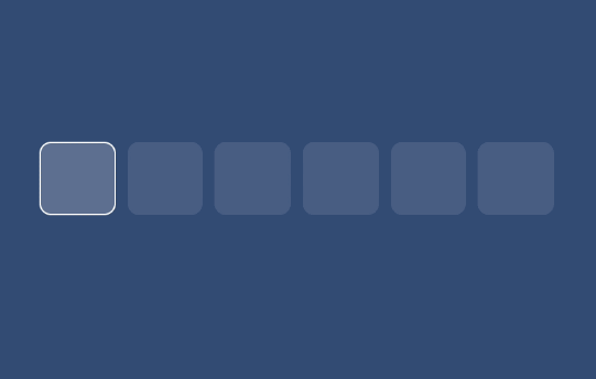
Example 1
.container {
  max-width: 350px;
}

.characters {
  height: 50px;
}

.character {
  line-height: 50px;
  font-size: 36px;
  background-color: rgba(255, 255, 255, 0.2);
  border: 1px solid transparent;
  border-radius: 8px;
  color: white;
  margin-left: 8px;
}

.character--inactive {
  background-color: rgba(255, 255, 255, 0.1);
  box-shadow: none;
}

.character--selected {
  border: 1px solid white;
}
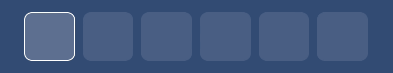
Example 2
.container {
  max-width: 350px;
}

.characters {
  height: 50px;
}

.character {
  line-height: 50px;
  font-size: 36px;
  background-color: rgba(255, 255, 255, 0.8);
  border: none;
  border-radius: 8px;
  color: black;
  margin-left: 8px;
  box-shadow: inset 0 0 2px black;

  &:nth-child(4) {
    margin-left: 24px;
  }
}

.character--inactive {
  background-color: rgba(0, 0, 0, 0.5);
  box-shadow: none;
}

.character--selected {
  color: black;
  outline: red 2px;
  background-color: white;
}