Smart Form
Smart Form component is a developer-friendly solution for integrating form controls into your React project.
By leveraging the power of the react-hook-form library, it provides a reliable and efficient way to handle form validation and error handling. With automatic registration of form fields, the Smart Form component simplifies the development process and enables you to create robust and seamless forms with ease.
Live Preview
Examples
Form With Uncontrolled Fields
<Form onSubmit={handleSubmit}>
  <FormField label="Name" name="name">
    <input />
  </FormField>
  <FormField label="Favorite Fruit:" name="favoriteFruit">
    <label>
      Apple
      <input type="radio" value="Apple" />
    </label>
    <label>
      Orange
      <input type="radio" value="Orange" />
    </label>
    <label>
      Banana
      <input type="radio" value="Banana" />
    </label>
  </FormField>
  <FormField label="Hobbies:" name="hobbies">
    <label>
      Swimming
      <input type="checkbox" name="hobbies.swimming" />
    </label>
    <label>
      Orange
      <input type="checkbox" name="hobbies.running" />
    </label>
  </FormField>
  <FormField label="Car:" name="car">
    <select>
      <option value="volvo">Volvo</option>
      <option value="saab">Saab</option>
      <option value="mercedes">Mercedes</option>
      <option value="audi">Audi</option>
    </select>
  </FormField>
  <button type="submit">Submit</button>
</Form>
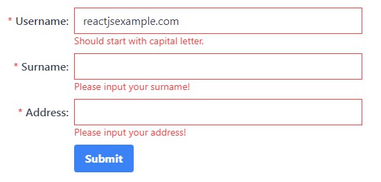
Form With Controlled Fields
This example demonstrates how to use the FormField component with either component libraries or custom input components.
<Form onSubmit={handleSubmit}>
  <FormField
    controlled
    label="username"
    name="username"
    options={{
      required: "Please input your username!",
    }}
  >
    {(props) => (
      <input
        value={props.field.value}
        onChange={(e) => props.field.onChange(e.target.value)}
      />
    )}
  </FormField>
  <button type="submit">Submit</button>
</Form>
Folder Structure
.
├── ...
├── src                     # Source files
│   ├── components          # Reusable components
│   ├── features            # Features and related components, utilities
│   └── index.tsx           # Entry point of the application.
└── ...
Running the demo locally
First, run the development server:
npm run dev
# or
yarn dev
# or
pnpm dev
Open http://localhost:5173/ with your browser to see the result.