React tags js
A flexible and customizable React component for tag selection.

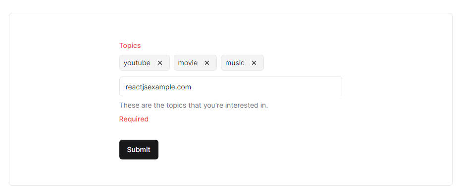
The ReactInputTags component is a simple and customizable tag selection input for React applications. It helps developers to implement a user-friendly interface for selecting, creating, and managing tags within their applications. By providing a range of features and options, this component simplifies the process of handling tags and enhances the user experience.
Features
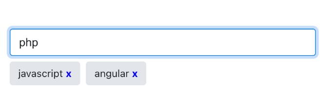
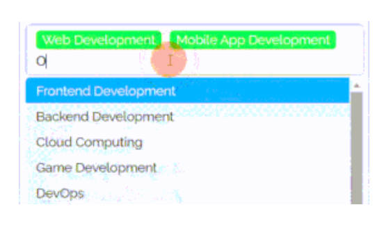
- Tag Input: Allow users to pick tags from a list.
- Tag Filters: Enhance data-rich apps with tag-based filtering for better exploration.
- Custom Style: Match tag design to your app’s look for consistency.
- Validation: Ensure correct tags with user-friendly input options.
- Content Display: Show content based on selected tags.
- Form Use: Improve forms with tag associations for specific input.
Installation
You can install the library using npm:
npm install react-tags-js
or via Yarn
yarn add react-tags-js
Example
import React, { useState } from 'react';
import ReactInputTags from 'react-select-tags';

function BasicMovieSelection() {
    const [selectedMovies, setSelectedMovies] = useState([]);

    const handleMoviesChange = (movies) => {
        setSelectedMovies(movies);
    };

    const movieOptions = [
        { value: 'avatar', label: 'Avatar' },
        { value: 'inception', label: 'Inception' },
        { value: 'jurassic-park', label: 'Jurassic Park' },
        { value: 'star-wars', label: 'Star Wars' },
        { value: 'titanic', label: 'Titanic' },
        { value: 'the-lion-king', label: 'The Lion King' },
        { value: 'pulp-fiction', label: 'Pulp Fiction' },
    ];

    return (
        <div>
            <h1>Basic Movie Selection</h1>
            <ReactInputTags
                tags={selectedTags}
                onChange={handleTagsChange}
                options={movieOptions}
            />
        </div>
    );
}

export default BasicMovieSelection;
Options
| Option | Type | Default | Description |
|---|---|---|---|
tags |
TagInterface[] |
[] |
An array of tag objects representing the selected tags. |
onChange |
(tags: TagInterface[], tag?: TagInterface) => void |
undefined |
A function to handle changes to the selected tags. |
options |
TagOptions[] |
[] |
An array of tag options for suggestions. |
createable |
boolean |
true |
Enable/disable the ability to create new tags. |
style |
StyleInterface |
undefined |
Custom styling options for various components. |
renderInput |
boolean |
true |
Show/hide the input field for adding new tags. |
clearOnBackSpace |
boolean |
true |
Enable/disable removing tags with the Backspace key. |
tags
An array of tag objects representing the currently selected tags. Each object should conform to the TagInterface structure, containing the value, label, and optional tagColor, textColor, and readOnly properties.
interface TagInterface {
    value: tagValue;
    label: tagValue;
    tagColor?: string;
    textColor?: string;
    readOnly?: boolean;
};
or import { TagInterface } from "react-tags-js";

const sciFiBookTags1: TagInterface[] = [
    { value: 'Dune', label: 'Dune' },
    { value: 'Neuromancer', label: 'Neuromancer' },
    { value: 'Snow Crash', label: 'Snow Crash' },
    { value: 'Enders Game', label: 'Enders Game' },
];

const sciFiBookTags2: TagInterface[] = [
    { value: 'The Martian', label: 'The Martian', tagColor: 'red', textColor: 'white' },
    { value: 'Blade Runner', label: 'Blade Runner', tagColor: 'black', textColor: 'white' },
    { value: 'I, Robot', label: 'I, Robot', tagColor: 'darkblue', textColor: 'white' },
];
onChange
A callback function that gets triggered when the selected tags change. It receives an array of updated tags and an optional tag object that triggered the change.
const handleTagChange = (tags: TagInterface[], changedTag?: TagInterface) => {
    console.log('Selected Tags:', tags);
    if (changedTag) {
        console.log('Changed Tag:', changedTag);
    }
};

<ReactInputTags
    tags={selectedTags}
    onChange={handleTagChange} />
options
An array of tag options used for suggestions when creating or selecting tags. Each option should conform to the TagOptions structure, containing the value and label properties.
const sciFiBookOptions: TagOptions[] = [
    { value: 'Dune', label: 'Dune' },
    { value: 'Neuromancer', label: 'Neuromancer' },
    { value: 'Snow Crash', label: 'Snow Crash' },
    { value: 'Enders Game', label: 'Ender Game' },
];
<ReactInputTags
    tags={selectedTags}
    onChange={handleTagChange}
    options={tagOptions} />
createable
A boolean flag that determines whether users can create new tags. When set to true, users can input custom tag values.
<ReactInputTags
    tags={selectedTags}
    onChange={handleTagChange}
    createable={true} />
style
An object defining custom CSS classes for various components of the tag selector, including mainContainer, tag, input, optionContainer, option, and selectedOption.
interface StyleInterface {
    mainContainer?: string;
    tag?: string;
    input?: string;
    optionContainer?: string;
    option?: string;
    selectedOption?: string;
}

const customStyles: StyleInterface = {
    mainContainer: 'custom-main-container',
    tag: 'custom-tag',
    input: 'custom-input',
    optionContainer: 'custom-option-container',
    option: 'custom-option',
    selectedOption: 'custom-selected-option',
};

<ReactInputTags
    tags={selectedTags}
    onChange={handleTagChange}
    style={customStyles} />
renderInput
A boolean flag to control whether the input field for adding new tags should be rendered or hidden.
<ReactInputTags
    tags={selectedTags}
    onChange={handleTagChange}
    renderInput={false} />
clearOnBackSpace
A boolean flag that determines whether tags can be removed using the Backspace key. When set to true, pressing Backspace removes tags.
Typescript
// Type to represent a tag value that can be a string or a number
type tagValue = string | number;

// Interface for tag options used for suggestions
interface TagOptions {
    value: tagValue; // Value of the tag option
    label: tagValue; // Display label for the tag option
}

// Interface for individual tag properties
interface TagInterface {
    value: tagValue; // Value of the tag
    label: tagValue; // Display label for the tag
    tagColor?: string; // Background color for the tag
    textColor?: string; // Text color for the tag
    readOnly?: boolean; // Whether the tag is read-only
}

// Interface for custom styling options
interface StyleInterface {
    mainContainer?: string; // CSS class for the main container
    tag?: string; // CSS class for individual tags
    input?: string; // CSS class for the input field
    optionContainer?: string; // CSS class for the options container
    option?: string; // CSS class for individual options
    selectedOption?: string; // CSS class for the selected option
}

// Interface for the props of the ReactInputTags component
export interface ReactInputTagsProps {
    tags: TagInterface[]; // An array of selected tags
    onChange: (tags: TagInterface[], tag?: TagInterface) => void; // Function to handle tag changes
    options?: TagOptions[]; // An array of tag options for suggestions
    createable?: boolean; // Enable/disable the creation of new tags
    style?: StyleInterface; // Custom styling options for components
    renderInput?: boolean; // Show/hide the input field for adding new tags
    clearOnBackSpace?: boolean; // Enable/disable removing tags with Backspace key
}
Usage

Basic Tag Selection

import React, { useState } from 'react';
import ReactInputTags from 'react-select-tags';

function BasicTagSelection() {
    const [selectedTags, setSelectedTags] = useState([]);

    const handleTagsChange = (tags) => {
        setSelectedTags(tags);
    };

    const tagOptions = [
        { value: 'react', label: 'React' },
        { value: 'javascript', label: 'JavaScript' },
        { value: 'html', label: 'HTML' },
        { value: 'css', label: 'CSS' },
        { value: 'nodejs', label: 'Node.js' },
        { value: 'mongodb', label: 'MongoDB' },
        { value: 'express', label: 'Express.js' },
    ];

    return (
        <div>
        <h1>Basic Tag Selection</h1>
        <ReactInputTags
            tags={selectedTags}
            onChange={handleTagsChange}
            options={tagOptions}
        />
        <h2>Selected Tags:</h2>
        <ul>
            {selectedTags.map((tag) => (
                <li key={tag.value}>{tag.label}</li>
            ))}
        </ul>
        </div>
    );
}

export default BasicTagSelection;
Createable Tags

import React, { useState } from 'react';
import ReactInputTags from 'react-select-tags';

function CreateableTags() {
    const [selectedTags, setSelectedTags] = useState([]);

    const handleTagsChange = (tags) => {
        setSelectedTags(tags);
    };

    const tagOptions = [
        { value: 'react', label: 'React' },
        { value: 'javascript', label: 'JavaScript' },
        { value: 'html', label: 'HTML' },
        { value: 'css', label: 'CSS' },
    ];

    return (
        <div>
            <h1>Createable Tags</h1>
            <ReactInputTags
                tags={selectedTags}
                onChange={handleTagsChange}
                options={tagOptions}
                createable={true}
            />
            <h2>Selected Tags:</h2>
            <ul>
                {selectedTags.map((tag) => (
                    <li key={tag.value}>{tag.label}</li>
                ))}
            </ul>
        </div>
    );
}

export default CreateableTags;
Custom Tags

import React, { useState } from 'react';
import ReactInputTags from 'react-select-tags';

function ColoredTags() {
    const [selectedTags, setSelectedTags] = useState([]);

    const handleTagsChange = (tags) => {
        setSelectedTags(tags);
    };

    const tagOptions = [
        { value: 'react', label: 'React', tagColor: '#61dafb', textColor: 'white' },
        { value: 'javascript', label: 'JavaScript', tagColor: '#f0db4f', textColor: 'black' },
        { value: 'html', label: 'HTML', tagColor: '#e34c26', textColor: 'white' },
        { value: 'css', label: 'CSS', tagColor: '#264de4', textColor: 'white' },
        { value: 'nodejs', label: 'Node.js', tagColor: '#8cc84b', textColor: 'black' },
    ];

    return (
        <div>
            <h1>Colored Tags</h1>
            <ReactInputTags
                tags={selectedTags}
                onChange={handleTagsChange}
                options={tagOptions}
            />
            <h2>Selected Tags:</h2>
            <ul>
                {selectedTags.map((tag) => (
                    <li
                        key={tag.value}
                        style={{
                            backgroundColor: tag.tagColor,
                            color: tag.textColor
                        }}>
                        {tag.label}
                    </li>
                ))}
            </ul>
        </div>
    );
}

export default ColoredTags;
Custom Styling

import React, { useState } from 'react';
import ReactInputTags from 'react-select-tags';

function CustomStyling() {
    const [selectedTags, setSelectedTags] = useState([]);

    const handleTagsChange = (tags) => {
        setSelectedTags(tags);
    };

    const tagOptions = [
        { value: 'react', label: 'React' },
        { value: 'javascript', label: 'JavaScript' },
        { value: 'html', label: 'HTML' },
        { value: 'css', label: 'CSS' },
    ];

    const customStyle = {
        mainContainer: 'custom-main-container',
        tag: 'custom-tag',
        input: 'custom-input',
        optionContainer: 'custom-option-container',
        option: 'custom-option',
        selectedOption: 'custom-selected-option',
    };

    return (
        <div>
            <h1>Custom Styling</h1>
            <ReactInputTags
                tags={selectedTags}
                onChange={handleTagsChange}
                options={tagOptions}
                style={customStyle}
            />
            <h2>Selected Tags:</h2>
            <ul>
                {selectedTags.map((tag) => (
                    <li key={tag.value}>{tag.label}</li>
                ))}
            </ul>
        </div>
    );
}

export default CustomStyling;
Development setup
In this project, I have used storybook for developing component, pnpm for package management and parcel for building
- Clone the repository:
git clone https://github.com/rvikunwar/react-tags-js.git
cd react-select-tags
- Install pnpm globally or you can use your own package manager
npm install -g pnpm
- Install project dependencies using pnpm:
pnpm install
- Open Storybook for component development:
pnpm run storybook
Contributing
We welcome contributions to enhance the react-tags-js component! To contribute, please follow these steps:
- Fork the repository on GitHub.
- Clone your forked repository to your local machine:
git clone https://github.com/yourusername/react-tags-js.git
cd react-tags-js
- Create a new branch for your feature or bug fix:
git checkout -b feature/your-feature
- Make your changes and ensure tests pass:
pnpm test
- Commit your changes with descriptive messages and create a pull request: