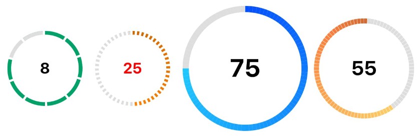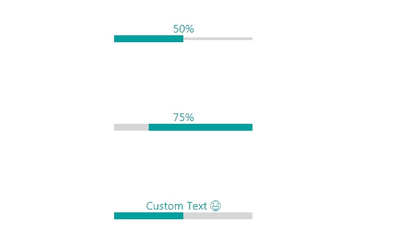
react-progressbar-line
A linear progressbar component.
Install
npm install --save react-progressbar-line
Usage
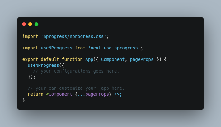
import React, { Component } from 'react'

import ProgressBarLine from 'react-progressbar-line'

class ProgressBarLineExample extends Component {
  render() {
    return (
      <ProgressBarLine
        value={50}
        min={0}
        max={100}
        strokeWidth={5}
        trailWidth={5}
        styles={{
          path: {
            stroke: '#17b978'
          },
          trail: {
            stroke: '#a7ff83'
          },
          text: {
            fill: '#404040',
            textAlign: 'center',
            fontSize: '32px'
          }
        }}
      />
    )
  }
}
Props
| Name | Description | Default |
|---|---|---|
| value | Value for the progress bar. Required |
50 |
| min | Min value for the progress bar |
0 |
| max | Max value for the progress bar |
100 |
| strokeWidth | strokeWidth for the progress bar |
5 |
| trailWidth | trailWidth for the progress bar trail path |
5 |
| flip | Flip direction rtl horizontally |
false |
| text | Text for the progress bar |
'' |
| styles | Custom styles for the progress bar |
Ideas for future development
- add round strokeLinecap
- add animation effects
- update demo page with react-styleguidist