TT React Calendar
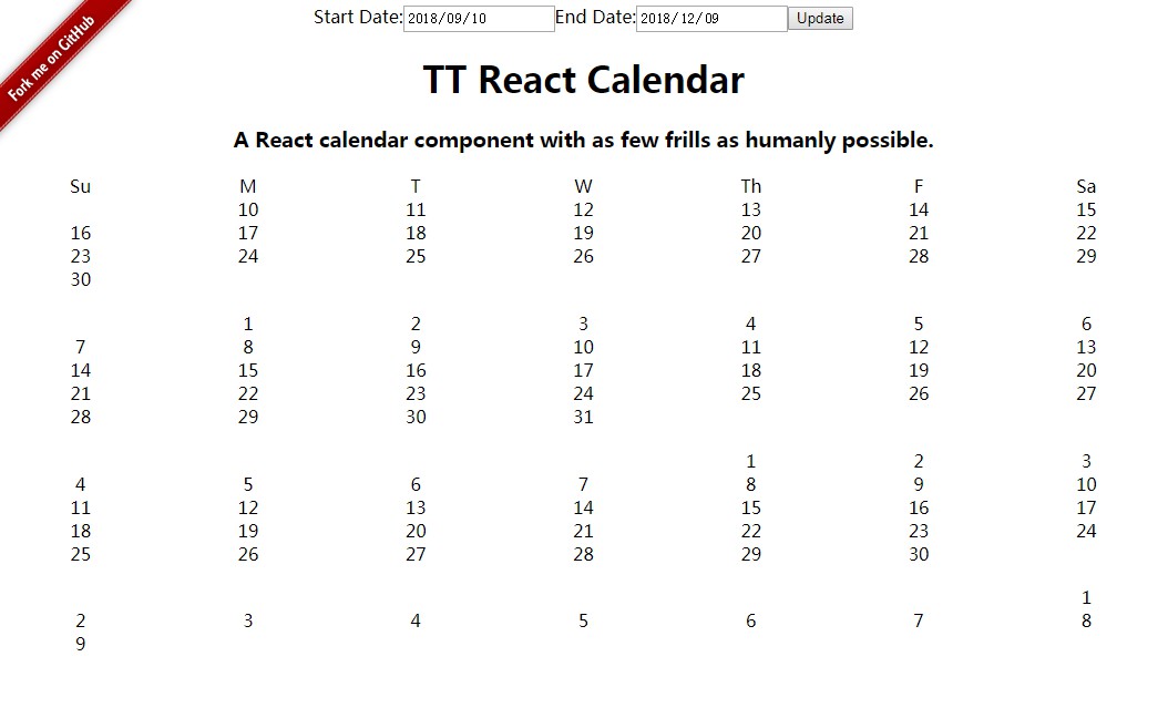
A no-frills calendar widget that lets you bring your own styling. This component takes a start date, an end date, and a renderDay function, and then gets out of the way.
Installation
npm install --save tt-react-calendar
Usage
import Calendar from 'tt-react-calendar';

function renderDay(day) {
  return <div className="day">{day.format('dd')}</div>
}

function renderMonthHeader(firstDay, format) {
  // Don't render month headers for 2016, for some reason.
  if (firstDay.year() === 2017) {
    return firstDay.format(format);
  }
}

function MyComponent() {
  return (
    <Calendar
      className="calendar-container"
      dayAbbrevs={['Su', 'M', 'T', 'W', 'Th', 'F', 'Sa']}
      dayHeaderClassName="calendar-day-header"
      dayHeaderStyle={Calendar.DayHeaderStyles.InFirstMonth}
      firstRenderedDay="2016-12-25"
      lastRenderedDay="2017-02-12"
      monthClassName="calendar-month"
      monthHeaderFormat="MMMM YYYY"
      monthHeaderClassName="calendar-month-header"
      renderDay={renderDay}
      renderMonthHeader={renderMonthHeader}
      weekClassName="calendar-week"
    />
  );
}
And somewhere in your stylesheet build process...
@import 'tt-react-calendar/dist/styles.css';
Properties
| Name | Type | Description | Since Version |
|---|---|---|---|
className |
string | Class name for the calendar's container element | 1.0.0 |
compactMonths |
bool | A flag that combines all of the months into one continuous block of days, with the month header split out and positioned along the left edge of the container. This sets position: absolute, right: 100%, and margin: 0 on the month header class, so override those properties in your CSS if you think you have better ideas. |
1.3.0 |
dayAbbrevs |
Array.<string> | Array of day names, starting with Sunday. Defaults to ['Su', 'M', 'T', 'W', 'Th', 'F', 'Sa']. |
1.0.0 |
dayHeaderClassName |
string | Class name for the day header container element | 1.2.0 |
dayHeaderStyle |
Enum | Determines where the day column headers are rendered. Can be one of Calendar.DayHeaderStyles.InFirstMonth (the default), Calendar.DayHeaderStyles.AboveFirstMonth, or Calendar.DayHeaderStyles.InEveryMonth |
1.0.0 |
firstRenderedDay |
varied | The first date that will be rendered as part of the calendar. Can be any type that moment's constructor supports. | 1.0.0 |
gutterWidth |
string | CSS value to use as the gutter between columns | 1.5.0 |
lastRenderedDay |
varied | The last date that will be rendered as part of the calendar. Can be any type that moment's constructor supports. | 1.0.0 |
monthClassName |
string | Class name to add to each month element | 1.0.0 |
monthHeaderFormat |
string | Format of the month header text. See moment.format for the available options. Defaults to 'MMMM YYYY'. |
1.0.0 |
monthHeaderClassName |
string | Class name to add to each month header h3 element | 1.0.0 |
renderDay |
function | A function that takes a moment object of a single day as a parameter and returns a React element. Defaults to (day) => <div>{day.format('YYYY-MM-DD')}</div> |
1.0.0 |
renderMonthHeader |
function | A function that takes a moment object and the value of the monthHeaderFormat prop, and returns a React element. Defaults to (firstDay, format) => firstDay.format(format) |
1.4.0 |
weekClassName |
string | Class name for the week element | 1.1.0 |
Development
Issues/PRs welcome!
Set up dev environment
tt-react-calendar uses yarn for its package management
during development. If you don't already have yarn installed on your machine,
follow the installation instructions here.
Once yarn is installed, you can simply run
yarn
to install all development dependencies.
Contributing
Please make sure your code passes our tests and linter.
yarn test
yarn run lint
It's not scary! Just a few code style rules to keep devs from shooting themselves
in the foot, and tests to make sure we didn't accidentally break anything.


