Getting started with React Three Fiber
Hello, welcome to this meetup! Let’s build together a simple 3D table configurator using React Three Fiber!
Let’s use the #Tokyo3DWeb hashtag on Twitter to share our progress and photos of the event! You can also mention me @wawasensei.

Grab the repo URL by scanning the QRCode above or type it manually:
https://github.com/wass08/meetup-r3f-workshop
The final source code is also available here (perfect if you only want to work on the HTML/CSS interface)
Project setup
To run this starter project simply run:
yarn
To install all the dependencies and then:
yarn dev
To start the development server.

You should see a cube in the middle of the screen.
Ultra quick introduction to React Three Fiber
The following code in the src/components/Experience.jsx is responsible for rendering the cube:
<mesh>
  <boxGeometry />
  <meshStandardMaterial color="white" />
</mesh>
In 3D world, a mesh is an object that is made up of a Geometry and a Material.
- A Geometry is the shape of the object, in this case a cube. It can be a sphere, a plane, a cylinder, etc.
- A Material is like clothing for the object and it defines how the object looks like (color, metallic, roughness, etc.) in this case a simple material that shows a white color.
Axes, Position, rotation and scale
In a 3D space, there are three axes: x, y, and z. Each axis is a line that extends infinitely in both directions.

With Three.js the axes are defined as follows:
x: points to the righty: points upz: points towards the viewer
We can move the cube around by changing its position. It takes an array of three values: [x, y, z]:
<mesh position={[5, 0, 0]}>
  <boxGeometry />
  <meshStandardMaterial color="white" />
</mesh>
We can also rotate the cube by changing its rotation.
The rotation values are in radians. To convert degrees to radians, you can use the THREE.MathUtils.degToRad() method:
import { OrbitControls } from "@react-three/drei";

import * as THREE from "three";

export const Experience = () => {
  return (
    <>
      <OrbitControls />
      <mesh
        position={[1, 1, 0]}
        rotation={[0, THREE.MathUtils.degToRad(90), 0]}
      >
        <boxGeometry />
        <meshStandardMaterial color="white" />
      </mesh>
    </>
  );
};
We can also scale the cube by changing its scale:
<mesh
  position={[1, 1, 0]}
  rotation={[0, THREE.MathUtils.degToRad(90), 0]}
  scale={[0.5, 0.5, 0.5]}
>
  <boxGeometry />
  <meshStandardMaterial color="white" />
</mesh>
This is the quickest possible introduction to React Three Fiber, don’t worry if you’re lost! We’ll go through everything together through this hands-on workshop.
Loading the table model
We’ll use a 3D model of a table that we’ll load into our scene.
The table.glb model is available in the public/models folder.
Instead of coding it from scratch, we’ll use a command line tool called gltfjsx made by the creator of React Three Fiber.
It will generate the code for us to load the model into our scene:
npx gltfjsx public/models/table.glb -o src/components/Table.jsx -k -r public
We use npx to run gltfjsx without installing it globally.
The -o flag is used to specify the output file, in this case src/components/Table.jsx.
The -k flag is used to keep the name on the meshes.
The -r flag is used to specify the root folder of the model, in this case public.
The generated code looks like this:
/*
Auto-generated by: https://github.com/pmndrs/gltfjsx
Command: npx [email protected] public/models/table.glb -o src/components/Table.jsx -k -r public
*/

import React, { useRef } from "react";
import { useGLTF } from "@react-three/drei";

export function Model(props) {
  const { nodes, materials } = useGLTF("/models/table.glb");
  return (
    <group {...props} dispose={null}>
      <mesh
        name="Plate"
        geometry={nodes.Plate.geometry}
        material={materials.Plate}
      />
      <mesh
        name="Legs01Left"
        geometry={nodes.Legs01Left.geometry}
        material={materials.Metal}
        position={[-1.5, 0, 0]}
      />
      <mesh
        name="Legs01Right"
        geometry={nodes.Legs01Right.geometry}
        material={materials.Metal}
        position={[1.5, 0, 0]}
      />
      <mesh
        name="Legs02Left"
        geometry={nodes.Legs02Left.geometry}
        material={materials.Metal}
        position={[-1.5, 0, 0]}
      />
      <mesh
        name="Legs02Right"
        geometry={nodes.Legs02Right.geometry}
        material={materials.Metal}
        position={[1.5, 0, 0]}
      />
      <mesh
        name="Legs03Left"
        geometry={nodes.Legs03Left.geometry}
        material={materials.Metal}
        position={[-1.5, 0, 0]}
      />
      <mesh
        name="Legs03Right"
        geometry={nodes.Legs03Right.geometry}
        material={materials.Metal}
        position={[1.5, 0, 0]}
      />
    </group>
  );
}

useGLTF.preload("/models/table.glb");
It uses the useGLTF hook from the React Three Drei library to load the model.
And it assigns the geometry, material, and position to each mesh it found in the model.
We can now import the Model component in our Experience component. Let’s replace our cube with the table:
import { OrbitControls } from "@react-three/drei";
import { Model } from "./Table";

export const Experience = () => {
  return (
    <>
      <OrbitControls />
      <Model />
    </>
  );
};
table-loaded.mp4
We can see our loaded table model and rotate around it with the mouse.
It currently displays the three different types of legs, we’ll fix it when we’ll add the legs picker.
Adjust camera and lighting
Let’s change the default camera position to have a better view of our table.
In App.jsx:
<Canvas shadows camera={{ position: [0, 3, 8], fov: 42 }}>
The lighting is too dark, we can change the Environment preset to city to have a better lighting:
<Environment preset="city" />
You can also add the background prop to the Environment to preview the applied preset:
<Environment preset="city" background />

Don’t forget to remove it after…
Shadows
To make our configurator more realistic, we’ll add shadows to our scene.
We will use the ContactShadows component from the React Three Drei library:
import { ContactShadows, OrbitControls } from "@react-three/drei";
import { Model } from "./Table";

export const Experience = () => {
  return (
    <>
      <OrbitControls />
      <Model />
      <ContactShadows position={[0, -1, 0]} />
    </>
  );
};

It works, but the shadow is too harsh!
We can change the blur and opacity props to make it look better:
<ContactShadows position={[0, -1, 0]} blur={3} opacity={0.42} />

Looks better!
useConfigurator
We’ll create a custom hook to get and set the table configuration from anywhere in our app.
We will use the useContext hook from React to create a context that will be available to all the components in our app and the useState hook to store the table configuration.
Create a new folder src/hooks and a new file useConfigurator.jsx:
import { createContext, useContext, useState } from "react";

export const ConfiguratorContext = createContext();

export const ConfiguratorProvider = ({ children }) => {
  const [legs, setLegs] = useState(1);

  return (
    <ConfiguratorContext.Provider value={{ legs, setLegs }}>
      {children}
    </ConfiguratorContext.Provider>
  );
};

export const useConfigurator = () => {
  const context = useContext(ConfiguratorContext);
  if (context === undefined) {
    throw new Error(
      "useConfigurator must be used within a ConfiguratorProvider"
    );
  }
  return context;
};
We created a ConfiguratorContext with the createContext function, and a ConfiguratorProvider component that will wrap our app and make the table configuration available to all the components.
We also created a useConfigurator hook that will be used to get and set the table configuration.
We can now wrap our app with the ConfiguratorProvider component in src/index.jsx:
import React from "react";
import ReactDOM from "react-dom/client";
import App from "./App";
import { ConfiguratorProvider } from "./hooks/useConfigurator";
import "./index.css";

ReactDOM.createRoot(document.getElementById("root")).render(
  <React.StrictMode>
    <ConfiguratorProvider>
      <App />
    </ConfiguratorProvider>
  </React.StrictMode>
);
Let’s use the useConfigurator hook in our Table component to get the table configuration:
import { useGLTF } from "@react-three/drei";
import React from "react";
import { useConfigurator } from "../hooks/useConfigurator";

export function Model(props) {
  const { nodes, materials } = useGLTF("/models/table.glb");
  const { legs } = useConfigurator();

  console.log(legs);

  return (
    <group {...props} dispose={null}>
      {/* ... */}
    </group>
  );
}

We can see in the console that the current selected legs are 1.
We can now use the legs variable to display the correct legs in our Model component:
/*
Auto-generated by: https://github.com/pmndrs/gltfjsx
Command: npx [email protected] public/models/table.glb -o src/components/Table.jsx -k -r public
*/

import { useGLTF } from "@react-three/drei";
import React from "react";
import { useConfigurator } from "../hooks/useConfigurator";

export function Model(props) {
  const { nodes, materials } = useGLTF("/models/table.glb");
  const { legs } = useConfigurator();

  return (
    <group {...props} dispose={null}>
      <mesh
        name="Plate"
        geometry={nodes.Plate.geometry}
        material={materials.Plate}
      />
      {legs === 1 && (
        <>
          <mesh
            name="Legs01Left"
            geometry={nodes.Legs01Left.geometry}
            material={materials.Metal}
            position={[-1.5, 0, 0]}
          />
          <mesh
            name="Legs01Right"
            geometry={nodes.Legs01Right.geometry}
            material={materials.Metal}
            position={[1.5, 0, 0]}
          />
        </>
      )}
      {legs === 2 && (
        <>
          <mesh
            name="Legs02Left"
            geometry={nodes.Legs02Left.geometry}
            material={materials.Metal}
            position={[-1.5, 0, 0]}
          />
          <mesh
            name="Legs02Right"
            geometry={nodes.Legs02Right.geometry}
            material={materials.Metal}
            position={[1.5, 0, 0]}
          />
        </>
      )}
      {legs === 3 && (
        <>
          <mesh
            name="Legs03Left"
            geometry={nodes.Legs03Left.geometry}
            material={materials.Metal}
            position={[-1.5, 0, 0]}
          />
          <mesh
            name="Legs03Right"
            geometry={nodes.Legs03Right.geometry}
            material={materials.Metal}
            position={[1.5, 0, 0]}
          />
        </>
      )}
    </group>
  );
}

useGLTF.preload("/models/table.glb");

Now our table only displays one set of legs.
We can update manually the legs variable in the useConfigurator hook to see the other sets of legs:
const [legs, setLegs] = useState(2);

We have the second set of legs displayed!
HTML UI
We’ll create a HTML UI to display the table configuration and allow the user to change it.
I chose to use Chakra UI but you can use any CSS Framework you want or go with plain CSS.
Install Chakra UI:
yarn add @chakra-ui/react @emotion/react @emotion/styled framer-motion
Wrap the App component with the ChakraProvider component in src/index.jsx:
import { ChakraProvider } from "@chakra-ui/react";
import React from "react";
import ReactDOM from "react-dom/client";
import App from "./App";
import { ConfiguratorProvider } from "./hooks/useConfigurator";
import "./index.css";

ReactDOM.createRoot(document.getElementById("root")).render(
  <React.StrictMode>
    <ChakraProvider>
      <ConfiguratorProvider>
        <App />
      </ConfiguratorProvider>
    </ChakraProvider>
  </React.StrictMode>
);
We can now create our Interface in the src/components/Interface.jsx file:
import { Box, Radio, RadioGroup, Stack, Text } from "@chakra-ui/react";
import { useConfigurator } from "../hooks/useConfigurator";

export const Interface = () => {
  const { legs, setLegs } = useConfigurator();
  return (
    <Stack
      textColor={"white"}
      pos={"fixed"}
      top={8}
      right={8}
      minW={200}
      userSelect={"none"}
    >
      <Box
        backgroundColor={"blackAlpha.600"}
        paddingY={4}
        paddingX={8}
        rounded="2xl"
      >
        <Text fontSize={"2xl"} fontWeight={"bold"}>
          Legs
        </Text>
        <RadioGroup
          onChange={(value) => setLegs(parseInt(value))}
          value={"" + legs}
        >
          <Stack direction="column" spacing={4} mt={4}>
            <Radio value="1">First</Radio>
            <Radio value="2">Second</Radio>
            <Radio value="3">Third</Radio>
          </Stack>
        </RadioGroup>
      </Box>
    </Stack>
  );
};
The only interesting part here is the:
const { legs, setLegs } = useConfigurator();
That allows us to get the table configuration and update it.
We also need to import the Interface component in the src/App.jsx file. We can put it anywhere outside the Canvas component. We will add it next to it:
import { Environment } from "@react-three/drei";
import { Canvas } from "@react-three/fiber";
import { Experience } from "./components/Experience";
import { Interface } from "./components/Interface";

function App() {
  return (
    <>
      <Canvas shadows camera={{ position: [0, 3, 8], fov: 42 }}>
        <color attach="background" args={["#ececec"]} />
        <Experience />
        <Environment preset="city" />
      </Canvas>
      <Interface />
    </>
  );
}

export default App;
table-legs-picker.mp4
We now have an HTML UI to display the table configuration and allow the user to change it.
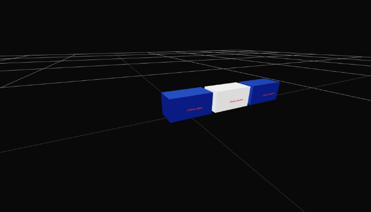
Table width
We’ll now add a slider to allow the user to change the table width.
First, let’s add a tableWidth variable in the useConfigurator hook:
// ...

export const ConfiguratorProvider = ({ children }) => {
  const [legs, setLegs] = useState(1);
  const [tableWidth, setTableWidth] = useState(1);

  return (
    <ConfiguratorContext.Provider
      value={{ legs, setLegs, tableWidth, setTableWidth }}
    >
      {children}
    </ConfiguratorContext.Provider>
  );
};

// ...
In the Interface component, we can now add a Slider component:
import {
  Box,
  Radio,
  RadioGroup,
  Slider,
  SliderFilledTrack,
  SliderThumb,
  SliderTrack,
  Stack,
  Text,
} from "@chakra-ui/react";
import { useConfigurator } from "../hooks/useConfigurator";

export const Interface = () => {
  const { legs, setLegs, tableWidth, setTableWidth } = useConfigurator();
  return (
    <Stack
      textColor={"white"}
      pos={"fixed"}
      top={8}
      right={8}
      minW={200}
      userSelect={"none"}
    >
      <Box
        backgroundColor={"blackAlpha.600"}
        paddingY={4}
        paddingX={8}
        rounded="2xl"
      >
        <Text fontSize={"2xl"} fontWeight={"bold"}>
          Table width
        </Text>
        <Slider
          value={tableWidth}
          onChange={setTableWidth}
          min={0.5}
          max={2}
          step={0.001}
        >
          <SliderTrack>
            <SliderFilledTrack />
          </SliderTrack>
          <SliderThumb />
        </Slider>
      </Box>
      <Box
        backgroundColor={"blackAlpha.600"}
        paddingY={4}
        paddingX={8}
        rounded="2xl"
      >
        <Text fontSize={"2xl"} fontWeight={"bold"}>
          Legs
        </Text>
        <RadioGroup
          onChange={(value) => setLegs(parseInt(value))}
          value={"" + legs}
        >
          <Stack direction="column" spacing={4} mt={4}>
            <Radio value="1">First</Radio>
            <Radio value="2">Second</Radio>
            <Radio value="3">Third</Radio>
          </Stack>
        </RadioGroup>
      </Box>
    </Stack>
  );
};
As the tableWidth will impact the scale of the table, we allow the slider to go from 0.5 to 2 with a step of 0.001.
Now, in the Table component, we can use the tableWidth to scale the table plate and also position the table legs:
/*
Auto-generated by: https://github.com/pmndrs/gltfjsx
Command: npx [email protected] public/models/table.glb -o src/components/Table.jsx -k -r public
*/

import { useGLTF } from "@react-three/drei";
import React from "react";
import { useConfigurator } from "../hooks/useConfigurator";

export function Model(props) {
  const { nodes, materials } = useGLTF("/models/table.glb");
  const { legs, tableWidth } = useConfigurator();

  return (
    <group {...props} dispose={null}>
      <mesh
        scale={[tableWidth, 1, 1]}
        name="Plate"
        geometry={nodes.Plate.geometry}
        material={materials.Plate}
      />
      {legs === 1 && (
        <>
          <mesh
            name="Legs01Left"
            geometry={nodes.Legs01Left.geometry}
            material={materials.Metal}
            position={[-1.5 * tableWidth, 0, 0]}
          />
          <mesh
            name="Legs01Right"
            geometry={nodes.Legs01Right.geometry}
            material={materials.Metal}
            position={[1.5 * tableWidth, 0, 0]}
          />
        </>
      )}
      {legs === 2 && (
        <>
          <mesh
            name="Legs02Left"
            geometry={nodes.Legs02Left.geometry}
            material={materials.Metal}
            position={[-1.5 * tableWidth, 0, 0]}
          />
          <mesh
            name="Legs02Right"
            geometry={nodes.Legs02Right.geometry}
            material={materials.Metal}
            position={[1.5 * tableWidth, 0, 0]}
          />
        </>
      )}
      {legs === 3 && (
        <>
          <mesh
            name="Legs03Left"
            geometry={nodes.Legs03Left.geometry}
            material={materials.Metal}
            position={[-1.5 * tableWidth, 0, 0]}
          />
          <mesh
            name="Legs03Right"
            geometry={nodes.Legs03Right.geometry}
            material={materials.Metal}
            position={[1.5 * tableWidth, 0, 0]}
          />
        </>
      )}
    </group>
  );
}

useGLTF.preload("/models/table.glb");
table-width-slider.mp4
We can now change the table width and see the table plate and legs change accordingly! ?
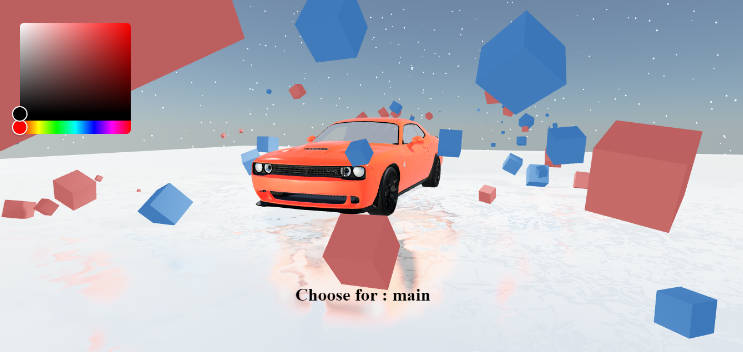
Legs color
We’ll add a last option to allow the user to change the legs color.
First, let’s add a legsColor variable in the useConfigurator hook:
import { createContext, useContext, useState } from "react";

export const ConfiguratorContext = createContext();

export const ConfiguratorProvider = ({ children }) => {
  const [legs, setLegs] = useState(1);
  const [tableWidth, setTableWidth] = useState(1);
  const [legsColor, setLegsColor] = useState("black");

  return (
    <ConfiguratorContext.Provider
      value={{
        legs,
        setLegs,
        tableWidth,
        setTableWidth,
        legsColor,
        setLegsColor,
      }}
    >
      {children}
    </ConfiguratorContext.Provider>
  );
};

export const useConfigurator = () => {
  const context = useContext(ConfiguratorContext);
  if (context === undefined) {
    throw new Error(
      "useConfigurator must be used within a ConfiguratorProvider"
    );
  }
  return context;
};
Then, in our Interface let’s add some controls to change the legsColor:
import {
  Box,
  Radio,
  RadioGroup,
  Slider,
  SliderFilledTrack,
  SliderThumb,
  SliderTrack,
  Stack,
  Text,
} from "@chakra-ui/react";
import { useConfigurator } from "../hooks/useConfigurator";

export const Interface = () => {
  const { legs, setLegs, tableWidth, setTableWidth, legsColor, setLegsColor } =
    useConfigurator();
  return (
    <Stack
      textColor={"white"}
      pos={"fixed"}
      top={8}
      right={8}
      minW={200}
      userSelect={"none"}
    >
      <Box
        backgroundColor={"blackAlpha.600"}
        paddingY={4}
        paddingX={8}
        rounded="2xl"
      >
        <Text fontSize={"2xl"} fontWeight={"bold"}>
          Table width
        </Text>
        <Slider
          value={tableWidth}
          onChange={setTableWidth}
          min={0.5}
          max={2}
          step={0.001}
        >
          <SliderTrack>
            <SliderFilledTrack />
          </SliderTrack>
          <SliderThumb />
        </Slider>
      </Box>
      <Box
        backgroundColor={"blackAlpha.600"}
        paddingY={4}
        paddingX={8}
        rounded="2xl"
      >
        <Text fontSize={"2xl"} fontWeight={"bold"}>
          Legs
        </Text>
        <RadioGroup
          onChange={(value) => setLegs(parseInt(value))}
          value={"" + legs}
        >
          <Stack direction="column" spacing={4} mt={4}>
            <Radio value="1">First</Radio>
            <Radio value="2">Second</Radio>
            <Radio value="3">Third</Radio>
          </Stack>
        </RadioGroup>
      </Box>
      <Box
        backgroundColor={"blackAlpha.600"}
        paddingY={4}
        paddingX={8}
        rounded="2xl"
      >
        <Text fontSize={"2xl"} fontWeight={"bold"}>
          Legs color
        </Text>
        <RadioGroup onChange={setLegsColor} value={legsColor}>
          <Stack direction="column" spacing={4} mt={4}>
            <Radio value="black">Black</Radio>
            <Radio value="pink">Pink</Radio>
            <Radio value="yellow">Gold</Radio>
            <Radio value="green">Green</Radio>
          </Stack>
        </RadioGroup>
      </Box>
    </Stack>
  );
};
I used CSS color names but you can use Hexadecimal or RGB values as well.
Time to apply the color to the legs! ?
//...
import { useGLTF } from "@react-three/drei";
import React, { useEffect } from "react";
import { useConfigurator } from "../hooks/useConfigurator";

export function Model(props) {
  const { nodes, materials } = useGLTF("/models/table.glb");
  const { legs, tableWidth, legsColor } = useConfigurator();

  useEffect(() => {
    materials.Metal.color.set(legsColor);
  }, [legsColor]);

  return (
    <group {...props} dispose={null}>
      {/*...*/}
    </group>
  );
}
// ...
useEffect is a React hook that allows us to run some code when a variable changes. In our case, we want to change the color of the legs when the legsColor variable changes.
The legs material is called Metal and we can change its color by using the set method on the color property.
table-legs-color.mp4
The color is now changing! ?
Conclusion
We’ve now built a configurator that allows us to change the table width, the legs and the legs color!
Here are some ideas to go further on this project:
- Add more options to change the table plate color, the table plate material, the legs material, etc.
- Save the table configuration in the browser’s local storage
- Add a button to download a photo of the table
- Make the interface responsive
- Animate the camera to show the table from different angles
- Lerp the table width to its new configuration instead of changing it instantly
- Scale the table plate texture to match the table width (and avoid stretching)
Resources
- React Three Fiber
- Drei Library: Useful components for React Three Fiber
- Wawa Sensei: an amazing YouTube channel about Three.js and React Three Fiber ?