hts-react-form
A simple and easy form for your react project.
Installation
npm install hts-react-form
yarn add hts-react-form
Usage
import React, { useState } from 'react'
import 'hts-react-form/styles/default.css'
import { HTSReactForm } from 'hts-react-form'

function HtsFormExample() {
  const [email, setEmail] = useState(null)
  const [password, setPassword] = useState(null)

  const loginHandler = (e) => {
    e.preventDefault()
  }

  return (
    <HTSReactForm
      controls={[
        {
          label: 'Email',
          type: 'text',
          name: 'email',
          value: email,
          onChange: (e) => setEmail(e.target.value),
          required: true,
        },
        {
          label: 'Password',
          type: 'password',
          name: 'password',
          value: password,
          onChange: (e) => setPassword(e.target.value),
          required: true,
        },
      ]}
      actionControl={{
        label: 'Login',
        onSubmit: loginHandler,
        className: `${btnStyles.button} ${btnStyles.primary}`,
      }}
      forgetPassword={{
        label: 'Forgot Password?',
        onClick: () => {},
      }}
      googleLogin={{
        label: <i className='la la-google-plus'></i>,
        onClick: () => {},
      }}
      facebookLogin={{
        label: <i className='lab la-facebook'></i>,
        onClick: () => {},
      }}
      githubLogin={{
        label: <i className='la la-github'></i>,
        onClick: () => {},
      }}
    />
  )
}

export default HtsFormExample
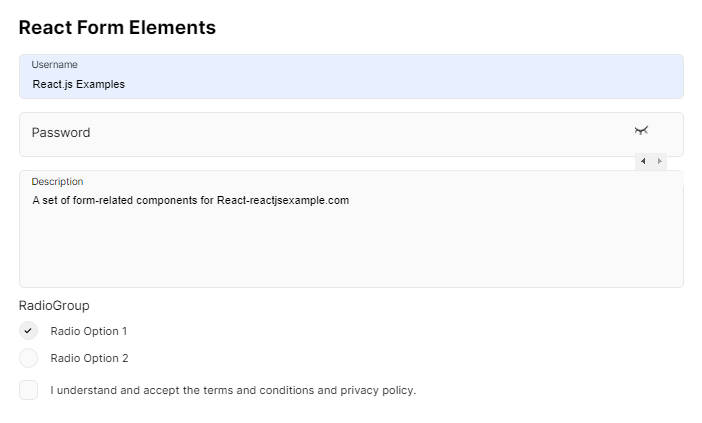
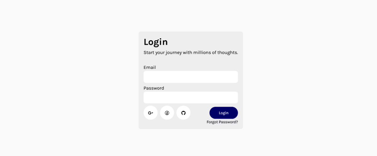
Preview
Attributes
| Key | Value |
| controls |
Array of input control each contains these properties {
"label": "string or JSX.Element"
"name" :"string"
"type" :"string"
"placeholder" :"string (optional)"
"value" :"any"
"onChange" :"function"
"styles" :"React.CSSProperties (optional)"
"className" :"string (optional)"
"required" :"boolean (optional) default false"
"validation" :{ "pattern" : "RegExp", "message": "string" } "(optional)"
"options": {
"label": "string"
"value": "string"
} "(optional)"
}
|
| actionControl |
action control otpions {
"label": "string or JSX.Element"
"onSubmit": "function"
"styles": "React.CSSProperties (optional)"
"className": "string"
}
|
| forgetPassword |
option for showing forgot password button {
"label": "string or JSX.Element"
"onClick": "function"
"styles": "React.CSSProperties (optional)"
"className": "string"
}
|
| googleLogin |
option for showing googleLogin button {
"label": "string or JSX.Element"
"onClick": "function"
"styles": "React.CSSProperties (optional)"
"className": "string"
}
|
| githubLogin |
option for showing githubLogin button {
"label": "string or JSX.Element"
"onClick": "function"
"styles": "React.CSSProperties (optional)"
"className": "string"
}
|
| facebookLogin |
option for showing facebookLogin button {
"label": "string or JSX.Element"
"onClick": "function"
"styles": "React.CSSProperties (optional)"
"className": "string"
}
|
| labelClassName | Custom class name for label style. |
| labelStyles | Custom style object to override label styles |
| className | Custom class name for form container style. |
| styles | Custom style object to override form container styles |
| errorClassName | Custom class name for form error box style. |
| errorStyles | Custom style object to override form error box styles |
Todos
Firebse auth option for all social logins
License
MIT