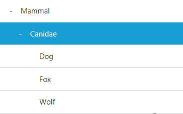
Inspired by Downshift, a simple, data-driven, light-weight React Tree Menu component that:
- does not depend on any UI framework
- fully customizable with
render props and control props
- allows search
Usage
Install with the following command in your React app:
npm i react-simple-tree-menu
// or
yarn add react-simple-tree-menu
To generate a TreeMenu, you need to provide data in the following structure.
// as an array
const treeData = [
  {
    key: 'first-level-node-1',
    label: 'Node 1 at the first level',
    ..., // any other props you need, e.g. url
    nodes: [
      {
        key: 'second-level-node-1',
        label: 'Node 1 at the second level',
        nodes: [
          {
            key: 'third-level-node-1',
            label: 'Last node of the branch',
            nodes: [] // you can remove the nodes property or leave it as an empty array
          },
        ],
      },
    ],
  },
  {
    key: 'first-level-node-2',
    label: 'Node 2 at the first level',
  },
];
// or as an object
const treeData = {
  'first-level-node-1': {               // key
    label: 'Node 1 at the first level',
    index: 0, // decide the rendering order on the same level
    ...,      // any other props you need, e.g. url
    nodes: {
      'second-level-node-1': {
        label: 'Node 1 at the second level',
        index: 0,
        nodes: {
          'third-level-node-1': {
            label: 'Node 1 at the third level',
            index: 0,
            nodes: {} // you can remove the nodes property or leave it as an empty array
          },
        },
      },
    },
  },
  'first-level-node-2': {
    label: 'Node 2 at the first level',
    index: 1,
  },
};
And then import TreeMenu and use it. By default you only need to provide data. You can have more control over the behaviors of the components using the provided API.
import TreeMenu from 'react-simple-tree-menu'
...
// Use the default minimal UI
<TreeMenu data={treeData} />

// Use any third-party UI framework
<TreeViewMenu
  data={treeData}
  onClickItem={({ key, label, ...props }) => {
    this.navigate(props.url); // user defined prop
  }}
  debounceTime={125}>
    {({ search, items }) => (
        <>
          <Input onChange={e => search(e.target.value)} placeholder="Type and search" />
          <ListGroup>
            {items.map(props => (
              // You might need to wrap the third-party component to consume the props
              // check the story as an example
              // https://github.com/iannbing/react-simple-tree-menu/blob/master/stories/index.stories.js
              <ListItem {...props} />
            ))}
          </ListGroup>
        </>
    )}
</TreeViewMenu>
API
| props |
description |
type |
default |
| data |
Data that defines the structure of the tree. You can nest it as many levels as you want, but note that it might cause performance issue. |
{[string]:TreeNode} | TreeNode[] |
- |
| activeKey |
the node matching this key will be highlighted |
string |
'' |
| onClickItem |
A callback function that defines the behavior when user clicks on an node |
(Item): void |
console.warn |
| debounceTime |
debounce time for searching |
number |
125 |
| openNodes |
you can pass an array of node names to make the branches open |
string[] |
null |
| children |
a render props that provdes two props: search and items |
(ChildrenProps) => React.ReactNode |
- |
TreeNode
| props |
description |
type |
default |
| key |
Node name |
string |
- |
| label |
the rendered text of a Node |
string | React.ReactNode |
'' |
| index |
a number that defines the rendering order of this node on the same level; this is not needed if data is TreeNode[] |
number |
- |
| nodes |
a node without this property means that it is the last child of its branch |
{[string]:TreeNode} | TreeNode[] |
- |
Item
| props |
description |
type |
default |
| hasNodes |
if a TreeNode is the last node of its branch |
boolean |
false |
| isOpen |
if it is showing its children |
boolean |
false |
| level |
the level of the current node (root is zero) |
number |
0 |
| key |
key of a TreeNode |
string |
- |
| label |
TreeNode label |
string | React.ReactNode |
- |
| ...other |
User defined props |
{[string]: any} |
- |
ChildrenProps
| props |
description |
type |
default |
| search |
A function that takes a string to filter the label of the item |
(value: string) => void |
- |
| items |
An array of TreeMenuItem |
TreeMenuItem[] |
[] |
| props |
description |
type |
default |
| hasNodes |
if a TreeNode is the last node of its branch |
boolean |
false |
| isOpen |
if it is showing its children |
boolean |
false |
| level |
the level of the current node (root is zero) |
number |
0 |
| key |
key of a TreeNode |
string |
- |
| label |
TreeNode label |
string | React.ReactNode |
- |
| active |
if current node is being selected |
boolean |
- |
| onClick |
a callback function that is run when the node is clicked |
Function |
- |
| ...other |
User defined props |
{[string]: any} |
- |
GitHub