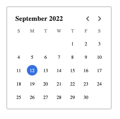
Moedim
A light-weight, localizable and customizable, styled React calendar component.
Getting Started
npm i -s moedim

yarn add moedim
If your project doesn’t already have styled-components installed, make sure you install that too. You’ll need it.
Usage
import React, { useState } from 'react';
import Calendar from 'moedim';

const App = () => (
  const [value, setValue] = useState(new Date())

  <Calendar value={value} onChange={(d) => setValue(d)} />
)
API
The Calendar component takes only three props:
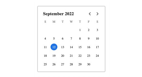
value– The currently selected date. This must be aDateobject.onChange– A callback function that will be called when the user selects a new date. The callback will be passed aDateobject.locale– The locale to use for the calendar. Locale will drive everything displayed, from the order of weekdays, to what weekdays are called. Defaults toen-US.
Styling
Moedim uses styled-components for styling. The main wrapping container (which has a border and some padding) is the target of the classNames prop which will allow you to wrap the component with styled-components.
One color is exposed as a CSS variable called --moedim-primary which is set on the container and can therefore be overridden through styled-components. The default value of --moedim-primary is #1a73e8 and colors the border of focused dates and the background of selected dates.
const StyledCalendar = styled(Calendar)`
  --moedim-primary: #f00;
`;
All font families are set to inherit so while you can override them directly by wrapping the styled component, most situations should find the Calendar component adopting your application’s font family.