react-json-form-engine
Build lightning fast web forms from JSON.
:heart: Conditional logic
:heart: Flexible validation
:heart: Infinite depth
:heart: Rehydratable
While other libraries might utilize react-redux, or the refs or context API for complex form managagement, react-json-form-engine relies on React as little as possible, and offloads its core logic to plain JavaScript. The result is scalable, lightning fast performance with neglible reliance on the React lifecycle.
Before proceeding, it's important to note that this library was designed to manage large forms (multi-section and multi-subsection), that may contain complex field dependencies (e.g Only show the Select Guardian field if the Age response is less than 18). This may or may not be for you, but it can also handle simple forms with extreme ease.
It also offers an easy mechanism for serializing all form responses to JSON for persistence. The reverse also stands, as any form can be easily rehydrated from historical data, and returned to its previous state.


Table of Contents
Live Demo
https://mikechabot.github.io/react-json-form-engine-storybook/
Storybook repository located here
Installing
Requires React 15.0.0+
$ npm install --save react-json-form-engine
Note: This library renders Bulma semantics; you'll need to include the styles on your own for everything to look nice. You can either install it with npm, or have it served from a CDN.
Note: Font Awesome is supported.
Bulma via CDN
<link rel="stylesheet" href="https://cdnjs.cloudflare.com/ajax/libs/bulma/0.7.1/css/bulma.min.css">
Bulma via npm
$ npm install --save bulma
- If your project supports Sass/SCSS, Bulma can be over easily overriden:
/* my-awesome-styles.scss */

// 1. Import the initial variables
@import "../sass/utilities/initial-variables";
@import "../sass/utilities/functions";

// 2. Set your own initial variables
$blue: #72d0eb;

// 3. Import the rest of Bulma
@import "../bulma";
- Depending on your build pipeline, either import the compiled CSS, or uncompiled SCSS.
// App.js
import './scss/my-awesome-styles.scss';
Font Awesome
If you'd like to use Font Awesome, be sure to also include the icon pack:
<link rel="stylesheet" href="https://use.fontawesome.com/releases/v5.0.13/css/all.css">
Starter Template
<!DOCTYPE html>
<html>
  <head>
    <meta charset="utf-8">
    <meta name="viewport" content="width=device-width, initial-scale=1">
    <title>react-json-form-engine</title>
    <link rel="stylesheet" href="https://cdnjs.cloudflare.com/ajax/libs/bulma/0.7.1/css/bulma.min.css">
    <link rel="stylesheet" href="https://use.fontawesome.com/releases/v5.0.13/css/all.css">
  </head>
  <body>
    <div id="root"></div>
  </body>
</html>
Getting Started
First, let's import the API:
import { Form, FormEngine } from 'react-json-form-engine';
Next, we'll need to build a Form Definition, which is the skeleton structure that describes how the form should look and behave. The definition must adhere to a strict schema, and can be represented as a JavaScript object or a JSON Schema. But don't worry about the details yet, we'll get into those.
Once we've built our definition, we'll feed it to the FormEngine, which returns an instance:
const instance = new FormEngine(definition);
Then, we just pass the instance to the <Form /> component, and react-json-form-engine takes care of the rest:
<Form
  instance={instance}
  onSubmit={() => {
    const responses = instance.serializeModel();
    // Do stuff
  }}
/>
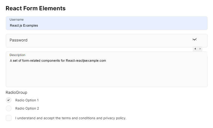
Login Form Example
Let's create a simple login form. Either follow along below, or check out the codesandbox.
| Show Title | Hide Title |
|---|---|
 |
 |
Login Form Definition
Here's our definition, which is a rather simple one. It consists of just a single section with a single subsection, which houses three fields. Note, we're also using a Field Decorator to ensure user_pass renders as a password field:
const loginForm = {
  id: "login_form",
  title: "Welcome to Foo!",
  sections: [
    {
      id: "section_1",
      title: "Login Section",
      subsections: [
        {
          id: "subsection_1",
          title: "Login",
          subtitle: "Please enter your credentials.",
          fields: [
            {
              id: "user_name",
              title: "Username",
              type: "string"
            },
            {
              id: "user_pass",
              title: "Password",
              type: "string"
            },
            {
              id: "remember_me",
              title: "Remember me",
              type: "boolean"
            }
          ]
        }
      ]
    }
  ],
  decorators: {
    "user_pass": {
      component: {
        type: "password"
      }
    }
  }
};
Now that we have our definition, let's create an instance of FormEngine:
const instance = new FormEngine(loginForm);
With the instance in hand, we can pass it our <Form /> component:
const LoginForm = () => (
  <Form
    instance={instance}
    onSubmit={() => {
       // Do stuff
    }}
  />
);
And once filled out, onSubmit will get us the form responses:
const LoginForm = () => (
  <Form
    hideTitle
    submitButtonLabel="Login"
    instance={instance}
    onSubmit={() => {
      console.log(instance.getModelValues());   // Get form responses
      console.log(instance.serializeModel());   // Serialize form responses
    }}
  />
);
Login Form Codesandbox
Have a look at the Login Form demo:

Form Engine
- Form Definition
- Field Definition
- Field Type
- Field Children
- Field Options
- Field Props List
- Field Type Transitions
- Field Decorators
Form Definition
Form definitions adhere to a strict schema. They must contain at least one section, which contains at least one subsection, which contains at least one Field Definition. You may find this schema verbose for smaller forms, however it scales well for significantly complex forms.
View the full schema in the FormAPIService
In forms with a single section, vertical tabs are not displayed. In sections with a single subsection, horizontal tabs are not displayed.
// The most minimal form possible
export default {
    id: <string>,
    title: <string>,
    sections: [
        {
            id: <string>,
            title: <string>,
            subsections: [
                {
                    id: <string>,
                    title: <string>,
                    fields: [
                        {
                            ...
                        }
                    ]
                }
            ]
        }
    ]
};
Have a look the Simple Form demo:
Form Definition Validation
Don't worry about making mistakes with your definition. If the FormEngine is instantiated with a malformed definition, the UI will be notified of the failure location:

Have a look at the Malformed Form demo:
Field Definition
Field definitions also adhere to a strict schema. At minimum, they must contain an id, type and title:
// The most minimal field object
{
  id: <string>,       // Uniquely identifies the field within the DOM, and FormEngine instance
  type: <string>,     // Determines the data type of the field response
  title: <string>     // Label of the field
}
Field Type
Determines the data type of the response value stored in the model, and which Default Control to render. To override the default and render an Allowed Control instead, use a Field Decorator.
| Field Type | Default Control | Allowed Controls | Supports options? |
|---|---|---|---|
string |
<Text /> |
<Password />, <Textarea />, <Select />, <Radio /> |
Yes* |
boolean |
<Checkbox /> |
<Radio /> |
Yes* |
number |
<Number /> |
<Range /> |
No |
array |
<Select /> |
<Checkboxgroup /> |
Yes |
date |
<DateTime /> |
N/A | No |
Some field types will automatically transition from their Default Control to another Allowed Control if an
optionsarray is present in the field definition. (See Field Type Transitions). However, in most cases, you must use a
Field Decorator to use another Allowed Control.
Field Children
Any field can contain child fields. Simply create a fields array on the field, and drop in valid Field Definitions. Here's an example of some nested fields:
Note: Field children can recurse infinitely, and also be placed on Field Options.
{
  id: "parent",
  type: "number",
  title: "Parent",
  fields: [
    {
      id: "child",
      type: "string",
      title: "Child",
      fields: [
        {
          id: "grandchild",
          type: "number",
          title: "Grandchild"
        }
      ]
    },
    {
      id: "child-2",
      type: "array",
      title: "Child",
      options: [
        { id: 'op1', title: 'Option 1'},
        { id: 'op2', title: 'Option 2' },
      ]
    }
  ]
}
Have a look at the Child Fields demo:
Field Options
Applies to
string,boolean, andarrayfield types only.
boolean
Fields of type boolean only accept a maximum of two options; each of which should contain just a title property. The first option is considered the affirmative response:
{
  id: 'my_bool',
  title: 'How often does it occur?',
  type: 'boolean',
  options: [
    { title: 'Always' },
    { title: 'Never' },
  ]
}
string / array
For field types that accept unlimited options (string, array), you must include both an id and title. The ids of the selected option(s) are stored in the model.
{
  id: 'my_arr',
  title: 'Pick some',
  type: 'array',      // Array type allows for multiple selections
  options: [
    { id: "op1", title: "Option 1" },
    { id: "op2", title: "Option 2" },
    { id: "op3", title: "Option 3" },
  ]
},
{
  id: 'my_str',
  title: 'Pick one',
  type: 'string',    // String type allows for single selection
  options: [
    { id: "op1", title: "Option 1" },
    { id: "op2", title: "Option 2" },
    { id: "op3", title: "Option 3" },
  ]
}
Field Children on Options
For field controls that render selectable options, like <Radio /> (incarnated as a string or boolean) or <Checkboxgroup />, you can include Field Children on any of the options:
{
  id: "field_2",
  type: "string",
  title: "Select One (Field Type: String)",
  options: [
    {
      id: "op1",
      title: "Option 1",
      fields: [{ id: "explain_1", type: "string", title: "Explain" }]
    },
    {
      id: "op2",
      title: "Option 2",
      fields: [{ id: "explain_2", type: "string", title: "Explain" }]
    },
    {
      id: "op3",
      title: "Option 3",
      fields: [{ id: "explain_3", type: "string", title: "Explain" }]
    }
  ]
}
Have a look at the Field Options demo:
Field Props List
Here's the complete list of props that can be passed to Field Definitions:
| Property | Type | Required | Description |
|---|---|---|---|
id |
string |
Yes | See Field ID |
type |
string |
Yes | See Field Type |
title |
string |
Yes | Display label for the field |
options |
array |
No | See Field Options |
fields |
array |
No | See Field Children |
placeholder |
string |
No | Placeholder text to display |
showCondition |
object |
No | Condition object (See Conditions) |
required |
boolean |
No | Whether the field is required (See Validation) |
pattern |
string |
No | Pattern to match during validation (See Validation) |
min |
number |
Yes* | Minimum value. (Used for number field types) |
max |
number |
Yes* | Maximum value. (Used for number field types) |
hideTime |
boolean |
No | Only show the Date in Date/Time. (Used for date field types) |
hideCalendar |
boolean |
No | Only show the Time in Data/Time. (Used for date field types) |
minandmaxare only required for<Range />component types.
Field Type Transitions
string
By default, a string field is rendered as <Text /> (See Field Type), but with options it automatically renders as a <Select />.
[
  {
    // Renders as <Text />
    id: 'field_1',
    type: 'string',
    title: 'Text Field'
  },
  {
    // Renders as <Select />
    id: 'field_2',
    type: 'string',
    title: 'Select Field',
    options: [
      { id: "op1", title: "Option 1" },
      { id: "op2", title: "Option 2" },
    ]
  }
]
Have a look at the String Transition demo:
boolean
By default, a boolean field is rendered as <Checkbox /> (See Field Type), but with options it automatically renders as a <Radio />.
[
  {
    id: "field_1",
    type: "boolean",
    title: "Checkbox Field"
  },
  {
    id: "field_2",
    type: "boolean",
    title: "Radio Field",
    options: [
      { title: "Yes" },
      { title: "No" }
    ]
  }
]
A maximum of two (2) options is allowed for
booleanfields. For unlimited<Radio />options, use thestringtype with acomponentofradio.
Have a look at the Boolean Transition demo:
Field Decorators
Field decorators contain metadata about the fields you've configured in your form definition. Add the decorators object to the root of the Form Definition:
  {
    id: 'my_form'
    title: 'My Form',
    sections: [...],
    decorators: {}
  }
The decorators object will be keyed by Field ID, and can contain the properties hint and component.
Hint Decorator
Add hint text to any field:
  id: "Form_ID",
  title: "Form Title",
  sections: [{
    ...
    subsections: [{
      ...
      fields: [{
        id: "field_1",
        type: "string",
        title: "Field title"
      }]
    }]
  }],
  decorators: {
    field_1: {
      hint: "This is some hint text!"   // Add hint text to any field
    }
  }
}
Take a look at the Hint Decorator demo:
Component Decorator
Every field type renders a Default Control (See Field Type), however you'll often want to explicitly override the default component type in favor of another. In some cases, this occurs automatically (See Field Type Transitions, however most times you'll need to specify a component decorator.
Let's update field_1 from a <Select /> to a <Checkboxgroup />:
  id: "Form_ID",
  title: "Form Title",
  sections: [{
    ...
    subsections: [{
      ...
      fields: [{
        id: "field_1",
        type: "array",
        title: "Field title",
        options: [
           ...
        ]
      }]
    }]
  }],
  decorators: {
    field_1: {
      hint: 'More hint text!',
      component: {
        type: 'checkboxgroup'   // Override the default component type
      }
    }
  }
}
Here's a list of field types with overrideable components:
| Field Type | Component Decorator Overrides |
|---|---|
string |
password, textarea, radio |
number |
range |
array |
checkboxgroup |
Take a look a the Component Override demo: