Simpler Color


Create your own complete Web color system fast and easy!
Color is at the heart of every UI design system. A cohesive color system enables your application to:
- consistently express brand identity and style
- effectively communicate intent and meaning
Simpler Color makes it super easy to implement your own CSS-compliant color system for any JavaScript/TypeScript project, no matter what platform, framework, or UI library you are using. It works in the browser, server (Node), mobile (React Native) and desktop (Electron).
Easy as 1-2-3!
Step 1: Install simpler-color
npm install simpler-color
Step 2: Define your color palettes and their corresponding base colors
const baseColors = {
  primary: '#336669',
  secondary: '#57614E',
  neutral: '#5E5F5A',
}
Step 3: Create your color scheme(s) by mapping UI roles to specific colors from your palettes
import { colorScheme } from 'simpler-color'

const uiColors = colorScheme(baseColors, colors => ({
  primaryButton: colors.primary(40),
  primaryButtonText: colors.primary(95),
  surface: colors.neutral(98),
  text: colors.neutral(10),
}))

// You can now access your various UI colors as `uiColors.primaryButton` and so on.
If some of those terms sound alien to you, read on…
BUT FIRST, if you like this library, the concept, and its simplicity, please give it a star ⭐️ on the GitHub repo to let me know. ?
Key Concepts
We’re not gonna discuss Color Theory here, but let’s talk a bit about what a proper color system comprises.
Color Palette
Creating your color system begins with building your color palettes. Each palette consists of a group of related colors, generated from one base color.
You decide what sort of relationship should be between colors in the palette. The most common type is the tonal palette (also called monochromatic), which is made up of various “tones” of the same general hue. For example, various shades of blue is a tonal palette.

Each color in a palette is accessed by a unique color key, which is a string or number that indicates its relationship with the base color. The color values are determined by a color mapping function, which returns a specific color value for a given color key.
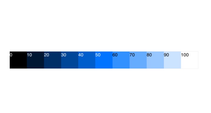
Palettes are automatically created by simpler-color based on your specified base colors. By default, it generates tonal palettes, with specific tones accessed by passing a numeric key between 0 and 100, which represents % lightness (0 = black, 100 = white). Any value in between generates a specific shade of the base color. So, for example, if your primary palette is based on blue (like in the illustration above), primary(40) gives you blue with 40% lightness.
You can, of course, define your own color mapping function to override the default. This also means that you can define a completely different set of color keys, which can be any of these common alternatives:
- string values, e.g. ‘darker’, ‘dark’, ‘base’, ‘light’, ‘lighter’
- discrete numeric values, e.g. 0, 10, 20, …, 90, 95, 98, 100 (like Material Design 3 does)
Color Set
The color set is simply the collective term for all the color palettes built.
Typically a color set would have a primary palette. This represents the main “brand” color of your app. This is the most prominent hue across your UI.
Common additional palettes can be any of (but not limited to) these:
- secondary: less prominent, usually more muted
- accent: usually complementary (opposite) to primary, to provide contrast
- neutral: typically shades of gray or similar neutral tones
To ensure consistency of your color set, simpler-color enforces that you use the same set of color keys (and thus the same color mapping function) across all your palettes.
Color Scheme
A color system consists of one or several color schemes. These days, it’s quite common to implement both Light and Dark color schemes. You can also choose to add some High Contrast schemes for accessibility.
To create a color scheme, you first identify the various UI roles in your design system. Each role indicates a specific use or purpose of color as it applies to specific elements of the UI.
Some common examples of UI role:
- primary button
- primary button text
- surface/background color
- text color
The final step is to map each UI role to a specific color value from one of the palettes in your color set. Each such mapping gives us one color scheme. By using a consistent set of color roles, simpler-color helps ensure that your UI can easily and safely switch between color schemes.
Recipes
Defining a custom color mapping function
function awesomeColor(baseColor, key) {
  const colorValue = /** insert logic here **/
  return colorValue
}

const uiColors = colorScheme(
  baseColors,
  colors => ({
    primaryButton: colors.primary(40),
    /** rest of the UI role mapping here **/
  }),
  {
    colorMapping: awesomeColor
  }
)