
Features
- Easily Customizable
- Promise API
- Lightweight
- Accessible
Installation
With yarn
yarn add solid-toast
With NPM
npm install solid-toast
Getting Started
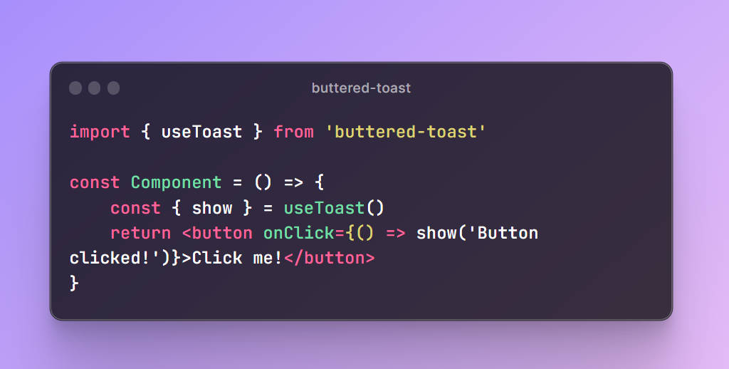
Add a Toaster to your component tree. This component will render all toasts. Now you can trigger toast() from anywhere!
import toast, { Toaster } from 'solid-toast';

const notify = () => toast('Here is your toast.');

const App = () => {
  return (
    <div>
      <button onClick={notify}>Make me a toast</button>
      <Toaster />
    </div>
  );
};
Documentation
toast() Function
Call this function from anywhere to create a toast.
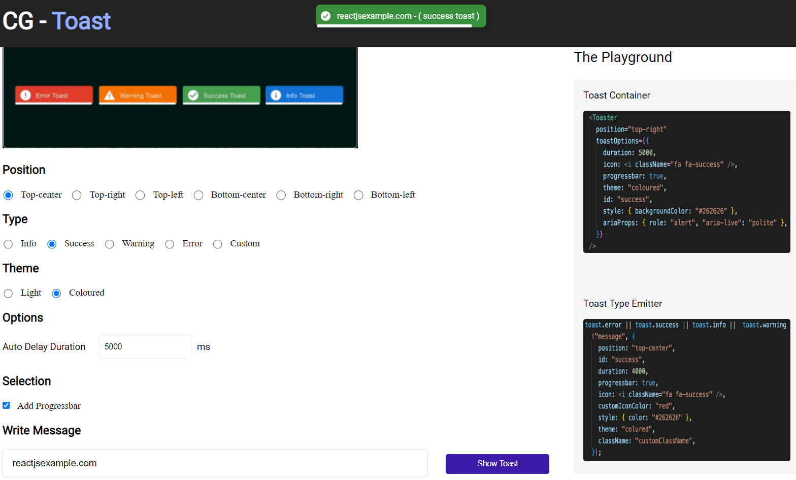
Available Options
You can provide ToastOptions as the second argument. They will overwrite all options received from the <Toaster/> component.
toast('This is a simple toast!', {
  duration: 5000,
  position: 'top-right',
  // Add a delay before the toast is removed
  // This can be used to time the toast exit animation
  unmountDelay: 500,
  // Styling - Supports CSS Objects, classes, and inline styles
  // Will be applied to the toast container
  style: {
    'background-color': '#f00',
  },
  className: 'my-custom-class',
  // Custom Icon - Supports text as well as JSX Elements
  icon: '?',
  // Set accent colors for default icons that ship with Solid Toast
  iconTheme: {
    primary: '#fff',
    secondary: '#000',
  },
  // Aria Props - Supports all ARIA props
  aria: {
    role: 'status',
    'aria-live': 'polite',
  },
})
Creating Toasts
There are several options for creating toasts
Blank
toast('This is a blank toast!')
Blank toasts do not come with a default icon. However, you can set a custom JSX Element/Text (Emoji) icon by placing it in the icon option.
Success
toast.success('Successfully saved!');
Creates a notification with an animated checkmark. Color accents can be themed with the iconTheme option.
Error
toast.error('Something went wrong!');
Creates a notification with an animated error icon. Color accents can be themed with the iconTheme option.
Loading
toast.loading('Loading Photos...');
Shows a toast with a loading indicator icon. The content can later be updated with an error or success icon. See how to update the toast content here.
Promise
The promise() function can be used to create a toast from a promise. This function will automatically show a loading icon and update the toast with the result of the promise.
const myPromise = fetchData();

toast.promise(myPromise, {
  loading: 'Loading',
  success: <b>Got the data</b>,
  error: 'An error occurred ?',
});
Custom Toast
You also have the ability to completely customize the appearance of your toast. A custom JSX Element can be passed in like so:
toast.custom(() => (
  <div>
    <h1>Custom Toast</h1>
    <p>This is a custom toast!</p>
  </div>
));
Advanced Option
You can also hook into the toast life-cycle by adding a parameter to the JSX Function call like so:
toast.custom((t) => {
  <div>
    <h1>Custom Toast</h1>
    <p>This is a custom toast!</p>
    <p>{t.visible ? 'Showing' : 'I will close in 1 second'}</p>
    <button
      onClick={() => toast.dismiss(t.id)}
    >
      Close Toast
    </button>
  </div>
}, {
  unmoutDelay: 1000,
})
Helpful Utilities
Dismiss Toasts Programatically
You can manually dismiss a notification with toast.dismiss. Beware that it triggers the exit animation and does not remove the Toast instantly. Toasts will auto-remove after 500ms by default. You can adjust the dismiss duration with the unmountDelay option.
Dismiss Single Toast
const toastId = toast.loading('Loading...');
// ...
toast.dismiss(toastId);
Dismiss all toasts by omitting all arguments.
Dismiss All Toasts
toast.dismiss();
Remove Toasts Instantly
Toasts can be removed instantly with toast.remove. This will not trigger the exit animation and remove the toast instantly.
toast.remove(toastId);
// or
toast.remove();
Updating Toasts
Each toast call returns a unique id. Use this id in the toast options to update an existing toast.
const toastId = toast.loading('Loading...');
// ...
toast.success('This worked', {
  id: toastId,
});
Toaster Component
This component will render all toasts.
Available Options
<Toaster
  position="top-center"
  // Spacing between each toast in pixels
  gutter={8}
  containerClassName=""
  containerStyle={{}}
  toastOptions={{
    // Define default options that each toast will inherit. Will be overwritten by individual toast options
    className: '',
    duration: 5000,
    style: {
      background: '#363636',
      color: '#fff',
    },
  }}
/>
Acknowledgements
This project is inspired by