react-select-search
Lightweight select component for React.

Features
- Lightweight, with zero dependencies*
- Accessible
- Headless mode
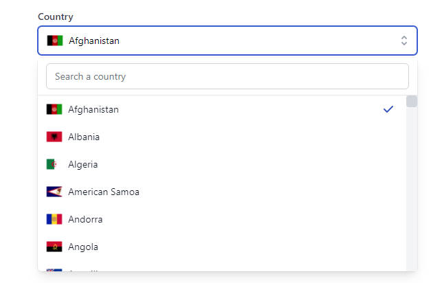
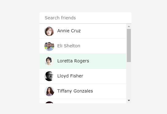
- Basic HTML select functionality, including multiple
- Search/filter options
- Async options
- Apply renderers to change markup and behavior
- Keyboard support
- Group options with group names, you can search group names
- Fully stylable
*One optional dependency required for built-in fuzzy search
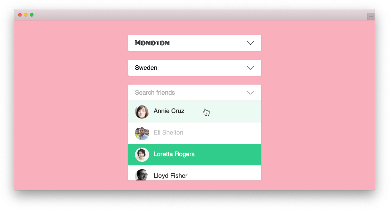
Demo
Install
Install it with npm (npm install react-select-search --save) and import it like you normally would.
Quick example
import SelectSearch from 'react-select-search';

/**
 * The options array should contain objects.
 * Required keys are "name" and "value" but you can have and use any number of key/value pairs.
 */
const options = [
    {name: 'Swedish', value: 'sv'},
    {name: 'English', value: 'en'},
    {
        type: 'group',
        name: 'Group name',
        items: [
            {name: 'Spanish', value: 'es'},
        ]
    },
];

/* Simple example */
<SelectSearch options={options} value="sv" name="language" placeholder="Choose your language" />
For examples you can take a look in the stories directory.
You will also need some CSS to make it look right. Example theme can be found in style.css.
Use with SSR
For use with SSR you might need to use the commonjs bundle (react-select-search/dist/cjs). If you want to utilise the example theme (style.css) you need to check if you're build script manipulates class names, for example minifies them. If that's the case, you can use CSS modules to get the class names from the style.css file and apply them using the className function. Example can be seen here as well as here https://react-select-search.com/?path=/story/custom--css-modules.
Headless mode with hooks
If you want complete control (more than styling and custom renderers) you can use hooks to pass data to your own components and build it yourself.
import React from 'react';
import { useSelect } from 'react-select-search';

const CustomSelect = ({ options, value, multiple, disabled }) => {
    const [snapshot, valueProps, optionProps] = useSelect({
        options,
        value,
        multiple,
        disabled,
    });

    return (
        <div>
            <button {...valueProps}>{snapshot.displayValue}</button>
            {snapshot.focus && (
                <ul>
                    {snapshot.options.map((option) => (
                        <li key={option.value}>
                            <button {...optionProps} value={option.value}>{option.name}</button>
                        </li>
                    ))}
                </ul>
            )}
        </div>
    );
};
Configuration
Below is all the available options you can pass to the component. Options without defaults are required.
| Name | Type | Default | Description |
|---|---|---|---|
| options | array | Se the options documentation below | |
| value | string, array | undefined | The value should be an array if multiple mode. |
| multiple | boolean | false | Set to true if you want to allow multiple selected options. |
| search | boolean | false | Set to true to enable search functionality |
| disabled | boolean | false | Disables all functionality |
| placeholder | string | empty string | Displayed if no option is selected and/or when search field is focused with empty value. |
| autoComplete | string, on/off | off | Disables/Enables autoComplete functionality in search field. |
| autoFocus | boolean | false | Autofocus on select |
| fuse | object, boolean | true | Use fuse.js to apply fuzzy search on search. Set to true to use default options or pass a fuse.js config option. If search is enabled and no filterOptions callback is passed, this will be set to true automatically. |
| className | string, function | select-search-box | Set a base class string or pass a function for complete control. Se custom classNames for more. |
| onChange | function | null | Function to receive and handle value changes. |
| printOptions | string | auto | Can be: auto, always, never, on-focus. This property controls when the options list should be rendered. |
| closeOnSelect | boolean | true | The selectbox will blur by default when selecting an option. Set this to false to prevent this behavior. |
| renderOption | function | null | Function that renders the options. See custom renderers for more. |
| renderValue | function | null | Function that renders the value/search field. See custom renderers for more. |
| renderGroupHeader | function | null | Function that renders the group header. See custom renderers for more. |
| getOptions | function | null | Get options through a function call, can return a promise for async usage. See get options for more. |
The options object
The options object can contain any properties and values you like. The only required one is name.
| Property | Type | Description | Required |
|---|---|---|---|
| name | string | The name of the option | Yes |
| value | string | The value of the option | Yes, if the type is not "group" |
| type | string | If you set the type to "group" you can add an array of options that will be grouped | No |
| items | array | Array of option objects that will be used if the type is set to "group" | Yes, if type is set to "group" |
| disabled | boolean | Set to true to disable this option |
No |
Custom class names
If you set a string as the className attribute value, the component will use that as a base and BEM-ify the class names for all elements.
If you want to fully control the class names you can pass a function that takes a key and returns a class name. The following keys exists:
- container
- value
- input
- select
- options
- option
- group
- group-header
- is-selected
- is-highlighted
- is-loading
- has-focus
Custom renderers
If CSS isn't enough, you can also control the HTML for the different parts of the component.
| Callback | Args | Description |
|---|---|---|
| renderOption | optionsProps: object, optionData: object, optionSnapshot: object | Controls the rendering of the options. |
| renderGroupHeader | name: string | Controls the rendering of the group header name |
| renderValue | valueProps: object, ref: React.ref, selectedValue: object | Controls the rendering of the value/input element |
The optionProps and the valueProps are needed for the component you render to work. For example:
<SelectSearch renderValue={(valueProps) => <input {...valueProps} />} />
Monkeypatch it if you need to but make sure to not remove important props.
The optionSnapshot is an object that contains the object state: { selected: bool, highlighted: bool }.
Get options
You can fetch options asynchronously with the getOptions property. You can either return options directly or through a Promise.
function getOptions(query) {
    return new Promise((resolve, reject) => {
        fetch(`https://www.thecocktaildb.com/api/json/v1/1/search.php?s=${query}`)
            .then(response => response.json())
            .then(({ drinks }) => {
                resolve(drinks.map(({ idDrink, strDrink }) => ({ value: idDrink, name: strDrink })))
            })
            .catch(reject);
    });
}
The function runs on each search query update, so you might want to throttle the fetches.
If you return a promise, the class is-searching will be applied to the main element, giving you a chance
to change the appearance, like adding a spinner. The property searching is also available in the snapshot that is sent to your render callbacks.