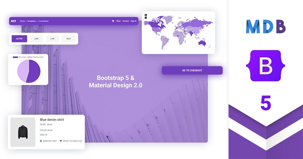
MDB React 5
React 17 & Bootstrap 5 & Material Design 2.0 UI KIT


|
|
 |
 |
|
|
|
|
|
|
|
|
|
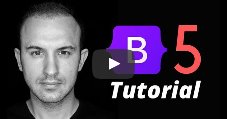
Tutorial for the latest Bootstrap v.5 Alpha. In this video we’ll learn about the changes implemented into v.5.
>> Click here for a written tutorial
|
|
|
Start to Code
|
Learn Bootstrap 5 | Crash Course for Beginners in 1.5H
|
Demo
Simplicity and ease of use are key features of MDBReact 5 UI Kit. You need only one minute to install and run it.
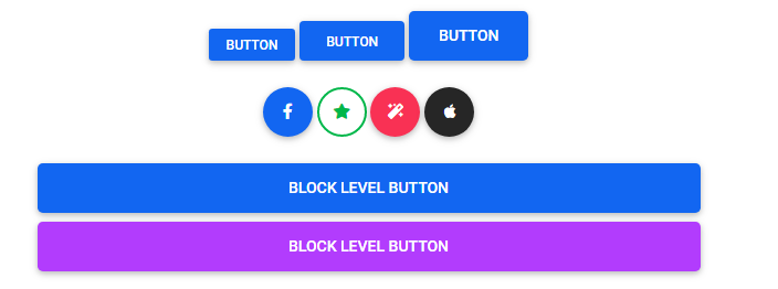
Buttons
Use MDB custom button styles for actions in forms, dialogs, and more with support for multiple sizes, states, and more.


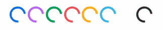
Spinners
Indicate the loading state of a component or page with MDB spinners, built entirely with HTML, CSS, and no JavaScript.

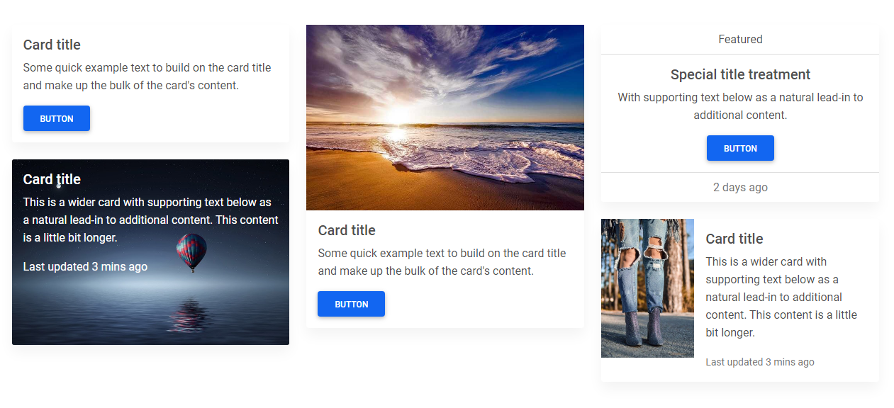
Cards
A card is a flexible and extensible content container. It includes options for headers and footers, a wide variety of content, contextual background colors, and powerful display options.
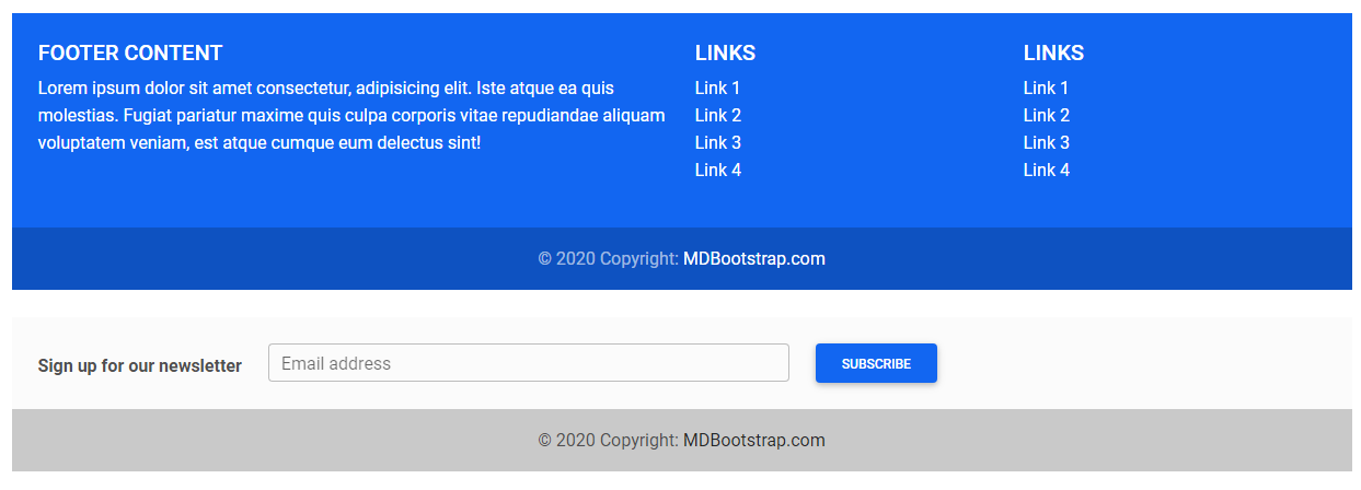
Footer
A footer is an additional navigation component. It can hold links, buttons, company info, copyrights, forms, and many other elements.
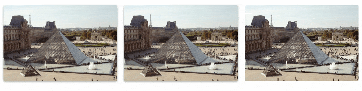
Hover
MDB hover effect appears when the user positions the computer cursor over an element without activating it. Hover effects make a website more interactive.
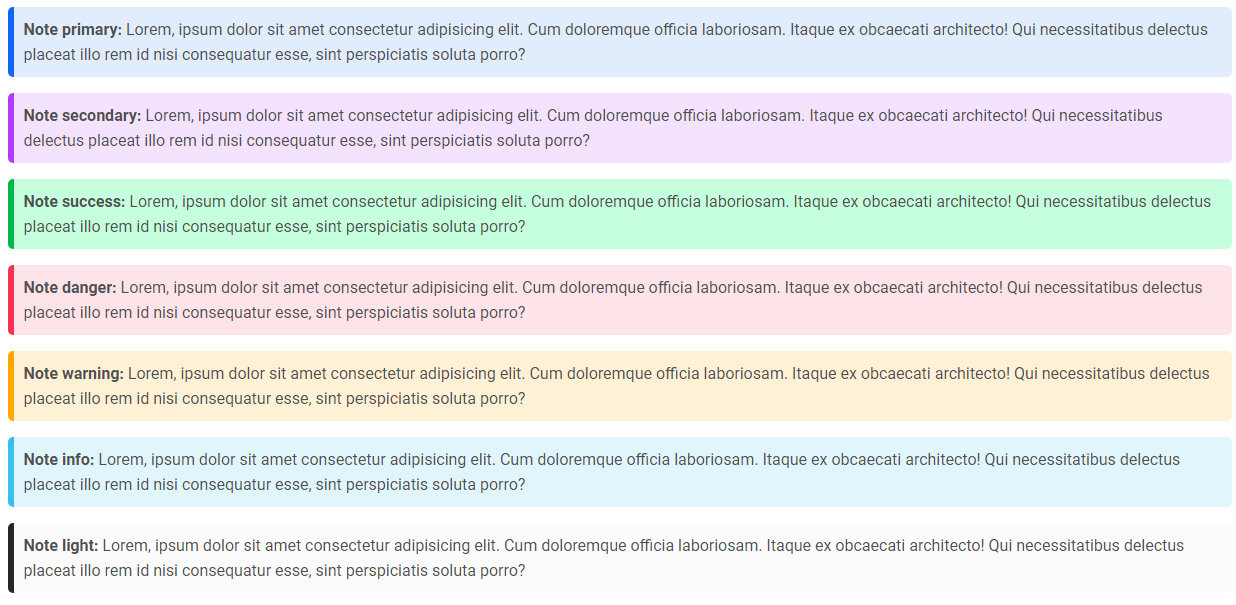
Notes
Notes are small components very helpful in inserting an additional piece of information.
and more.