React Step Progress Bar
A library to create stunning progress bars and steps in React.
Key Features
- Create simple progress bars or with steps ?
- Customize your steps as you want ?
- Create your own step animations ?
Installation
To use this library, you'll need the npm CLI installed on your computer. From your command line, using npm:
npm install --save react-step-progress-bar
Or using yarn:
yarn add react-step-progress-bar
Example
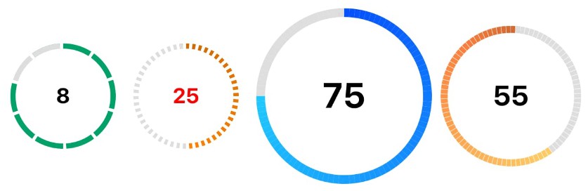
Simple progress bar
This example demonstrate how to create a simple progress bar.
import React from "react";
import "react-step-progress-bar/styles.css";
import { ProgressBar } from "react-step-progress-bar";

class ProgressBar extends React.Component {
  render() {
    return (
      <ProgressBar
        percent={75}
        fillBackground="linear-gradient(to right, #fefb72, #f0bb31)"
      />
    );
  }
}
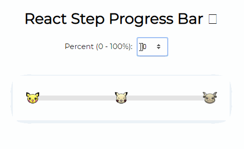
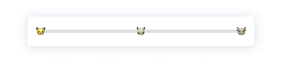
Progress bar with steps
This example demonstrate how to create your own progress bar with steps.
import React from "react";
import "react-step-progress-bar/styles.css";
import { ProgressBar, Step } from "react-step-progress-bar";

class StepProgressBar extends React.Component {
  render() {
    return (
      <ProgressBar
        percent={75}
        fillBackground="linear-gradient(to right, #fefb72, #f0bb31)"
      >
        <Step transition="scale">
          {({ accomplished }) => (
            <img
              style={{ filter: `grayscale(${accomplished ? 0 : 80}%)` }}
              width="30"
              src="https://vignette.wikia.nocookie.net/pkmnshuffle/images/9/9d/Pichu.png/revision/latest?cb=20170407222851"
            />
          )}
        </Step>
        <Step transition="scale">
          {({ accomplished }) => (
            <img
              style={{ filter: `grayscale(${accomplished ? 0 : 80}%)` }}
              width="30"
              src="https://vignette.wikia.nocookie.net/pkmnshuffle/images/9/97/Pikachu_%28Smiling%29.png/revision/latest?cb=20170410234508"
            />
          )}
        </Step>
        <Step transition="scale">
          {({ accomplished }) => (
            <img
              style={{ filter: `grayscale(${accomplished ? 0 : 80}%)` }}
              width="30"
              src="https://orig00.deviantart.net/493a/f/2017/095/5/4/raichu_icon_by_pokemonshuffle_icons-db4ryym.png"
            />
          )}
        </Step>
      </ProgressBar>
    );
  }
}
API
<ProgressBar/>
| name | type | default | description |
|---|---|---|---|
| percent | number | Percantage of progression | |
| children | Step component(s) | ProgressBar only accepts Step as children | |
| stepPositions | array of numbers | By default Steps are spaced linearly on the ProgressBar. You can override this by specifying the positions of the steps (in percent) | |
| unfillBackground | string | rgba($color: lightgrey, $alpha: 0.6); | This props is used directly on the CSS background property of the unfilled part of the ProgressBar. |
| fillBackground | string | rgba($color: #0074d9, $alpha: 0.8) | This props is used directly on the CSS background property of the filled part of the ProgressBar |
| width (in pixel) | number | 100% | The width of the progress bar in pixel |
| height (in pixel) | number | 10 | The height of the progress bar in pixel |
| hasStepZero | boolean | true | Tells if steps position should start at 0 or not |
| text | string | Add a text in the middle of the progress bar |
<Step/>
| name | type | default | description |
|---|---|---|---|
| accomplished | boolean | Tells if this Step has been accomplished | |
| position | number | The position in percentage of the Step on the ProgressBar | |
| index | number | The index of the Step in the ProgressBar | |
| children | function | The function used to render the content of the Step | |
| transition | string | Use one of the built-ins transitions | |
| transitionDuration (in ms) | string | 300 | The duration of the transition |