react-input-Position
react-input-position is a component that decorates it's children with mouse/touch position tracking, a status toggle fired by click/gesture events, and more. Assisting in the creation of UI features that require detailed information about user touch/mouse input.
The status toggle feature can be triggered by Click, Double Click, Hover, Mouse Down, Tap, Double Tap, Touch, and Long Touch gestures.
Includes an item tracking feature which provides coordinates that can be moved by user input. This position can be limited through min/max settings or even limited based on the size of a linked element anywhere in the hierarchy of children. Useful for creating some image components such as magnifiers.
Installation
npm install --save react-input-position
Basic Usage
import ReactInputPosition from "react-input-position";
...

<ReactInputPosition>
  <YourComponentOne />
  <YourComponentTwo />
</ReactInputPosition>
Importing and using activation method constants:
import ReactInputPosition, {
  MOUSE_ACTIVATION,
  TOUCH_ACTIVATION
} from "react-input-position";
...

<ReactInputPoisiton
  mouseActivationMethod={MOUSE_ACTIVATION.DOUBLE_CLICK}
  touchActivationMethod={TOUCH_ACTIVATION.DOUBLE_TAP}
>
</ReactInputPosition>
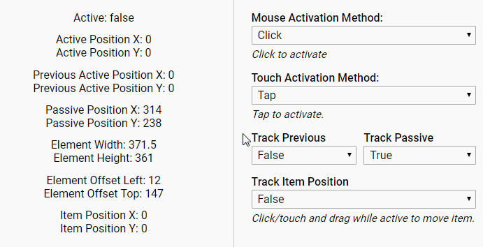
Child components will receive the following props (although some may be inactive depending on the options you select):
{
  active: boolean,
  activePosition: {
    x: number,
    y: number
  },
  prevActivePosition: {
    x: number,
    y: number
  },
  passivePosition: {
    x: number,
    y: number
  },
  elementDimensions: {
    width: number,
    height: number
  },
  elementOffset: {
    left: number,
    top: number
  },
  itemPosition: {
    x: number,
    y: number
  },
  itemDimensions: {
    width: number,
    height: number
  },
  itemRef: React Ref,
  onLoadRefresh: function
}
active: The component's current state (active/inactive).
activePosition: Current position of mouse or touch event. Only updated while the component is in an active state.
prevActivePosition: Previous position of mouse of touch event. Helpful for calculating movement between updates. Only updated while the component is in an active state. Disabled by default.
passivePosition: Current position of mouse or touch event. Updated even when the component is in an inactive state. Disabled by default.
elementDimensions: Current dimensions of the component's wrapping div.
elementOffset: Current left and top offset of the component's wrapping div.
itemDimensions: Current dimensions of the tracked item. Disabled by default.
itemRef: Used when enabling the item position feature. Pass this to the element you wish to track. Example: <div ref={props.itemRef}>Content</div>.
onLoadRefresh: If slow loading elements are causing your initial stats to be inaccurate, you can call this function after they are loaded to reset and recalculate. For example, in an image's onload event.
Props API
All props are optional.
mouseActivationMethod: Sets the mouse action necessary to toggle the component's active state. Accepted Values: "click", "doubleClick", "hover", "mouseDown". Type: string, Default: click.
touchActivationMethod: Sets the touch gesture necessary to toggle the component's active state. Accepted Values: "tap", "doubleTap", "touch", "longTouch". Type: string, Default: tap.
tapDurationInMs: Sets the maximum length of touch events in order to be considered tap gestures. Type: number, Default: 180.
doubleTapDurationInMs: Sets the minimum length of time in which two tap gestures must be performed in order to be considered a double tap gesture. Type: number, Default: 400.
longTouchDurationInMs: Sets the minimum length of touch events in order to be consider a long touch gesture. Type: number, Default: 500.
longTouchMoveLimit: Sets the maximum movement allowed during a long touch gesture. Type: number, Default: 5.
clickMoveLimit: Sets the maximum movement allowed during a mouse click. Helps to differentiate between a drag and click. Type: number, Default: 5.
minUpdateSpeedInMs: Throttles the mouse/touch position updates. For example, setting this to 10 will force a 10ms delay between position updates. A minimum of 10ms (since it's asynchronous). This won't actually cause updates every 10ms, it simply adds a delay to the natural rate. Note: Setting this to zero can create performance issues in IE. Raising this number too high will cause animations tied to positions to become choppy. Type: number, Default: 1.
trackPassivePosition: Provides mouse position regardless of active/inactive state. Type: boolean, Default: false.
trackPreviousPosition: Provides previous mouse/touch position. Useful for calculating movement between updates. Type: Boolean, Default: false.
trackItemPosition: Activates the item position functionality. Type: boolean, Default: false.
centerItemOnLoad: Centers the item position on component mount. Requires limits to be set for both min/max of both axis or limit by size. Type: boolean, Default: false.
centerItemOnActivate: Centers the item position whenever the component switches to an active state. Requires limits to be set for both min/max of both axis or limit by size. Type: boolean, Default: false.
centerItemOnActivatePos: Centers the item based on the current mouse/touch position whenever the component switches to an active state. Achieved by scaling the input position based on the sizes of the component and item. Useful for image zoom style components where you want to display a larger version of an image, centered on the spot where the user clicked/tapped. Requires use of the itemRef prop (see "Item Position Feature"). Type: boolean, Default: false.
alignItemOnActivePos: Links and aligns the item position with the active position. Achieved by scaling the active position based on the sizes of the component and item. Useful for creating components like a magnifying glass where a larger version of an image needs to stay aligned with a smaller version based on the current mouse/touch position. Requires use of the itemRef prop (see "Item Position Feature"). Type: boolean, Default: false.
itemMovementMultiplier: Multiplier to adjust the item's movement. Can also be used to reverse item movement by using a negative number. Type: number, Default: 1.
linkItemToActive: Links the item position to the active position. Type: boolean, Default: false.
itemPositionMinX: Sets the minimum value for the x axis of the item position. Type: number, Default: undefined.
itemPositionMaxX: Sets the maximum value for the x axis of the item position. Type: number, Default: undefined.
itemPositionMinY: Sets the minimum value for the y axis of the item position. Type: number, Default: undefined.
itemPositionMaxY: Sets the maximum value for the y axis of the item position. Type: number, Default: undefined.
itemPositionLimitBySize: Limits the item's position based on the size of the item. Assumes that the item is larger than the component's size. For example, moving around a large image while looking through a small viewing window. Requires use of the itemRef prop (see "Item Position Feature"). Type: boolean, Default: false.
itemPositionLimitInternal: Changes the behavior of itemPositionLimitBySize to assume that the item is smaller than the component's size. Stops the item from moving outside the bounds of the component. For example, moving around a small image within a large viewing window. Type: boolean, Default: false.
className: Passed to the className of the component's parent div. Type: string, Default: "".
style: Passed to the style of the component's parent div. Type: object, Default: {}.
cursorStyle: Sets the cursor style while the component is inactive. Accepts standard CSS cursor values. Type: string, Default: crosshair.
cursorStyleActive: Sets the cursor style while the component is active. Accepts standard CSS cursor values. Type: string, Default: Uses cursorStyle if not set.
Item Position Feature
To use this feature, set the component's trackItemPosition prop to true. If you intend to use the itemPositionLimitBySize feature, pass the itemRef prop to the element you wish to enable the feature on. Example: <img ref={props.itemRef} src="./example.jpg" />.
Set the item element's position to absolute and use the itemPosition prop to position the element. Set the item position limits to control how far the item can be moved.
The item element will now move based on the input of the user while the component is in an active state. By default, this position will not reset for the life of the component.
You can adjust the behavior of this feature further using the many API props provided.
Style Notes
Some styling passed to the component may be overwritten if they conflict with styles required for correct behavior.
By default, the width of the component will adjust to the size of the child components. You can change this behavior by passing in your own styling using the className and/or style props.
Example Project
git clone https://github.com/adamrisberg/react-input-position.git
cd react-input-position
npm install
npm start