react-inputs-validation
A react inputs validation component.
For version >= 1.1.4, please import css manually.
import { Textbox, Textarea, Radiobox, Checkbox, Select } from 'react-inputs-validation';
import 'react-inputs-validation/lib/react-inputs-validation.min.css';
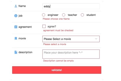
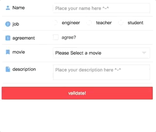
Codesandbox Examples
- Custom control(when
check: false) - Custom function(when providing
customFunc) - Custom locales(when providing
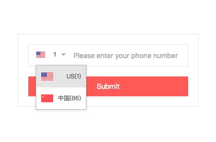
window.REACT_INPUTS_VALIDATION['customErrorMessage']) - Phone and email validation example(handled with
customFunc)
Installation
npm install react-inputs-validation --save
Browser support
Tested on IE9+ and Chrome and Safari(10.0.3)
Docs
Textbox
| Props | Type | Description | Default | |
|---|---|---|---|---|
| tabIndex | Opt | Str | -1 | |
| id | Opt | Str | "" | |
| name | Opt | Str | "" | |
| type | Opt | Str | "text" | |
| value | Opt | Str | "" | |
| disabled | Opt | Bool | false | |
| maxLength | Opt | Str | "" | |
| placeholder | Opt | Str | "" | |
| validate | Opt | Bool | If you have a submit button and trying to validate all the inputs of your form at once, toggle it to true, then it will validate the field and pass the result via the "validationCallback" you provide. | false |
| validationCallback | Opt | Func | Return the validation result. | none |
| classNameInput | Opt | Str | "" | |
| classNameWrapper | Opt | Str | "" | |
| classNameContainer | Opt | Str | "" | |
| customStyleInput | Opt | Obj | {} | |
| customStyleWrapper | Opt | Obj | {} | |
| customStyleContainer | Opt | Obj | {} | |
| onChange | Req | Func | (val, e) => {}. Will return the value. | (val, e) => {} |
| onBlur | Opt | Func | In order to validate the value on blur, you MUST provide a function, even if it is an empty function. Missing this, the validation on blur will not work. | none |
| onFocus | Opt | Func | none | |
| onClick | Opt | Func | none | |
| onKeyUp | Opt | Func | none | |
| validationOption | Opt | obj | validationOption object, see below | {} |
| validationOption.name | Opt | Str | To display in the Error message. i.e Please enter your ${name}. | "" |
| validationOption.check | Opt | Bool | To determin if you need to validate. | true |
| validationOption.required | Opt | Bool | To determin if it is a required field. | true |
| validationOption.type | Opt | Str | Validation type, options are ['string', 'number' |
"string" |
| validationOption.showMsg | Opt | Bool | To determin display the error message or not. | true |
| validationOption.min | Opt | Num | Validation of min length when validationOption['type'] is string, min amount when validationOption['type'] is number. | 0 |
| validationOption.max | Opt | Num | Validation of max length when validationOption['type'] is string, max amount when validationOption['type'] is number. | 0 |
| validationOption.length | Opt | Num | Validation of exact length of the value. | 0 |
| validationOption.compare | Opt | Str | Compare this value to 3 to see if they are equal. | "" |
| validationOption.customFunc | Opt | Func | Custom function. Returns true or err message. | none |
| validationOption.reg | Opt | Bool | Custom regex. | "" |
| validationOption.regMsg | Opt | Str | Custom regex error message. | "" |
| validationOption.locale | Opt | Str | For error message display. Current options are ['zh-CN', 'en-US']; Default is 'en-US'. If your are looking for more options, you can take a look at 'window.REACT_INPUTS_VALIDATION' section, which provides the extensibility for your own locale. | "en-US" |
No longer support after v1.4.0. For phone or email address validation please reffer to 'Phone and email validation example' |
||||
| validationOption.msgOnError | Opt | Str | Show your custom error message no matter what when it has error if it is provied. | "" |
| validationOption.msgOnSuccess | Opt | Str | Show your custom success message no matter what when it has error if it is provied. | "" |
import { Textbox } from 'react-inputs-validation';
import 'react-inputs-validation/lib/react-inputs-validation.min.css';

<Textbox
  tabIndex="1" //Optional.[String or Number].Default: -1.
  id={'Name'} //Optional.[String].Default: "".  Input ID.
  name="Name" //Optional.[String].Default: "". Input name.
  type="text" //Optional.[String].Default: "text". Input type [text, password, number].
  value={name} //Optional.[String].Default: "".
  disabled={false} //Optional.[Bool].Default: false.
  maxLength={maxLength} //Optional.[String].Default: "".
  placeholder="Place your name here ^-^" //Optional.[String].Default: "".
  validate={validate} //Optional.[Bool].Default: false. If you have a submit button and trying to validate all the inputs of your form at once, toggle it to true, then it will validate the field and pass the result via the "validationCallback" you provide.
  validationCallback={res =>
    this.setState({ hasNameError: res, validate: false })} //Optional.[Func].Default: none. Return the validation result.
  classNameInput="" //Optional.[String].Default: "".
  classNameWrapper="" //Optional.[String].Default: "".
  classNameContainer="" //Optional.[String].Default: "".
  customStyleInput={{}} //Optional.[Object].Default: {}.
  customStyleWrapper={{}} //Optional.[Object].Default: {}.
  customStyleContainer={{}} //Optional.[Object].Default: {}.
  onChange={(name, e) => {
    this.setState({ name });
    console.log(e);
  }} //Required.[Func].Default: () => {}. Will return the value.
  onBlur={(e) => {console.log(e)}} //Optional.[Func].Default: none. In order to validate the value on blur, you MUST provide a function, even if it is an empty function. Missing this, the validation on blur will not work.
  // onFocus={(e) => {console.log(e)}} //Optional.[Func].Default: none.
  // onClick={(e) => {console.log(e)}} //Optional.[Func].Default: none.
  // onKeyUp={(e) => {console.log(e)}} //Optional.[Func].Default: none.
  validationOption={{
    name: 'Name', //Optional.[String].Default: "". To display in the Error message. i.e Please enter your ${name}.
    check: true, //Optional.[Bool].Default: true. To determin if you need to validate.
    required: true, //Optional.[Bool].Default: true. To determin if it is a required field.
    // type: 'string', //Optional.[String].Default: "string". Validation type, options are ['string', 'number', 'phone'].
    // showMsg: true, //Optional.[Bool].Default: true. To determin display the error message or not.
    // min: 2, //Optional.[Number].Default: 0. Validation of min length when validationOption['type'] is string, min amount when validationOption['type'] is number.
    // max: 10, //Optional.[Number].Default: 0. Validation of max length when validationOption['type'] is string, max amount when validationOption['type'] is number.
    // length: 2, //Optional.[Number].Default: 0. Validation of exact length of the value.
    // compare: '3', //Optional.[String].Default: "" Compare this value to 3 to see if they are equal.
    // reg: /^\d{18}|\d{15}$/, //Optional.[Bool].Default: "" Custom regex.
    // regMsg: 'failed in reg.test(${value})', //Optional.[String].Default: "" Custom regex error message.
    // locale: 'en-US', //Optional.[String].Default: "en-US". For error message display. Current options are ['zh-CN', 'en-US']; Default is 'en-US'. If your are looking for more options, you can take a look at 'window.REACT_INPUTS_VALIDATION' section, which provides the extensibility for your own locale.
    // msgOnError: "Your custom error message if you provide the validationOption['msgOnError']", //Optional.[String].Default: "" Show your custom error message no matter what when it has error if it is provied.
    // msgOnSuccess: "Your custom success message if you provide the validationOption['msgOnSuccess']. Otherwise, it will not show, not even green border.", //Optional.[String].Default: "". Show your custom success message no matter what when it has error if it is provied.
    // customFunc: res => { //Optional.[Func].Default: none. Custom function. Returns true or err message
    //   if (res != 'milk') {
    //     return 'Description cannot be other things but milk';
    //   }
    //   return true;
    // }
  }}
/>
Radiobox
| Props | Type | Description | Default | |
|---|---|---|---|---|
| tabIndex | Opt | Str | -1 | |
| id | Req | Str | IMPORTANT if you have multiple Radiobox on the page, id is used to distinguish them for the label 'for' use | "" |
| name | Opt | Str | "" | |
| value | Opt | Str | "" | |
| disabled | Opt | Bool | false | |
| validate | Opt | Bool | If you have a submit button and trying to validate all the inputs of your form at once, toggle it to true, then it will validate the field and pass the result via the "validationCallback" you provide. | false |
| validationCallback | Opt | Func | Return the validation result. | none |
| optionList | Req | Array | [{id: 'teacher', name: 'teacher'] | [] |
| classNameInput | Opt | Str | "" | |
| classNameWrapper | Opt | Str | "" | |
| classNameContainer | Opt | Str | "" | |
| classNameOptionListItem | Opt | Str | "" | |
| customStyleInput | Opt | Obj | {} | |
| customStyleWrapper | Opt | Obj | {} | |
| customStyleContainer | Opt | Obj | {} | |
| customStyleOptionListItem | Opt | Obj | {} | |
| onBlur | Opt. | Func | In order to validate the value on blur, you MUST provide a function, even if it is an empty function. Missing this, the validation on blur will not work. | none |
| onChange | Req. | Func | (val, e) => {}. Will return the value. | (val, e)=>{} |
| onFocus | Opt. | Func | none | |
| onClick | Opt. | Func | none | |
| validationOption | Opt | obj | validationOption object, see below | {} |
| validationOption.name | Opt | Str | To display in the Error message. i.e Please enter your ${name}. | "" |
| validationOption.check | Opt | Bool | To determin if you need to validate. | true |
| validationOption.required | Opt | Bool | To determin if it is a required field. | true |
| validationOption.showMsg | Opt | Bool | To determin display the error message or not. | true |
| validationOption.locale | Opt | Str | For error message display. Current options are ['zh-CN', 'en-US']; Default is 'en-US'. If your are looking for more options, you can take a look at 'window.REACT_INPUTS_VALIDATION' section, which provides the extensibility for your own locale. | "en-US" |
| validationOption.msgOnError | Opt | Str | Show your custom error message no matter what when it has error if it is provied. | "" |
| validationOption.msgOnSuccess | Opt | Str | Show your custom success message no matter what when it has error if it is provied. | "" |
import { Radiobox } from 'react-inputs-validation';
import 'react-inputs-validation/lib/react-inputs-validation.min.css';

<Radiobox
  tabIndex={2} //Optional.[String or Number].Default: -1.
  id="job" //Optional.[String].Default: "".  Input ID.
  name="job" //Optional.[String].Default: "". Input name.
  disabled={false} //Optional.[Bool].Default: false.
  value={job} //Optional.[String].Default: "".
  validate={validate} //Optional.[Bool].Default: false. If you have a submit button and trying to validate all the inputs of your form at once, toggle it to true, then it will validate the field and pass the result via the "validationCallback" you provide.
  validationCallback={res =>
    this.setState({ hasJobError: res, validate: false })} //Optional.[Func].Default: none. Return the validation result.
  optionList={JOB_OPTIONS_LIST}
  classNameInput="" //Optional.[String].Default: "".
  classNameWrapper="" //Optional.[String].Default: "".
  classNameContainer="" //Optional.[String].Default: "".
  classNameOptionListItem="" //Optional.[String].Default: "".
  customStyleInput={{}} //Optional.[Object].Default: {}.
  customStyleWrapper={{}} //Optional.[Object].Default: {}.
  customStyleContainer={{
    display: 'flex',
    justifyContent: 'flex-start'
  }} //Optional.[Object].Default: {}.
  customStyleOptionListItem={{ marginRight: '20px' }} //Optional.[Object].Default: {}.
  onChange={(job, e) =>{
    this.setState({ job });
    console.log(e);
  }} //Required.[Func].Default: () => {}. Will return the value.
  onBlur={(e) => {console.log(e)}} //Optional.[Func].Default: none.
  // onFocus={(e) => {console.log(e)}} //Optional.[Func].Default: none.
  // onClick={(e) => {console.log(e)}} //Optional.[Func].Default: none.
  validationOption={{
    name: 'Name', //Optional.[String].Default: "". To display in the Error message. i.e Please enter your ${name}.
    check: true, //Optional.[Bool].Default: true. To determin if you need to validate.
    required: true, //Optional.[Bool].Default: true. To determin if it is a required field.
    // showMsg: true, //Optional.[Bool].Default: true. To determin display the error message or not.
    // locale: 'en-US', //Optional.[String].Default: "en-US". For error message display. Current options are ['zh-CN', 'en-US']; Default is 'en-US'. If your are looking for more options, you can take a look at 'window.REACT_INPUTS_VALIDATION' section, which provides the extensibility for your own locale.
    // msgOnError: "Your custom error message if you provide the validationOption['msgOnError']", //Optional.[String].Default: "". Show your custom error message no matter what when it has error if it is provied.
    // msgOnSuccess: "Your custom success message if you provide the validationOption['msgOnSuccess']. Otherwise, it will not show, not even green border." //Optional.[String].Default: "". Show your custom success message no matter what when it has error if it is provied.
  }}
/>
Checkbox
| Props | Type | Description | Default | |
|---|---|---|---|---|
| tabIndex | Opt | Str | -1 | |
| id | Opt | Str | "" | |
| name | Opt | Str | "" | |
| value | Opt | Str | "" | |
| checked | Opt | Bool | false | |
| disabled | Opt | Bool | false | |
| validate | Opt | Bool | If you have a submit button and trying to validate all the inputs of your form at once, toggle it to true, then it will validate the field and pass the result via the "validationCallback" you provide. | false |
| validationCallback | Opt | Func | Return the validation result. | none |
| classNameWrapper | Opt | Str | "" | |
| classNameInputBox | Opt | Str | "" | |
| classNameContainer | Opt | Str | "" | |
| customStyleWrapper | Opt | Obj | {} | |
| customStyleInputBox | Opt | Obj | {} | |
| customStyleContainer | Opt | Obj | {} | |
| onBlur | Opt. | Func | In order to validate the value on blur, you MUST provide a function, even if it is an empty function. Missing this, the validation on blur will not work. | none |
| onChange | Req. | Func | (val, e) => {}. Will return the value. | (val, e)=>{} |
| onFocus | Opt. | Func | none | |
| onClick | Opt. | Func | none | |
| labelHtml | Req. | Html | none | |
| validationOption | Opt | obj | validationOption object, see below | {} |
| validationOption.name | Opt | Str | To display in the Error message. i.e Please enter your ${name}. | "" |
| validationOption.check | Opt | Bool | To determin if you need to validate. | true |
| validationOption.required | Opt | Bool | To determin if it is a required field. | true |
| validationOption.showMsg | Opt | Bool | To determin display the error message or not. | true |
| validationOption.locale | Opt | Str | For error message display. Current options are ['zh-CN', 'en-US']; Default is 'en-US'. If your are looking for more options, you can take a look at 'window.REACT_INPUTS_VALIDATION' section, which provides the extensibility for your own locale. | "en-US" |
| validationOption.msgOnError | Opt | Str | Show your custom error message no matter what when it has error if it is provied. | "" |
| validationOption.msgOnSuccess | Opt | Str | Show your custom success message no matter what when it has error if it is provied. | "" |
import { Checkbox } from 'react-inputs-validation';
import 'react-inputs-validation/lib/react-inputs-validation.min.css';

<Checkbox
  tabIndex="5" //Optional.[String or Number].Default: -1.
  id={'agreement'} //Optional.[String].Default: "".  Input ID.
  name={'agreement'} //Optional.[String].Default: "". Input name
  value={agreement} //Required.[String].Default: "".
  checked={false} //Optional.[Bool].Default: false.
  disabled={false} //Optional.[Bool].Default: false.
  validate={validate} //Optional.[Bool].Default: false. If you have a submit button and trying to validate all the inputs of your form at once, toggle it to true, then it will validate the field and pass the result via the "validationCallback" you provide.
  validationCallback={res =>
    this.setState({
      hasAgreementError: res,
      validate: false
    })} //Optional.[Func].Default: none. Return the validation result.
  classNameWrapper="" //Optional.[String].Default: "".
  classNameInputBox="" //Optional.[String].Default: "".
  classNameContainer="" //Optional.[String].Default: "".
  customStyleWrapper={{}} //Optional.[Object].Default: {}.
  customStyleInputBox={{}} //Optional.[Object].Default: {}.
  customStyleContainer={{}} //Optional.[Object].Default: {}.
  onBlur={() => {}} //Optional.[Func].Default: none. In order to validate the value on blur, you MUST provide a function, even if it is an empty function. Missing this, the validation on blur will not work.
  // onFocus={(e) => {console.log(e)}} //Optional.[Func].Default: none.
  // onClick={(e) => {console.log(e)}} //Optional.[Func].Default: none.
  onChange={(agreement, e) => {
    this.setState({ agreement });
    console.log(e);
  }} //Required.[Func].Default: () => {}. Will return the value.
  labelHtml={
    <div style={{ color: '#4a4a4a', marginTop: '2px' }}>
      agree?
    </div>
  } //Required.[Html].Default: none.
  validationOption={{
    name: 'agreement', //Optional.[String].Default: "". To display in the Error message. i.e Please check the ${name}.
    check: true, //Optional.[Bool].Default: true. To determin if you need to validate.
    required: true, //Optional.[Bool].Default: true. To determin if it is a required field.
    // showMsg: true, //Optional.[Bool].Default: true. To determin display the error message or not.
    // locale: 'en-US', //Optional.[String].Default: "en-US". For error message display. Current options are ['zh-CN', 'en-US']; Default is 'en-US'. If your are looking for more options, you can take a look of 'window.REACT_INPUTS_VALIDATION' section, which provides the extensibility for your own locale.
    // msgOnError: "Your custom error message if you provide the validationOption['msgOnError']", //Optional.[String].Default: "". Show your custom error message no matter what when it has error if it is provied.
    // msgOnSuccess: "Your custom success message if you provide the validationOption['msgOnSuccess']. Otherwise, it will not show, not even green border." //Optional.[String].Default: "". Show your custom success message no matter what when it has error if it is provied.
  }}
/>
Select
| Props | Type | Description | Default | |
|---|---|---|---|---|
| tabIndex | Opt | Str | -1 | |
| id | Opt | Str | "" | |
| name | Opt | Str | "" | |
| type | Opt | Str | "text" | |
| value | Opt | Str | "" | |
| disabled | Opt | Bool | false | |
| validate | Opt | Bool | false | |
| validationCallback | Opt | Func | none | |
| optionList | Req | Array | [{id: '1', name: 'Twin Peaks'] | [] |
| classNameSelect | Opt | Str | "" | |
| classNameWrapper | Opt | Str | "" | |
| classNameContainer | Opt | Str | "" | |
| classNameOptionListContainer | Opt | Str | "" | |
| classNameOptionListItem | Opt | Str | "" | |
| customStyleSelect | Opt | Obj | {} | |
| customStyleWrapper | Opt | Obj | {} | |
| customStyleContainer | Opt | Obj | {} | |
| customStyleOptionListContainer | Opt | Obj | {} | |
| customStyleOptionListItem | Opt | Obj | {} | |
| onChange | Req | Func | (val, e) => {} | |
| onBlur | Opt | Func | none | |
| onFocus | Opt | Func | none | |
| onClick | Opt | Func | none | |
| selectHtml | Opt | Html | The custom html that will display when user choose. Use it if you think the default html is ugly. | none |
| selectOptionListItemHtml | Opt | Html | The custom select options item html that will display in dropdown list. Use it if you think the default html is ugly. | none |
| validationOption | Opt | obj | {} | |
| validationOption.name | Opt | Str | To display in the Error message. i.e Please enter your ${name}. | "" |
| validationOption.check | Opt | Bool | To determin if you need to validate. | true |
| validationOption.required | Opt | Bool | To determin if it is a required field. | true |
| validationOption.showMsg | Opt | Bool | To determin display the error message or not. | true |
| validationOption.locale | Opt | Str | For error message display. Current options are ['zh-CN', 'en-US']; Default is 'en-US'. If your are looking for more options, you can take a look at 'window.REACT_INPUTS_VALIDATION' section, which provides the extensibility for your own locale. | "en-US" |
| validationOption.msgOnError | Opt | Str | Show your custom error message no matter what when it has error if it is provied. | "" |
| validationOption.msgOnSuccess | Opt | Str | Show your custom success message no matter what when it has error if it is provied. | "" |
import { Select } from 'react-inputs-validation';
import 'react-inputs-validation/lib/react-inputs-validation.min.css';

<Select
  tabIndex="6" //Optional.[String or Number].Default: -1.
  id={'movie'} //Optional.[String].Default: "". Input ID.
  name={'movie'} //Optional.[String].Default: "". Input name.
  value={movie} //Optional.[String].Default: "".
  disabled={false} //Optional.[Bool].Default: false.
  validate={validate} //Optional.[Bool].Default: false. If you have a submit button and trying to validate all the inputs of your form at once, toggle it to true, then it will validate the field and pass the result via the "validationCallback" you provide.
  validationCallback={res =>
    this.setState({ hasMovieError: res, validate: false })} //Optional.[Func].Default: none. Return the validation result.
  optionList={MOVIE_OPTIONS_LIST} //Required.[Array of Object(s)].Default: [].
  classNameSelect="" //Optional.[String].Default: "".
  classNameWrapper="" //Optional.[String].Default: "".
  classNameContainer="" //Optional.[String].Default: "".
  classNameOptionListContainer="" //Optional.[String].Default: "".
  classNameOptionListItem="" //Optional.[String].Default: "".
  customStyleSelect={{}} //Optional.[Object].Default: {}.
  customStyleWrapper={{}} //Optional.[Object].Default: {}.
  customStyleContainer={{}} //Optional.[Object].Default: {}.
  customStyleOptionListContainer={{}} //Optional.[Object].Default: {}.
  customStyleOptionListItem={{}} //Optional.[Object].Default: {}.
  onChange={(movie, e) => {
    this.setState({ movie });
    console.log(e);
  }} //Optional.[Func].Default: () => {}. Will return the value.
  onBlur={() => {}} //Optional.[Func].Default: none. In order to validate the value on blur, you MUST provide a function, even if it is an empty function. Missing this, the validation on blur will not work.
  // onFocus={(e) => {console.log(e)}} //Optional.[Func].Default: none.
  // onClick={(e) => {console.log(e)}} //Optional.[Func].Default: none.
  // selectHtml={<div>{movieItem.name}</div>} //Optional.[Html].Default: none. The custom html that will display when user choose. Use it if you think the default html is ugly.
  // selectOptionListItemHtml={MOVIE_OPTIONS_LIST.map(
  //   (i, k) => {
  //     return (
  //       <div
  //         key={k}
  //         onClick={() => {
  //           this.handleMovieChange(i.id);
  //         }}
  //       >
  //         <span className="icon icon-person" />{i.name}
  //       </div>
  //     );
  //   }
  // )} //Optional.[Html].Default: none. The custom select options item html that will display in dropdown list. Use it if you think the default html is ugly.
  validationOption={{
    name: 'movie', //Optional.[String].Default: "". To display in the Error message. i.e Please select a ${name}.
    check: true, //Optional.[Bool].Default: true. To determin if you need to validate.
    required: true, //Optional.[Bool].Default: true. To determin if it is a required field.
    // showMsg: true, //Optional.[Bool].Default: true. To determin display the error message or not.
    // locale: 'en-US', //Optional.[String].Default: "en-US". For error message display. Current options are ['zh-CN', 'en-US']; Default is 'en-US'. If your are looking for more options, you can take a look at 'window.REACT_INPUTS_VALIDATION' section, which provides the extensibility for your own locale.
    // msgOnError: "Your custom error message if you provide the validationOption['msgOnError']", //Optional.[String].Default: "". Show your custom error message no matter what when it has error if it is provied.
    // msgOnSuccess: "Your custom success message if you provide the validationOption['msgOnSuccess']. Otherwise, it will not show, not even green border." //Optional.[String].Default: "". Show your custom success message no matter what when it has error if it is provied.
  }}
/>
Textarea
| Props | Type | Description | Default | |
|---|---|---|---|---|
| tabIndex | Opt | Str | -1 | |
| id | Opt | Str | "" | |
| name | Opt | Str | "" | |
| type | Opt | Str | "text" | |
| value | Opt | Str | "" | |
| disabled | Opt | Bool | false | |
| maxLength | Opt | Str | "" | |
| placeholder | Opt | Str | "" | |
| validate | Opt | Bool | If you have a submit button and trying to validate all the inputs of your form at once, toggle it to true, then it will validate the field and pass the result via the "validationCallback" you provide. | false |
| validationCallback | Opt | Func | Return the validation result. | none |
| classNameInput | Opt | Str | "" | |
| classNameWrapper | Opt | Str | "" | |
| classNameContainer | Opt | Str | "" | |
| customStyleInput | Opt | Obj | {} | |
| customStyleWrapper | Opt | Obj | {} | |
| customStyleContainer | Opt | Obj | {} | |
| onChange | Req | Func | (val, e) => {}. Will return the value. | (val, e) => {} |
| onBlur | Opt | Func | In order to validate the value on blur, you MUST provide a function, even if it is an empty function. Missing this, the validation on blur will not work. | none |
| onFocus | Opt | Func | none | |
| onClick | Opt | Func | none | |
| onKeyUp | Opt | Func | none | |
| validationOption | Opt | obj | validationOption object, see below | {} |
| validationOption.name | Opt | Str | To display in the Error message. i.e Please enter your ${name}. | "" |
| validationOption.check | Opt | Bool | To determin if you need to validate. | true |
| validationOption.required | Opt | Bool | To determin if it is a required field. | true |
| validationOption.type | Opt | Str | Validation type, options are ['string']. | "string" |
| validationOption.showMsg | Opt | Bool | To determin display the error message or not. | true |
| validationOption.min | Opt | Num | Validation of min length. | 0 |
| validationOption.max | Opt | Num | Validation of max length. | 0 |
| validationOption.length | Opt | Num | Validation of exact length of the value. | 0 |
| validationOption.customFunc | Opt | Func | Custom function. Returns true or err message. | none |
| validationOption.reg | Opt | Bool | Custom regex. | "" |
| validationOption.regMsg | Opt | Str | Custom regex error message. | "" |
| validationOption.locale | Opt | Str | For error message display. Current options are ['zh-CN', 'en-US']; Default is 'en-US'. If your are looking for more options, you can take a look at 'window.REACT_INPUTS_VALIDATION' section, which provides the extensibility for your own locale. | "en-US" |
| validationOption.msgOnError | Opt | Str | Show your custom error message no matter what when it has error if it is provied. | "" |
| validationOption.msgOnSuccess | Opt | Str | Show your custom success message no matter what when it has error if it is provied. | "" |
import { Textarea } from 'react-inputs-validation';
import 'react-inputs-validation/lib/react-inputs-validation.min.css';

<Textarea
  tabIndex="7" //Optional.[String or Number].Default: -1.
  id="description" //Optional.[String].Default: "".  Textarea ID.
  name="description" //Optional.[String].Default: "". Textarea name.
  value={description} //Optional.[String].Default: "".
  disabled={false} //Optional.[Bool].Default: false.
  maxLength={maxLength} //Optional.[String].Default: "".
  placeholder="Place your description here ^-^" //Optional.[String].Default: "".
  validate={validate} //Optional.[Bool].Default: false. If you have a submit button and trying to validate all the inputs of your form at once, toggle it to true, then it will validate the field and pass the result via the "validationCallback" you provide.
  validationCallback={res =>
    this.setState({
      hasDescriptionError: res,
      validate: false
    })} //Optional.[Func].Default: none. Return the validation result.
  classNameInput="" //Optional.[String].Default: "".
  classNameWrapper="" //Optional.[String].Default: "".
  classNameContainer="" //Optional.[String].Default: "".
  customStyleInput={{}} //Optional.[Object].Default: {}.
  customStyleWrapper={{}} //Optional.[Object].Default: {}.
  customStyleContainer={{}} //Optional.[Object].Default: {}.
  onChange={(description, e) => {
    this.setState({ description });
    console.log(e);
  }} //Required.[Func].Default: () => {}. Will return the value.
  onBlur={(e) => {console.log(e)}} //Optional.[Func].Default: none. In order to validate the value on blur, you MUST provide a function, even if it is an empty function. Missing this, the validation on blur will not work.
  // onFocus={(e) => {console.log(e)}} //Optional.[Func].Default: none.
  // onClick={(e) => {console.log(e)}} //Optional.[Func].Default: none.
  // onKeyUp={(e) => {console.log(e)}} //Optional.[Func].Default: none.
  validationOption={{
    name: 'Description', //Optional.[String].Default: "". To display in the Error message. i.e Please enter your ${name}.
    check: true, //Optional.[Bool].Default: true. To determin if you need to validate.
    required: true, //Optional.[Bool].Default: true. To determin if it is a required field.
    type: 'string', //Optional.[String].Default: "string". Validation type, options are ['string'].
    // showMsg: true, //Optional.[Bool].Default: true. To determin display the error message or not.
    // locale: 'en-US', //Optional.[String].Default: "en-US". For error message display. Current options are ['zh-CN', 'en-US']; Default is 'en-US'. If your are looking for more options, you can take a look at 'window.REACT_INPUTS_VALIDATION' section, which provides the extensibility for your own locale.
    // min: 2, //Optional.[Number].Default: 0. Validation of min length.
    // max: 10, //Optional.[Number].Default: 0. Validation of max length.
    // length: 2, //Optional.[Number].Default: 0. Validation of exact length of the value.
    // reg: /^\d{18}|\d{15}$/, //Optional.[Bool].Default: "". Custom regex.
    // regMsg: 'failed in reg.test(${value})', //Optional.[String].Default: "". Custom regex error message.
    // msgOnError: "Your custom error message if you provide the validationOption['msgOnError']", //Optional.[String].Default: "". Show your custom error message no matter what when it has error if it is provied.
    // msgOnSuccess: "Your custom success message if you provide the validationOption['msgOnSuccess']. Otherwise, it will not show, not even green border.", //Optional.[String].Default: "". Show your custom success message no matter what when it has error if it is provied.
    // customFunc: res => { //Optional.[Func].Default: none. Custom function. Returns true or err message
    //   if (res != 'banana') {
    //     return 'Description cannot be other things but banana';
    //   }
    //   return true;
    // }
  }}
/>
Phone and email validation example
 import validator from 'validator';
 // Phone
  <Textbox
   ...
   validationOption={{
     name: 'Phone', //Optional.[String].Default: "". To display in the Error message. i.e Please enter your ${name}.
     check: true, //Optional.[Bool].Default: true. To determin if you need to validate.,
     required: true, //Optional.[Bool].Default: true. To determin if it is a required field.
     customFunc: phone => {
       if (validator.isMobilePhone(phone, 'en-US')) {
         return true;
       } else {
         return 'is not a valid phone number';
       }
     }
   }}
 />

 // Email
 <Textbox
   ...
   validationOption={{
     name: 'Email', //Optional.[String].Default: "". To display in the Error message. i.e Please enter your ${name}.
     check: true, //Optional.[Bool].Default: true. To determin if you need to validate.,
     required: true, //Optional.[Bool].Default: true. To determin if it is a required field.
     customFunc: email => {
       const reg = /^(([^<>()\[\]\\.,;:\s@"]+(\.[^<>()\[\]\\.,;:\s@"]+)*)|(".+"))@((\[[0-9]{1,3}\.[0-9]{1,3}\.[0-9]{1,3}\.[0-9]{1,3}\])|(([a-zA-Z\-0-9]+\.)+[a-zA-Z]{2,}))$/;
       if (reg.test(String(email).toLowerCase())) {
         return true;
       } else {
         return 'is not a valid email address';
       }
     }
   }}
 />
Custom Error Message (can be multiple locales)
By providing window.REACT_INPUTS_VALIDATION['customErrorMessage'], you can overwrite the error message.
IMPORTANT NOTE: YOU WILL NEED TO PLACE window.REACT_INPUTS_VALIDATION BEFORE YOUR JS SCRIPT
codesandbox example(located in index.html)
example(fully customized):
<script type="text/javascript">
  //es6
  window.REACT_INPUTS_VALIDATION = {
    customErrorMessage: {
      "my-own-locale": {...},//structure must follow below
      "en-US": {
        textbox: {
          empty: name => `${name} cannot be empty(custom message)`,
          invalid: name => `${name} invalid format(custom message)`,
          invalidFormat: name => `${name} is not a number(custom message)`,
          inBetween: name => min => max => `${name} must be ${min}-${max}(custom message)`,
          lessThan: name => min => `${name} cannot less than ${min}(custom message)`,
          greaterThan: name => max => `${name} cannot greater than ${max}(custom message)`,
          lengthEqual: name => length => `${name} length must be ${length}(custom message)`,
          twoInputsNotEqual: () => `two inputs are not equal(custom message)`
        },
        radiobox: {
          empty: name => `Please choose one ${name}(custom message)`
        },
        checkbox: {
          unchecked: name => `${name} must be checked(custom message)`
        },
        select: {
          empty: name => `Please select a ${name}(custom message)`
        },
        textarea: {
          empty: name => `${name} cannot be empty(custom message)`,
          invalid: name => `${name} invalid format(custom message)`,
          invalidFormat: name => `${name} is not a number(custom message)`,
          inBetween: name => min => max => `${name} must be ${min}-${max}(custom message)`,
          lessThan: name => min => `${name} cannot less than ${min}(custom message)`,
          greaterThan: name => max => `${name} cannot greater than ${max}(custom message)`,
          lengthEqual: name => length => `${name} length must be ${length}(custom message)`,
          twoInputsNotEqual: () => `two inputs are not equal(custom message)`
        }
      }
    }
  };
</script>
<script type="text/javascript" src="/js/index.js"></script></body>
<script type="text/javascript">
  //es5
  window.REACT_INPUTS_VALIDATION = {
    customErrorMessage: {
      "my-own-locale": {...},//structure must follow below
      "en-US": {
        textbox: {
          empty: function empty(name) {
            return name + " cannot be empty(custom message)";
          },
          invalid: function invalid(name) {
            return name + " invalid format(custom message)";
          },
          invalidFormat: function invalidFormat(name) {
            return name + " is not a number(custom message)";
          },
          inBetween: function inBetween(name) {
            return function (min) {
              return function (max) {
                return name + " must be " + min + "-" + max + "(custom message)";
              };
            };
          },
          lessThan: function lessThan(name) {
            return function (min) {
              return name + " cannot less than " + min + "(custom message)";
            };
          },
          greaterThan: function greaterThan(name) {
            return function (max) {
              return name + " cannot greater than " + max + "(custom message)";
            };
          },
          lengthEqual: function lengthEqual(name) {
            return function (length) {
              return name + " length must be " + length + "(custom message)";
            };
          },
          twoInputsNotEqual: function twoInputsNotEqual() {
            return "two inputs are not equal(custom message)";
          }
        },
        radiobox: {
          empty: function empty(name) {
            return "Please choose one " + name + "(custom message)";
          }
        },
        checkbox: {
          unchecked: function unchecked(name) {
            return name + " must be checked(custom message)";
          }
        },
        select: {
          empty: function empty(name) {
            return "Please select a " + name + "(custom message)";
          }
        },
        textarea: {
          empty: function empty(name) {
            return name + " cannot be empty(custom message)";
          },
          invalid: function invalid(name) {
            return name + " invalid format(custom message)";
          },
          invalidFormat: function invalidFormat(name) {
            return name + " is not a number(custom message)";
          },
          inBetween: function inBetween(name) {
            return function (min) {
              return function (max) {
                return name + " must be " + min + "-" + max + "(custom message)";
              };
            };
          },
          lessThan: function lessThan(name) {
            return function (min) {
              return name + " cannot less than " + min + "(custom message)";
            };
          },
          greaterThan: function greaterThan(name) {
            return function (max) {
              return name + " cannot greater than " + max + "(custom message)";
            };
          },
          lengthEqual: function lengthEqual(name) {
            return function (length) {
              return name + " length must be " + length + "(custom message)";
            };
          },
          twoInputsNotEqual: function twoInputsNotEqual() {
            return "two inputs are not equal(custom message)";
          }
        }
      }
    }
  };
</script>
<script type="text/javascript" src="/js/index.js"></script></body>
Then in the component...
<Textbox
  tabIndex="1" //Optional.[String or Number].Default: -1.
  ...
  validationOption={{
    ...
    locale: 'my-own-locale'
    ...
  }}
 />
For more extensibility or customization please reffer to 'validationOption.customFunc'