react-alert
2kb alerts for React.
Installation
$ npm install --save react-alert
Templates
You can provide your own alert template if you need to. Otherwise you can just plug in one of the following:
Feel free to submit a PR with the link for your own template.
To get started, try installing the basic one:
$ npm install --save react-alert react-alert-template-basic
Peer dependencies
This package expect the following peer dependencies:
  "prop-types": "^15.6.2"
  "react": "^16.8.1"
  "react-dom": "^16.8.1"
  "react-transition-group": "^2.5.3"
So make sure that you have those installed too!
Usage
First you have to wrap your app with the Provider giving it the alert template and optionally some options:
// index.js
import React from 'react'
import { render } from 'react-dom'
import { Provider as AlertProvider } from 'react-alert'
import AlertTemplate from 'react-alert-template-basic'
import App from './App'

// optional cofiguration
const options = {
  position: 'bottom center',
  timeout: 5000,
  offset: '30px',
  transition: 'scale'
}

const Root = () => (
  <AlertProvider template={AlertTemplate} {...options}>
    <App />
  </AlertProvider>
)

render(<Root />, document.getElementById('root'))
Then import the useAlert hook to be able to show alerts:
// App.js
import React from 'react'
import { useAlert } from 'react-alert'
const App = () => {
const alert = useAlert()
return (
<button
onClick={() => {
alert.show('Oh look, an alert!')
}}
>
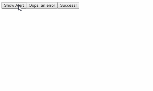
Show Alert
</button>
)
}
export default App
And that's it!
You can also use it with a HOC:
import React from 'react'
import { withAlert } from 'react-alert'

const App = ({ alert }) => (
  <button
    onClick={() => {
      alert.show('Oh look, an alert!')
    }}
  >
    Show Alert
  </button>
)

export default withAlert()(App)
Options
You can pass the following options as props to Provider:
offset: PropTypes.string // the margin of each alert
position: PropTypes.oneOf([
  'top left',
  'top right',
  'top center',
  'bottom left',
  'bottom right',
  'bottom center'
]) // the position of the alerts in the page
timeout: PropTypes.number // timeout to alert remove itself, if  set to 0 it never removes itself
type: PropTypes.oneOf(['info', 'success', 'error']) // the default alert type used when calling this.props.alert.show
transition: PropTypes.oneOf(['fade', 'scale']) // the transition animation
containerStyle: PropTypes.Object // style to be applied in the alerts container
template: PropTypes.oneOfType([PropTypes.element, PropTypes.func]).isRequired // the alert template to be used
Here's the defaults:
offset: '10px'
position: 'top center'
timeout: 0
type: 'info'
transition: 'fade',
containerStyle: {
  zIndex: 100
}
Those options will be applied to all alerts.
Api
After getting the alert with the useAlert hook, this is what you can do with it:
// show
const alert = alert.show('Some message', {
  timeout: 2000, // custom timeout just for this one alert
  type: 'success',
  onOpen: () => {
    console.log('hey')
  }, // callback that will be executed after this alert open
  onClose: () => {
    console.log('closed')
  } // callback that will be executed after this alert is removed
})

// info
// just an alias to alert.show(msg, { type: 'info' })
const alert = alert.info('Some info', {
  timeout: 2000, // custom timeout just for this one alert
  onOpen: () => {
    console.log('hey')
  }, // callback that will be executed after this alert open
  onClose: () => {
    console.log('closed')
  } // callback that will be executed after this alert is removed
})

// success
// just an alias to alert.show(msg, { type: 'success' })
const alert = alert.success('Some success', {
  timeout: 2000, // custom timeout just for this one alert
  onOpen: () => {
    console.log('hey')
  }, // callback that will be executed after this alert open
  onClose: () => {
    console.log('closed')
  } // callback that will be executed after this alert is removed
})

// error
// just an alias to alert.show(msg, { type: 'error' })
const alert = alert.error('Some error', {
  timeout: 2000, // custom timeout just for this one alert
  onOpen: () => {
    console.log('hey')
  }, // callback that will be executed after this alert open
  onClose: () => {
    console.log('closed')
  } // callback that will be executed after this alert is removed
})

// remove
// use it to remove an alert programmatically
alert.remove(alert)
Using a custom alert template
If you ever need to have an alert just the way you want, you can provide your own template! Here's a simple example:
import React from 'react'
import { render } from 'react-dom'
import { Provider as AlertProvider } from 'react-alert'
import App from './App'

// the style contains only the margin given as offset
// options contains all alert given options
// message is the alert message
// close is a function that closes the alert
const AlertTemplate = ({ style, options, message, close }) => (
  <div style={style}>
    {options.type === 'info' && '!'}
    {options.type === 'success' && ':)'}
    {options.type === 'error' && ':('}
    {message}
    <button onClick={close}>X</button>
  </div>
)

const Root = () => (
  <AlertProvider template={AlertTemplate}>
    <App />
  </AlertProvider>
)

render(<Root />, document.getElementById('root'))
Easy, right?
Using a component as a message
You can also pass in a component as a message, like this:
alert.show(<div style={{ color: 'blue' }}>Some Message</div>)
Using multiple Providers
You can use different Contexts to show alerts in different style and position:
import React, { createContext } from 'react'
import { render } from 'react-dom'
import { Provider as AlertProvider, useAlert } from 'react-alert'
import AlertTemplate from 'react-alert-template-basic'

const TopRightAlertContext = createContext()

const App = () => {
  const alert = useAlert()
  const topRightAlert = useAlert(TopRightAlertContext)

  return (
    <div>
      <button onClick={() => alert.show('Oh look, an alert!')}>
        Show Alert
      </button>
      <button
        onClick={() =>
          topRightAlert.show('Oh look, an alert in the top right corner!')
        }
      >
        Show Top Right Alert
      </button>
    </div>
  )
}

const Root = () => (
  <AlertProvider template={AlertTemplate}>
    <AlertProvider
      template={AlertTemplate}
      position="top right"
      context={TopRightAlertContext}
    >
      <App />
    </AlertProvider>
  </AlertProvider>
)

render(<Root />, document.getElementById('root'))