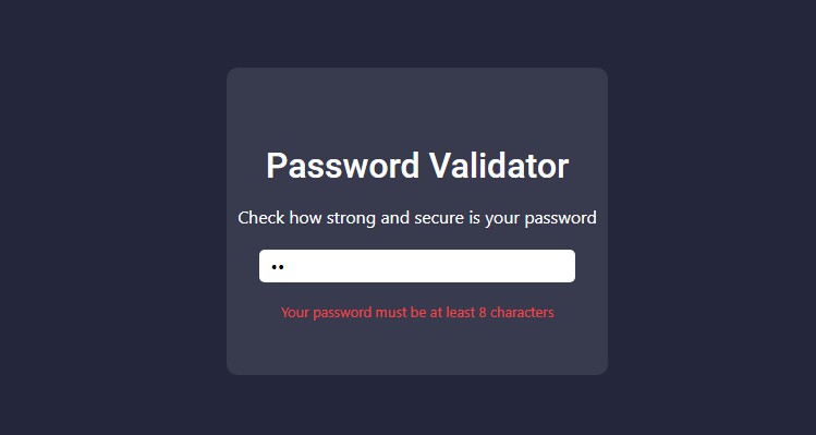
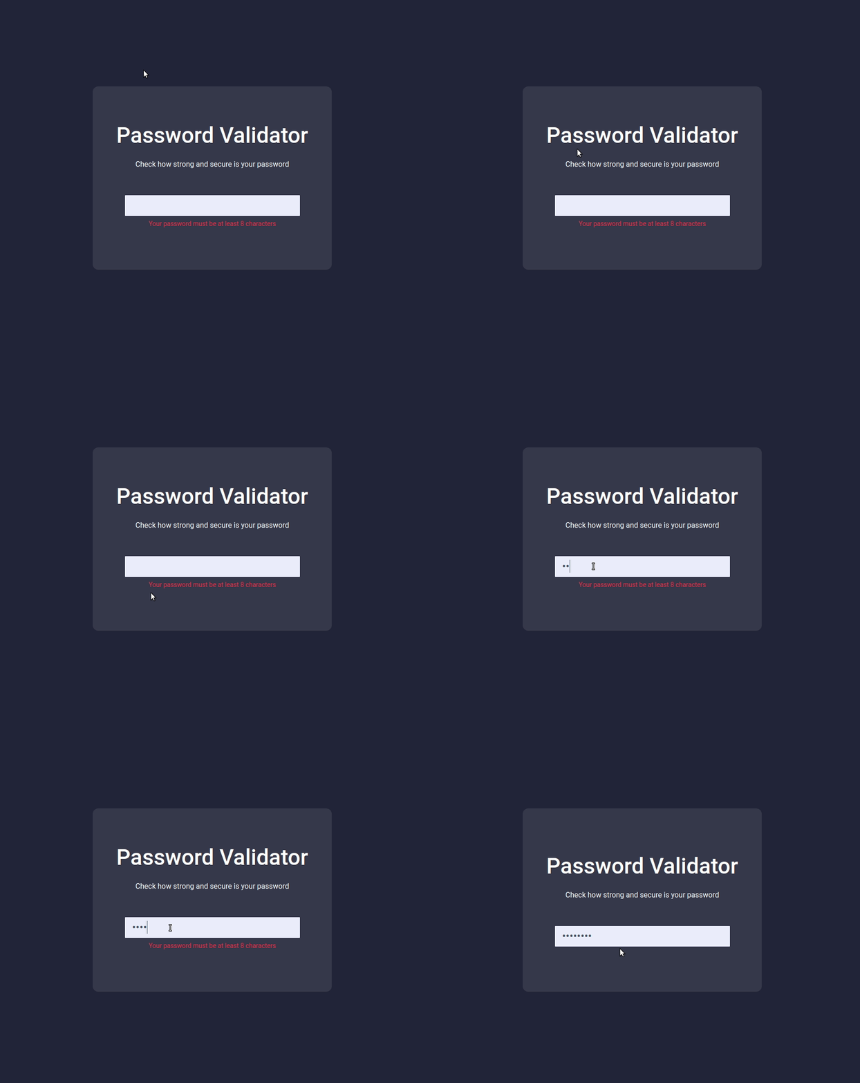
In this project, let’s build a Password Validator by applying the concepts we have learned till now.
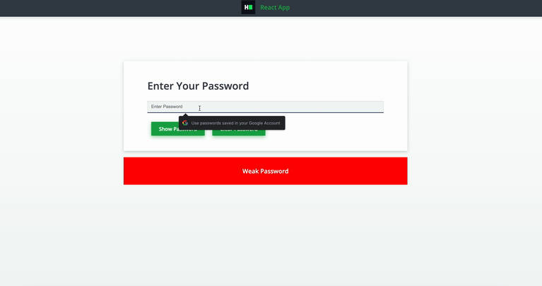
Refer to the image below:
Design Files
Click to view
- Extra Small (Size < 576px) and Small (Size >= 576px)
- Medium (Size >= 768px), Large (Size >= 992px) and Extra Large (Size >= 1200px) – Empty Password
- Medium (Size >= 768px), Large (Size >= 992px) and Extra Large (Size >= 1200px) – Invalid Password
- Medium (Size >= 768px), Large (Size >= 992px) and Extra Large (Size >= 1200px) – Valid Password
Set Up Instructions
Click to view
- Download dependencies by running
npm install - Start up the app using
npm start
Completion Instructions
Functionality to be added
The app must have the following functionalities
- When the app is opened,
- Error message should be displayed
- When a non-empty value is provided in the input,
- If provided value length is less than eight characters, then the error message should be displayed
- If provided value length is greater than or equal to eight characters, then the error message should not be displayed
Implementation Files
Use these files to complete the implementation:
src/components/PasswordValidator/index.jssrc/components/PasswordValidator/styledComponents.js
Important Note
Click to view
The following instructions are required for the tests to pass
- Styled Components should be used for styling purposes
- Roboto should be applied as
font-familyfor Password Validator heading
Resources
Colors
Background Colors:
Hex: #24263c
Hex: #edeeff
Hex: #383a4e
Hex: #475569
Box Shadow Color:
Hex: #434451
Text Colors:
Hex: #ef4444
Hex: #f8fafc
Hex: #ffffff
Font-families
- Roboto
Things to Keep in Mind
- All components you implement should go in the
src/componentsdirectory.- Don’t change the component folder names as those are the files being imported into the tests.
- Do not remove the pre-filled code
- Want to quickly review some of the concepts you’ve been learning? Take a look at the Cheat Sheets.
