react-pin-input-hook
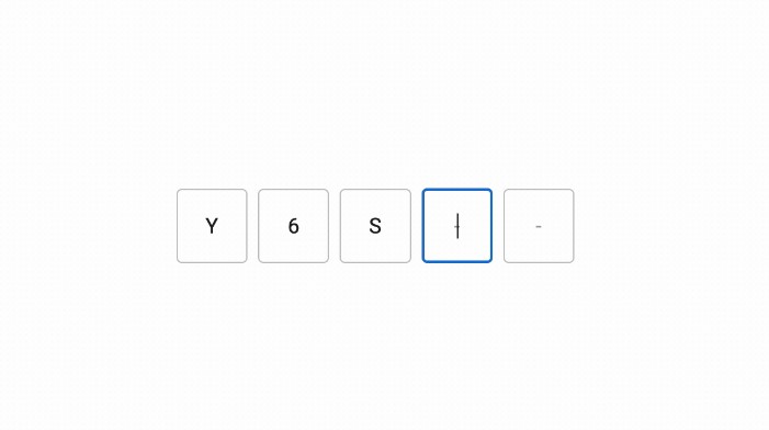
React hook for entering a PIN code.
Installation
// with npm
npm install --save react-pin-input-hook

// with yarn
yarn add react-pin-input-hook
Usage example
Uncontrolled
import * as React from 'react'
import { usePinInput } from 'react-pin-input-hook'

function Component() {
  const { fields } = usePinInput({
    onComplete: (value) => {
      // Here you can make asynchronous requests to your API for verification.

      console.log(value)
    },
  })

  return (
    <div className='pin-input'>
      {fields.map((propsField, index) => (
        <input key={index} className='pin-input__field' {...propsField} />
      ))}
    </div>
  )
}
Controlled
import * as React from 'react'
import { usePinInput } from 'react-pin-input-hook'

function Component() {
  const [values, setValues] = React.useState(Array(6).fill(''))
  const { fields } = usePinInput({
    values,
    onChange: (values) => {
      setValues(values)
    },
  })

  return (
    <div className='pin-input'>
      {fields.map((propsField, index) => (
        <input key={index} className='pin-input__field' {...propsField} />
      ))}
    </div>
  )
}
Options
| Prop | Type | Default | Description |
|---|---|---|---|
| values | string[] | – | Field values. If no values are passed, the default value defined in defaultValues is used. |
| onChange | (values: string[]) => void | – | The function is called every time the value changes. |
| onComplete | (value: string) => void | – | The function is called when all fields are filled in. |
| actionRef | React.Ref<PinInputActions> | – | A reference to imperative actions. |
| autoFocus | boolean | false | Automatic focus setting at the first mount, is set to the first field. |
| defaultValues | string[] | [”,”,”,”,”,”] | In the case when the component is unmanaged, default values are set, where the number of values in the array is equal to the number of fields. |
| type | ‘numeric’ or ‘alphanumeric’ | ‘numeric’ | Changes the type of keyboard display on mobile devices. |
| otp | boolean | false | If true, then the attribute autocomplete=“one-time-code” is added, otherwise autocomplete=“off”. |
| placeholder | string | ‘○’ | Placeholder for the input element. |
| disabled | boolean | false | If true, the transmission of event handlers onChange, onBlur, onFocus and onKeyDown in the parameters of each field is prevented. |
| mask | boolean | false | If true, then the attribute type="password" is set, otherwise type="text". |
| error | boolean | false | If true, then the focus behavior on the fields changes. |
Return
| Prop | Type | Default | Description |
|---|---|---|---|
| fields | PinInputFieldProps[] | – | An array of objects with attributes. |
| isFocused | boolean | – | Whether the focus was set on any field. |
| clear | (options?: { focus?: boolean }) => void | { focus: false } | Sets the initial values of the fields. Removes focus by default. The parameter can be passed { focus: true } to set the focus on the first field. |
PinInputFieldProps
| Prop | Type | Descriptions |
|---|---|---|
| ref | React.RefCallback | Returns a callback function to register the field. |
| value | string | Returns the value of the field. |
| disabled | boolean | Returns the value passed by the disabled parameter. |
| autoComplete | ‘one-time-code’ or ‘off’ | Returns either one-time-code if the parameter otp: true was passed, otherwise off. |
| inputMode | ‘text’ or ‘numeric’ | Returns either text if the parameter type: 'alphanumeric' was passed, otherwise numeric. |
| type | ‘text’ or ‘password’ | Returns either password if the mask: true parameter was passed, or text. |
| placeholder | string | Returns the value passed by the placeholder parameter if there are no focused fields. |
| onBlur | (event: React.FocusEvent) => void | Returns the handler for the focus loss event if disabled: false. |
| onFocus | (event: React.FocusEvent) => void | Returns the handler for the focus appearance event if disabled: false. |
| onChange | (event: React.ChangeEvent) => void | Returns a handler for the field change event if disabled: false. |
| onKeyDown | (event: React.ChangeEvent) => void | Returns a handler for the keystroke event if disabled: false. |
PinInputActions
| Name | Type | Description |
|---|---|---|
| blur | () => void | Imperative function call to lose focus. |
| focus | (index?: number) => void | Imperative function call to set focus on the first empty field. In the case when error: true. the focus is set to the first empty field. The argument takes an optional parameter in the form of a number (ordinal index), which will set the focus on a specific field. |
Example
import * as React from 'react'
import { usePinInput, PinInputActions } from 'react-pin-input-hook'

function Component() {
  const [values, setValues] = React.useState(['', '', '', '', '', ''])
  const [error, setError] = React.useState(false)
  const actionRef = React.useRef<PinInputActions>(null)
  const { fields } = usePinInput({
    values,
    onChange: setValues,
    error,
    actionRef,
  })

  const onSubmit = () => {
    // Check if there is at least one empty field. If there is, the input is considered empty.
    if (values.includes('')) {
      // Setting the error.
      setError(true)
      // We set the focus on the first empty field if `error: true` was passed as a parameter in `options`.
      actionRef.current?.focus()
    }
  }

  return (
    <form>
      <div className='pin-input'>
        {fields.map((propsField, index) => (
          <input key={index} className='pin-input__field' {...propsField} />
        ))}
      </div>
      <button onClick={onSubmit}>Submit</button>
    </form>
  )
}


