React Photo Gallery
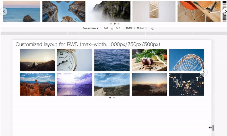
Responsive React Masonry Photo Gallery Component.
Installation
To install:
yarn add react-photo-gallery
Direct CodeSandbox Links with Examples and Use Cases
- Basic Row Layout
- Basic Column Layout
- With Lightbox
- Custom Dynamic Columns
- Selection using custom ImageComponent
- Sortable with drag and drop
To build some examples locally, run:
yarn install
yarn start
```\
Then open localhost:8000 in a browser.
## Use

```jsx

import Gallery from 'react-photo-gallery';

export default class Sample extends React.Component {
    render() {
	return (
	    <Gallery photos={PHOTO_SET} />
	);
    }
}
const PHOTO_SET = [
  {
    src: 'http://example.com/example/img1.jpg',
    width: 4,
    height: 3
  },
  {
    src: 'http://example.com/example/img2.jpg',
    width: 1,
    height: 1
  }
];
Gallery properties
| Property | Type | Default | Description |
|---|---|---|---|
| photos | array | undefined | required; array of objects |
| columns | number | undefined | optional; number of photos per row; defaults to Gallery's breakpoint choosing |
| onClick | function | undefined | optional; do something when the user clicks a photo; receives arguments event and an object containing the index, photo obj originally sent and the next and previous photos in the gallery if they exist |
| margin | number | 2 | optional; number of margin pixels around each entire image |
| direction | string | 'row' | optional; column or row based layout |
| ImageComponent | function | default component | optional; use a different image component than the default provided to display your photo |
Photos array item properties (passed into Gallery's photos property)
| Property | Type | Default | Description |
|---|---|---|---|
| src | string | undefined | required; the img src attribute value of the image |
| srcSet | array or string | undefined | optional; srcSet attribute of the image |
| sizes | array or string | undefined | optional; sizes attribute of the image |
| width | number | undefined | required; original width of the gallery image (only used for calculating aspect ratio) |
| height | number | undefined | required; original height of the gallery image (only used for calculating aspect ratio) |
| alt | string | undefined | optional; alt text of the gallery image |
| key | string | src | optional; key to be used on component |
ImageComponent props
If you're passing a function component to ImageComponent you will receive back these props:
| Property | Type | Value |
|---|---|---|
| margin | string | optional; margin prop optionally passed into Gallery by user |
| index | number | required; the index of the photo within the Gallery |
| photo | object | required; the individual object passed into Gallery's photos array prop, with all the same props except recalculated height and width |
| direction | string | optional; direction passed into Gallery |
| top | number | required if direction is 'column'; top position of this image, only passed if direction prop was 'column' |
| left | number | required if direction is 'column'; left position of this image, only passed if direction prop was 'column' |
| onClick | function | optional; the onClick function optionally passsed into Gallery by user |


