react-popover

Varld's popover and tooltip library.
Install
# yarn
yarn add @varld/popover

# npm
npm install --save @varld/popover
Tooltips
import { Tooltip } from '@varld/popover';

let Component = () => {
  return (
    <Tooltip content="I am a tooltip">
      <button>I have a tooltip</button>
    </Tooltip>
  )
}
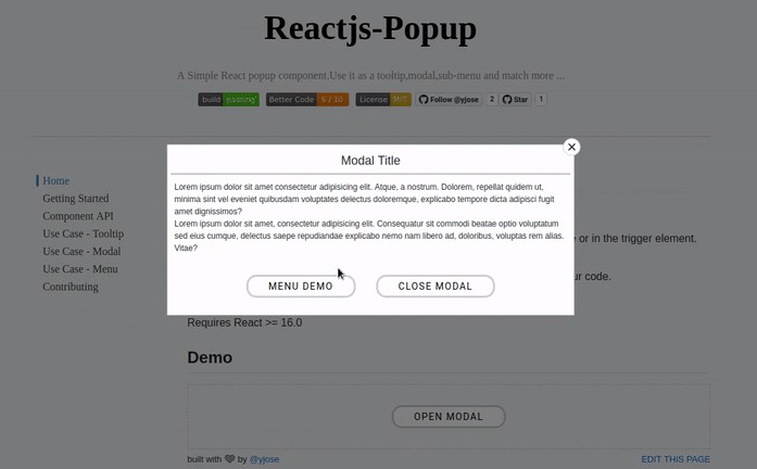
Popovers
import { Popover } from '@varld/popover';

let Component = () => {
  return (
    <Popover popover={({ visible, open, close }) => {
      return (
        <div>
          I am a popover and i am {visible ? 'visible' : 'not visible'} and {open ? 'open' : 'not open'}

          <button onClick={() => close()}>
            Close me
          </button>
        </div>
      )
    }}>
      <button>I have a popover</button>
    </Popover>
  )
}
The popover prop gets passed an object with three values (open, visible and close) and must return a ReactElement.
The open value is true when the popover is fully visible or animating.
The visible value is true when the popover is fully visible.
The close value is a function, which you can call to close the popover.